The Erik Bulatov jungle-themed lesson is here. The Henri Rousseau – here.
The language
We continued with our January theme and the jungle, and we continued to focus on the animal vocabulary and the phrases with ‘I can’. We revised the animals and we played the animal riddles based on a video, guessing the animals by the sound (I can hear).
The artist
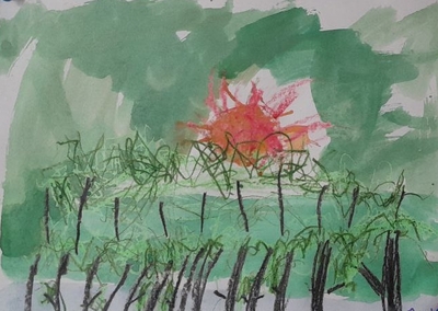
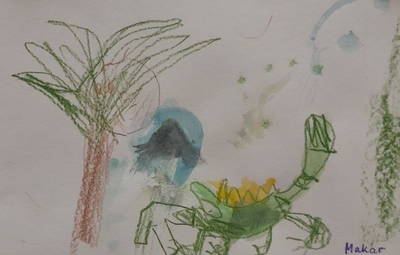
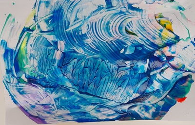
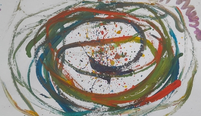
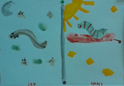
Our Artist of the Day this time came from Australia. We looked at his paintings and I told the kids a story of his travels to Europe and how him being far away from his own country made him realise that this is where the real beauty is. This was ‘the favourite thing’ for John Olsen – Australia. We looked at a few of his paintings to see the unique style; we compared the paintings and the same objects in photographs. This year, this was our first meeting with abstract paintings.
We also looked at different pictures of the jungle, to see what it looks like from the perspective of a bird (or as John Olsen would see it, if he painted jungle) and to see what colour palette we need (green!).
The art
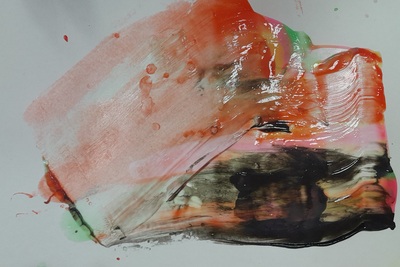
I have prepared my own version of the jungle picture, a la John Olsen, but I quickly realised that my kids were not quite interested in the abstract, non-figurative painting. For that reason, my painting was used only as a curiosity but everyone were allowed to paint the jungle in any way they wanted.
I demonstrated the technique that I have chosen for this lesson (crayons and watercolours, wet on wet or dry on wet) and we started to work. And, as usual, it was a joy to see them choose ideas, make decisions and work.
As could be predicted from their initial reactions, not one of my kids chose the abstract, not in the younger group, not in the older, either. Most kids worked with the technique I chose but I also had one student who asked for acrylic pens and one who only did crayons.
They were all invested in the process and I am really happy that we got so many beautiful and so many different paintings out of this lesson. I cannot even choose one picture that really ‘stole my heart’, although there usually is one. They are all special, each in their own way.
Every week, I have a few opportunities to interact with my students’ creations. First, when they are creating them – I am looking, then when I am editing the photos, then, when I am writing the post and then, usually after a few days, when I am uploading them here and posting. Every week, it is a chance to revisit and to notice something new. Initially, I thought that they did not really take John Olsen in, but now, on the 4th interaction, I can see that in those jungle of ours, the sun does play a very important part and, even when it is not always the centerpiece, it is very much present in their paintings. So, they did look and they did see!
Now, I am just wondering how to get them like the abstract art a tiny little bit more…
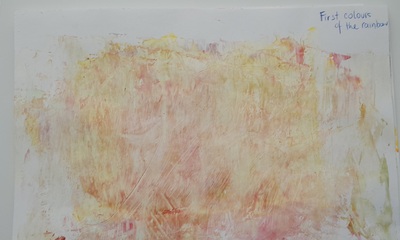
The language in this lesson was not quite our priority. We did not introduce any new language items and I really wanted to focus on working with the colour and help the students see the variety of colours at their disposal. We sang the song, talked about how we are and we revised the colours, briefly.
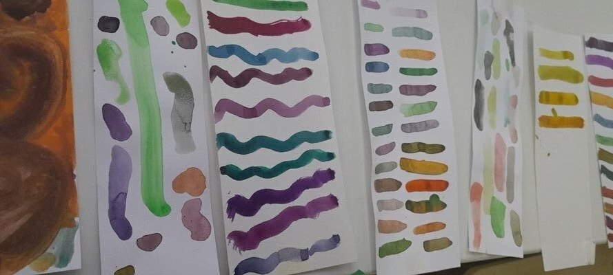
We looked at different colours and their shades to understand that each colour is, in fact, a number of colours. My younger students counted the shades and the older ones had a lot of fun reading the names of the different shades of blue, red and pink. You can find my presentation here.
The artist
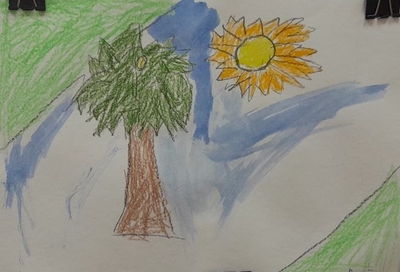
In this particular lesson we had a group of artists, to introduce a range of different paintings with one leading colour. We looked at van Gogh’s Starry Night (blue) and Sunflowers (yellow), we had Kandinsky’s Mit und Gegen (red), Levitan’s Forest Gave (green) and Sue Williams’ Pink Pentagon (pink). We called out the main colours in every painting and we called out the contrasting colours, too.
The art
I taught this lesson twice, with my younger group and my older group, with some differences.
The younger kids, pre-K and year 1, were working at a much slower pace. They needed more revision, they took longer to get into the task and they were
Everyone got a strip of paper, a mixing palette and a box of watercolours. The task was to create ten different shades of different colours. I showed them what I created for red at home and we also sat around my table for a moment to see in real time what happens if you mix yellow with brown and yellow with white or black.
They were involved in the task and they kept coming up with more and more unusual combination. Even those few kids who entered the room with ‘I will not paint today’ (there is always someone!) eventually got down to work and started to create. They kept calling me over and over again, to come over to check out the new shade. And we actually managed to get lots of language out of it. They were either telling me what they had mixed or I was trying to guess, judging by the final product.
The older students managed to complete two tasks: creating ten different shades of their chosen colour and then also creating a picture in their chosen colour. Looking at how it was going on, I decided not to speed them up and to focus and mixing the colours.
I think that next time I teach this particular lesson to the older students, I am going to focus more on the language and after creating our ten shades of X, we are going to come up with some interesting names for them. That will require preparing a slightly different page, with some room to write but it looks like a fun activity with a lot of potential. Especially that they already really enjoyed finding out about the official shades of different colours.
Afterwards, we went on to painting a picture with our chosen colour as the main theme. My model made at home was a picture of rowan, to showcase red. The one I did in class was a sunflower ready to bloom, to showcase green. We also talked about focusing on the main colour and choosing something of a different colour for contrast. My students decided to paint pumpkins (orange) and the forest (green).
The exercise of 10 Shades can be used as a warm-up activity to many other lessons. We used in our Turner lesson and in our green lesson, too. I am planning to do a lesson on red and still-life and I will include that element, too.
The funny thing is the mismatch between the actual lesson and how good it was and the photos and creations that we have to show. In case of my younger group, we ended up only with a few ‘dirty’ pieces of paper and nobody would even be able to guess that they were the result of experimentation and creative discovery. I wanted to display them on our noticeboard but what happened was that they were taken away from me, as soon as possible. Meaning? They were dear to the budding artists. As was the lesson, hopefully.
This was not a typical Art lesson for many reasons. First of all, it was a part of the camp programme, so I had a mixed ability group, with many children who have not created a lot with me. Then, it was an Art lesson that did not involve the Artist of the Day and, also, a lesson which was fully and thoroughly devoted to the process, perhaps more than any other lesson that I taught.
The language
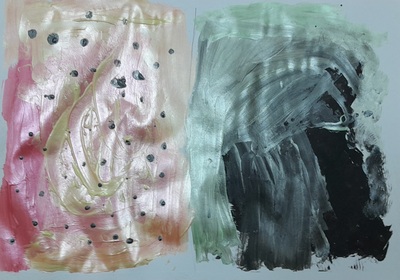
This particular lesson was taught as a part of the summer camp programme which meant a lot more time for all of us, we had one lesson for the language practice and one separate lesson for creation. And one whole lesson for Science and experiments! It was a part of the Black and White day so in our English lesson, we talked about the things that are black and white, we did some acting, we talked about our preferences (Do you prefer a black and white zebra or a colourful zebra? based on the illustrationsI found) and we wrote a poem about our favourite black and white things. We also had a fantastic Science lesson in which we were learning about what the colour black is made of and what the colour white (aka the light) is made of.
The art
Initially, I had a different idea for this lesson and I wanted to create two drawings (black on white and white on black) but we did something like that very recently and I needed something a lot more inspiring.
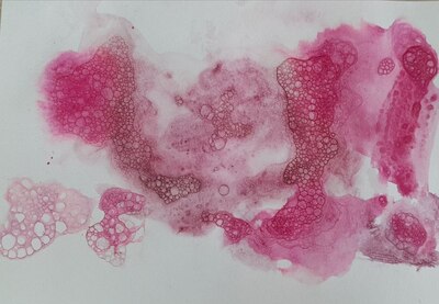
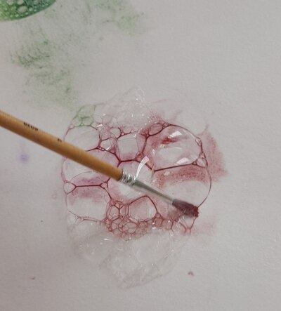
I did ‘waste’ some time thinking about the ways of making the connection between the colours and the art (something that is one of my favourite things, this kind of a brain-breaker) but, luckily, a few days earlier I was also researching new watercolour techniques and this is how I found a video on Lemon Creation ‘The most relaxing watercolour technique ever!‘. Then it was easy for the grey cells to make a connection: bubbles = white, bubbles = light, bubbles = colours.
I tried and tested the technique on myself, the day before. It helped me to understand the process better and to plan and stage it for the classroom full of kids. Not to mention that I had lots and lots of fun with it, as an adult. A delightful process that I really wanted to share with my kids.
In the classroom, the next day, it went like that:
I showed the kids all of the materials (plates, spoons, straws, washing up liquid, watercolours, paper, paintbrushes) and I explained that we are going to make bubble paintings.
I showed the kids my creations, already dry and ready for all of us to see the final product.
The next step was the list on the board, all the stages with simple verbs, for each of them because, again, this is an activity whose success depends a lot on the careful following in the footsteps of the teacher, one at a time.
And, to further underline it, I produced one more picture in real time, with us following the instructions on the board and the kids watching the process, from the beginning until the end. Initially, I wanted to colour the bubbles only with the black paint, in order to keep in line with the theme of the day but I quickly gave up on the idea. Not because it is a bad idea but because adding more and more colour and looking at how they seep into each other and mix and dry was way too much fun to skip it.
Giving out cups and straws to all the kids and making out own foam would be a lot of fun but I didn’t want to risk anyone taking a sip of the soapy water by accident (and, mind you, that is very easy, even for an adult, I did it myself while in class, oups) so I decided that there will be only two Foam Makers, myself and my TA.
After we have given out resources, put on aprons and prepared the paper, we started to walk around the room with my teacher assistant giving out the foam to kids. At home I used a piece of cardboard but a spoon is a much better solution (Miss Nigina’s idea:-).
Children went on to infuse their bubbles with colour and only now and again someone would should ‘Miss Anka, more foam, please!’
Some of the kids named their paintings in the same lesson, some decided to leave it for later (‘Miss Anka, I haven’t finished yet’ as my 5 y.o. artist told me).
When we came back after the lunch break, we unpeeled all of the pictures, signed them, named them and decided who is taking theirs home and who is keeping theirs on the noticeboard.
If you haven’t figured that out yet from the first 500 words of the post, I am here to tell you that we absolutely enjoyed this activity.
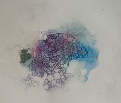
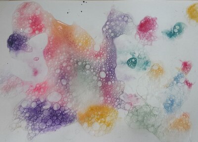
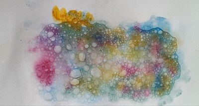
Yet again, we had an opportunity to learn to keep the pace and to follow detailed (but carefully-staged) instructions. We created these beautiful pieces that you can see in the photos and the kids were fully engaged. It is almost difficult to call it ‘painting’, it seems that ‘a show’ would be a more appropriate term as it was a whole performance that we created with the help of the bubbles and the watercolour. Observing how the paint seeps down, through the bubbles, colouring them and then drying and changing slowly…We literally watched the paint dry and it was an absolutely fascinating experience.
It was only after the lesson when I had a chance to look at the photos that we took during the lesson and the kids in all the photos are so focused, so engrossed, so into it…A beauty to behold!
The study in pink that is the title photo of this post was created by my 5 y.o. firestarter who, when ‘forced’, stops plotting how to destroy the world and sits down to paint and ends up putting together the most amazing pieces. Like that one. I have already had a chance to witness it 6 times and every single time it is a wonder.
There many things that can be done with the finished paintings, with the use of markers or colours or even collage and we will definitely be coming back to it! Bubbles for everyone!
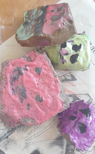
This was the last episode in our series of Materials in May. The language input was a revision and limited to colours, emotions and animals which was also consistent with the vocabulary that featured in the photos I found online to inspire my students. Which, of course, means that the vocabulary can be adapted, adjusted and selected to match the topic that you are planning to focus on or the topic that the stone painting is supposed to accompany.
The artist
Since our main character was stone, I decided to choose a group Artist of the Day and look at the artistic creations across the centuries made specifically of stone (or, rather, different variations of it) such as the Sphinx of Giza, the Easter Islands monuments, Nike, the Greek goddess and Moscow lions, among others. The great thing about it was that many of these, the kids were already familiar with and they could relate to them on a slightly different level, for example, because they had a lot to share, although most of the time this was done in Russian, rather than in the target langauge.
The art
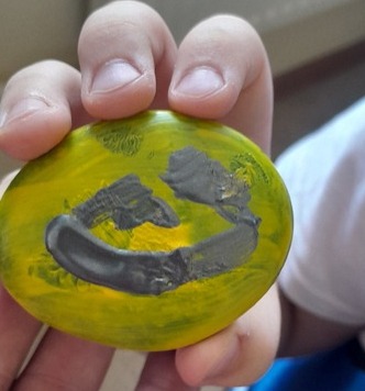
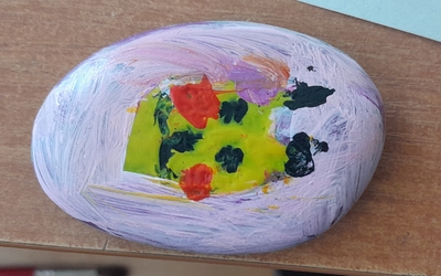
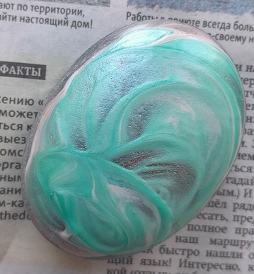
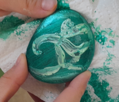
The art part was very simple and straightforward. We started with looking at a great variety of stone paintings that can be found online, with different smileys, fish, dogs, cats, elephants and what not. The kids were told that they would be able to paint whatever their want.
We proceeded to choosing the stones and handing out pieces of paper and pencils as we were to design our drawings. We traced our stones on the paper and spent some time trying to figure out the best picture or pattern for our stones. I tried to encourage them to be inspired by the shape, especially that we had stones of two different sources.
A word here on the stones themselves. They came from two main sources. Some of them were the ‘pretty’ craft stones, round and polished and I bought them in a craft store. The others were more organic, collected by me in the neighbourhood. These are irregular, ragged, rough but also more inspiring. I washed all of them with soap and hot water. In the end, they were left in a bowl with hot water, in order to sanitise them as much as possible.
When our designs were ready, we put on the aprons and started painting. Our paints were on a big table in the middle of the classroom so that all the kids could share all the resources. We used two types of the acrylic paints, I had some basic colours (but in lovely, rich shades) and some pearl colours (in other shades, as it happened). A part of the fun on the day was mixing of both in order to get the best of both. I am not sure if it can be seen in the photographs but it really worked out very well.
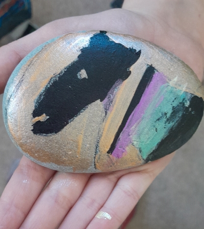
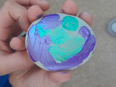
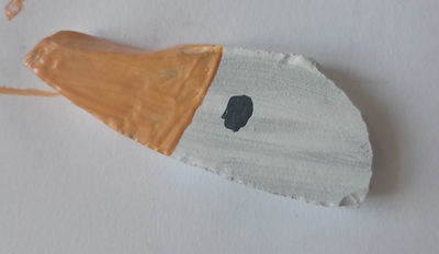
As for the design, as I said before, the kids had a free hand and they chose whatever they wanted. We had some smileys, we had some ‘favourite things’ such as the horses, the geese and Picachu, we also had some ‘magic stones’, which were only coloured and decorated. Because the acrylic paint dries relatively quickly, some of my students managed to decorate both sides of the stones.
I had the black markers ready for the follow-up decorating as it is also an option, especially useful for all the tiny elements of the drawing or the tracing, but it turned out not be necessary in the end. As with all the materials lessons in May, I announced that we would be leaving our creations to dry overnight but, guess what, that also didn’t happen. Almost everyone insisted on taking their stones home asap. I barely had time to take any photos. I suppose that means that the lesson was a success.
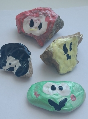
Magic stone, step 1Magic stone, step 2A series of emoticonsAnd another series of emoticons
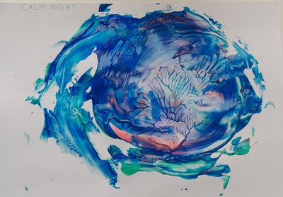
‘Calm night’ that started as an apple, if I remember correctly…
I am happy. As a teacher of English and a teacher of Art – I am happy. I have my Art Explorers classes twice a week, there are two groups so every lesson is not only taught twice and every idea trialled and trialled again. I am happy because I am getting better at coming up with ideas and with combining all the elements and finding the links between the artist, the language and the technique. And I can see how my kids are reacting to it and becoming more familiar with the paintings and more confident as artists.
I have also realised that all of us, we are more involved in the process and we are enjoying it more. The final product is important, of course, but so is the journey. It is all very rewarding and I am just happy that it is a part of my weekly schedule.
‘You destroyed my food’Sasha’s favourite food
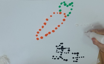
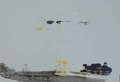
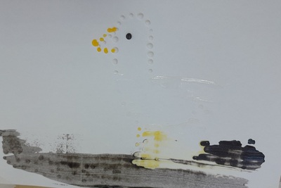
The art
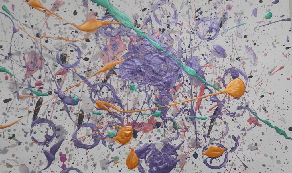
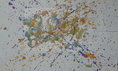
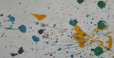
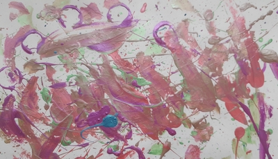
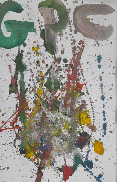
As usual, out of the three components, one had to be prioritised and, this time, it was the art itself. I wanted to give my students an opportunity to experience the process of creating a non-figurative art piece. We tried doing it a little bit in our Jackson Pollock lesson but there the lead was taken by the very specific technique. The outcomes, amazing as they are, were absolutely accidental, and only at the very end of the lesson, we gave our paintings their names.
This time, I wanted it to be fully conscious, purposeful and planned, from A to Z for the kids to understand how a figurative painting may become a non-figurative piece and the artist (aka US!) takes the responsibility for that.
The goose after the wind blew it awayThe goose
In order to achieve it we did the following:
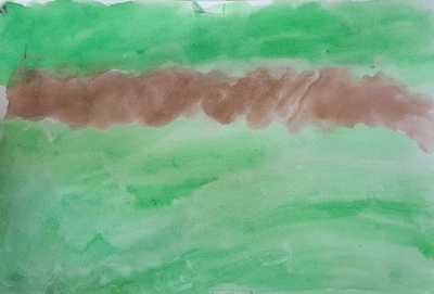
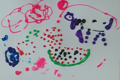
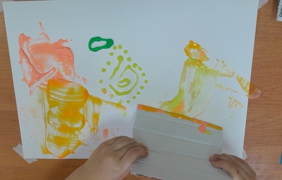
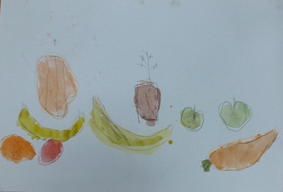
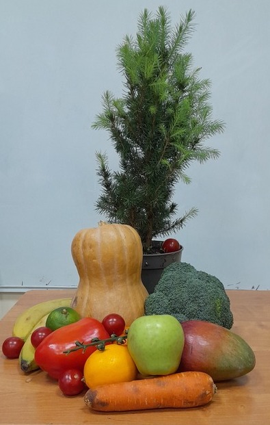
we decided what to paint. I suggested a fruit and veg still life since it was still our Fruit February but I allowed the kids to opt out of it if they really wanted to. Some did.
we made decisions about the composition and started to drip draw with the paints. I had a set of paints that I bought for the stained glass lessons but they turned out to be of a very bad quality, too watery, to liquidy and I could not use them for stained glass. They spent about five months in the drawer and last week I had already taken them out to bin them when the hoarder in me hesitated and decided to use them somehow. Since they were so good at dripping, dripping was what I chose to be their destiny. We used a technique we experimented with before, spread painting.
we drew the contours with drips of the paint (sharing the one set of paints, hooray to the social skills development!)
we photographed the ready picture
we used pieces of thick cardboard to spread the paint and a decision had to be made here to, regarding the movement (or movements) of the hand.
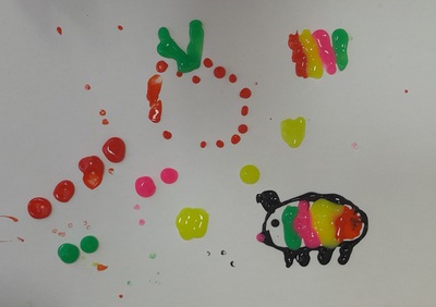
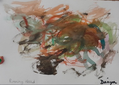
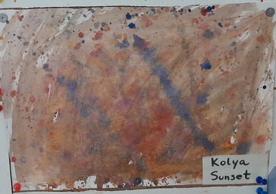
we gave the paintings a name. In most cases, it was a list of the items of the picture but some of the children came up with different names, not related to what the painting first was. Real artists, I am telling you!
As usual, the creation started with a quick modelling session during which I produced a painting of a watermelon and then turned it into a non-figurative item.
A watermelon and a horseSame watermelon and same horse
The artist
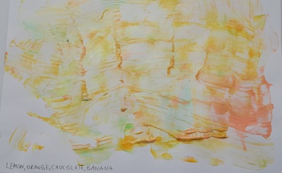
This was one of the lessons in which we did not have one superhero but a whole dinner party. I divided them into two groups to illustrate what figurative and non-figurative art is. Our definitions were very simply, in order to convey the message even to my youngest students. ‘Figurative’ was defined as ‘I can see real things’ and represented by a still-life by Cezanne, by Rene Magritte’s Son of Man, by an apply by Yayoi Kusama and a still-life by Ilya Mashkov. ‘Non-figurative’ was defined as ‘I can see shapes and colours’ and represented by a piece by Jackson Pollock, Kandinsky’s circles, Mark Rothko and Yves Klein that I have just discovered for myself.
I also brought two pictures that I created at home and I asked the students to guess what fruit I tried to paint by the colours that they could see or the shapes that were still visible, just to highlight the fact that the fruit might be only represented by a fruit, not necessarily by shape.
Lemon, orange, chocolate, banana……and when they still resembled themselves a bit more
The language
The langauge in this lesson was, as in every lesson of this month – fruit and vegetables. Apart from that I wanted to play with the language and to reinforce the idea of looking at the world from a different perspective. In order to do that, we looked at a set of pictures of the everyday objects and fruit and vegetables, seen either under a microscope or in a close up. This was a lot of fun and I am definitely going to use this resource again!
A selection of favourite things…And a favourite blur
Outcomes
It’s not going to be the first time I say it, here or in the real life, but this, indeed, was one of my favourite Art lessons ever. The rest you can see in the paintings my students created.
February is our month of food and fruit and this is what we focus on in the language part of the lesson. With my younger group we listened to a great song from the Singing Walrusand we used cards to guess the fruit and vegetables from the stencils. We did some drilling, too and we talked about whether we like them or not.
The older students needed a more advanced activity and for that I used my magic bag which, indeed, on the day was full of fruit and veg that I brought for the still-life installation. Kids put their hands into the bag and tried to describe the object they were holding using basic adjectives (big / small, hard / soft, smooth / rough, light / heavy). Despite the fact that some of the kids were as old as ten, they all did enjoy it. We also talked about the fruit and vegetables we like and don’t like.
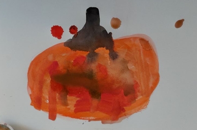
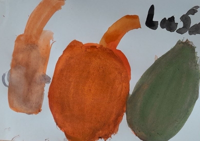
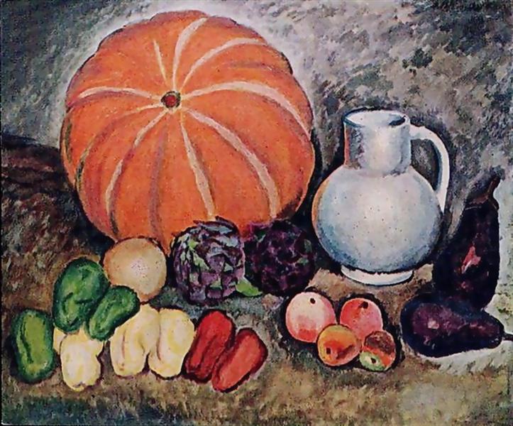
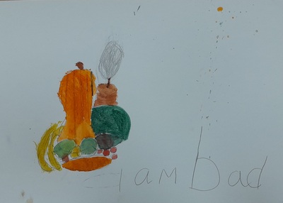
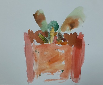
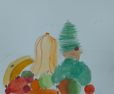
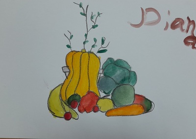
Ilya Mashkov, Pumpkin (1914)
The artist
Our artist of the day was my still-life here, Ilya Mashkov. I have used his painting in my Art classes before and it was only natural that this time I would want to take it up to another level. I did and I am quite happy how it went.
First of all, we introduced the artist himself and his famous (in my opinion) painting ‘Pumpkin’. We defined what a still life is (‘a painting of things’) and we looked at a few chosen paintings by Mashkov. I put together a set of questions, inspired and adapted from the material online Essential Questions to ask about each still life photographs. My final, go-to set for this topic includes: What colour is it? What objects can you see? What shapes can you see? What is the biggest shape? What is the smallest shape? Is it light? Is it dark? Is it smooth? Is it light?, although in the lessons this week we have gone through only a few of them.
In order to prepare for our creative activity I prepared a special slide for ‘Pumpkin’ made entirely of shapes, one to represent every fruit and every vegetable. I was revealing them one by one and the task for the kids was to call out the object that they represent. In the end, I showed them the real painting and we checked our answers. I was a fun activity and it helped them the kids the basics of the composition of the painting and to prepare them for drawing.
The art
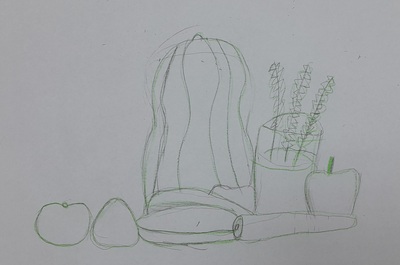
We started with putting together our installations and while I was the one responsible for arranging the items for the younger kids, my older group just took over the bag, the table and all the elements. And, it has to be said, not all the fruit made it to the table. Avocado and aubergine were not deemed worthy of our set. I accepted.
We outline the main stages of the lesson: 1. sketching with a pencil, 2. tracing the lines with crayons (one colour or a set of colours) and 3. colouring in with watercolours. I also showed my students the homework that I did before the lesson: a small still-life I painted at home and a photo of it, for comparison.
Since it was our first lesson with a still-life I did not want to invade too much and to direct the kids for example by guiding them in which order to draw the fruit. I wanted to let them try to face the task on their own and, also, to see what they can do. I was preparing my own copy and moving around, handing in the resources for each step (which also help with staging) and admiring what I was looking at. The only thing that I said to encourage them was something along the lines of ‘Don’t be scared, trust your hand. This is our first still-life. Let’s see how it goes’.
And guess what? It was beyond amazing. Some of my students are already very confident as regards drawing and they have a good eye for detail so I expected some good work but still they managed to surprise me, especially the little ones. They approached the task with curiosity, without fear and they were just working diligently on their paintings.
The only question left to answer is: What are we painting next?
We continue to work on expressing our opinions and on justifying them. Since the Unusual Colours was a huge success with both groups, I decided to continue with a different set of visuals. We revised all the basic structures to express opinions, we looked at all the pictures in the set with the group and we said what we thought of them and why. As usual, it was great to see the growing confidence and the courage to express your preferences even if they are different from your friend’s or the group.
This time round I went more slowly, pausing after each picture, to share ideas. I was also trying to encourage the kids to produce a little bit more than just ‘I like it’ or ‘I don’t like it’, with questions such as ‘Why?’, ‘How does it make you feel about it?’, ‘What are you thinking about?’ etc.
The artist
Beginning October, my Art classes have been divided into two groups, the younger (pre-school and year 1) and the older (year 2 -4) and the decision to do so was a real game changer because I can adapt the level of the language and the Art input sessions to the age and the language level of the students. Each group has only one lesson a week but they are more meaningful, more focued and more child-friendly.
Because of the holidays and the calendar, the lesson with the older kids comes up first right now and it is also very important and handy. I can prepare for the more group with more advanced language skills, motor skills and with more life expience and do what I really want to do and then just adapt to what my younger kids are able to do. I really like it this way.
In our Jackson Pollock lesson, I introduced the artist of the day (name, country, favourite things) and the fact that he is, most likely, the most renowned modern artist today or, at least, the painter that most people associate with modern art.
Later on, we looked at five of his paintings, in different colours, with different titles, from ‘real’ names (‘Summer’) through ‘Number 5’, to the beautiful ‘Untitled’ and we talked about what we think about them and how they make us feel. In the end, we watched a clip from the video ‘How to paint like Jackson Pollock’ to show the students the real process. I also decided to include a short slot devoted to the main characteristics and I called it ‘What Jackson Pollock would tell us’.
The art
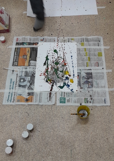
Well, this has to be the first thing to say out loud: Jackson Pollock is a serious logicstical challenge for an Art teacher. Especially if this Art teacher works with young kids and in a room that is a regular classroom which lends its square meters to all the creative activities and then goes back again to being ‘just a classroom’, used and shared with other students and teachers. To be prefectly honest, I am not sure I am entirely happy with how I dealt with it.
Things that need to be taken into consideration are as follows: the technique is a mess-generating one and it requires serious preparations. It is supposed to be done on the floor (which is refreshing and exciting) and the floor needs to be protected. So do the walls, the desks, the chairs and the kids’ clothes, because, surprise surprise, the paint spatter is a powerful force and you will find it in the most unexpected places.
The classroom was almost completely reorganised – the tables and the chairs were put aside, to make room on the floor. I perpared the working station for each of my students (an A3 piece of cardboard, on a much larger piece of newspaper, scotched to the floor) as well as the station with all the paints, brushes, water and tissues. Apart from that we had a semi-circle of chairs in front of the TV where we were to sit during the first, theoretical part of the lesson. We spent here around 20 minutes and later on, we moved to our work stations, to create.
The task was really simple – choose your favourite colours, think what idea you want to convey, take the water and the paints and start creating and experimenting with the technique. This part was great. The kids were trying out different hand movements, they were also observing each other and sharing ideas and opinions. The creativity was slow and a bit inhibited at the beginning but, as we moved on, the kids really got into it. Things were coming together. In the end, we talked about the possible titles for our paintings and how we felt during the entire process. This part was amazing. The paintings were left on shelves to dry overnight and some of my students came on the following day to pick up theirs and to take them home. They did enjoy and they did treasure their creations. Aims – met.
However, I have to admit – these preparations were not enough. The stations were too close to each other, the pieces protecting the floor were too small and, overall, the students’ clothes were not protected. We talked about being careful and respecting the other artists’ space, but I could have done better but mostly because I was lucky, with my older group of only seven students. I am to do the same lesson on Monday, with the younger group and I am working on adapting the ideas and the set-up or, also, entirely giving up on Jackson. I will also be adapting the number of resources used, giving up on the acrylic paints and the guache, because only the watercolours are relatively easy to wash and to clean.
The Pollock lesson – round two. Pre-K and year 1
There were a few things that I had to change for the lesson with the younger kids.
I took over a much bigger space on the floor, with the smaller pieces of cardboard (A4) on much bigger pieces of newspapers and with much bigger distance between them. I also marked the place on the floor where the kids were supposed to be sitting, to ensure that they are not facing each other but sitting back to back to minimise the paint spatter.
I also gave out the painting aprons that we apparently had at the school. However, I had my plan B – bin liners with holes for arms and head.
I was more selective as regards the types of paints, limiting them to watercolours only. Watercolours lend themselves to splashing and spattering, too if more water is added. Acrylic and guache paints are more thicker and more difficult to wash. What is more, a box of watercolours is a box of watercolours, with each child working on their own, at their station, without the need to get up, walk around and exchange jars with friends. Hence – fewer opportunities for stepping into splashes and dirty footprints around the room.
I am happy to say that it all worked very well!
Apart from that, I have to say that, somehow, my little students were somehow more open-minded and ready to dive into the modern art world. They were eager to discuss what they could see in the paintings I showed them and I really could not calm them down here. They wanted to talk and talk, although, because of their level of language, they could do it in English and in L1. They were also very eager to come up with titles for their own creations. These were really artistic discussions. I was really proud of them and some of these paintings are just precious!
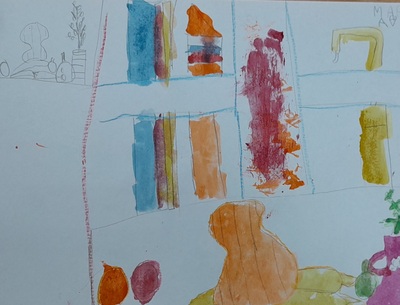
January is our month of colours, chosen this way to balance up the monochromatic landscape outside the window. At the moment, due to the combination of various factors, calendards and timetables, I get to teach every lesson first with my older group and then to repeat it and to re-do it with the younger kids. This, in itself, is a fascinating set-up for experiments and reflection. The activity with the objects in unusual colours was created for my little ones but it was such a success that I decided to do it again with my older group, too. It was a success and my older and more advanced children were even more involved and more capable of taking part in a discussion and expressing their views on pink teddy bears, brown unicorns and pink chocolate. This was the main language activity in this lesson. The older group were using a wider range of structures, including ‘I really like’, ‘I really don’t like’, ‘I love’ and ‘I hate’ and they could explain why they felt this way.
Because of that I am going to repeat it, once more, with a different set of images in this coming week.
This week, we invited not one but two artists to lead us through the world of colour and this decision was made specifically with the art project I planned for us for the day and that, in turn, was the result of these creators’ artistic decisions.
My main idea was to show the students how the same object can be painted with different colours and how the selection of the colours can affect our perception of the painting and our emotions. Or, in other words, why would an artist choose specific colours to paint.
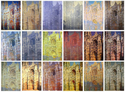
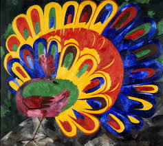
Our first artist of the day was Claude Monet and his cathedral, the other Natalia Goncharova and her peacock, or rather, two peacocks because Natalia Sergeevna created more than one and that was exactly what we needed. We looked at the two peacocks and answered a few questions: ‘What colours can you see?’, ‘Do you like this peacock? Why?’, ‘How does it make you feel?’, ‘Why did she choose such colours?’, ‘Which one do you like more?’. We compared the paintings with the photos of the cathedral and of the bird.
In general, the colourful peacock was a favourite although some of my students mentioned that there are too many colours and they are too loud. The black-and-brown peacock was noone’s favourite as very thin, very sad and a bit scary.
We needed these artists also because their colour decisions were rooted in two different sources – the sun itself and the artist’s conscious decision and it is the second approach that we were getting ready to use in our art.
https://arthive.com/ https://arthive.com/
The art
The task was very simple and it came as a natural follow-up of the activities in the first half of the lesson: choose a simple object and paint it twice, using a different set of colours to represent two different ideas or emotions.
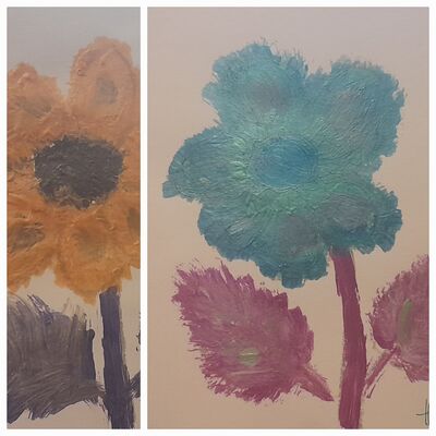
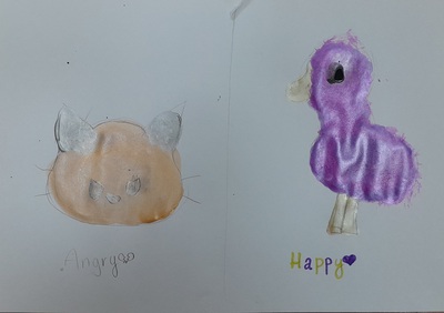
To demonstrate how it can be done, in an even more direct and straightforward way, I showed the students the pictures that I created – a flower that I decided to paint using my happy colours, such as pink, green and blue and to paint the same flower using the colours that make me angry (orange, purple and yellow). You can see it above. Below – everything that my students created last Wednesday.
Before we started, we also brought back our earlier project, namely Andy Warhol and Chebourashka that I wrote about here. The previous activity had a character in it and it was, perhaps, easier to associated it with a set of emotions whereas this time round I wanted everyone to be a little bit more open-minded and, at the same time, to focus on the emotions and colours, rather than on looking at the world through the character. However, I did not limit them in any choice and, as a result, some of them decided to choose two different items to paint or to even give up on the shapes and focus entirely on the colours.
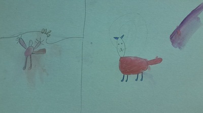
It is exciting to see that they paired up their beloved shapes and characters with the colours they love and, in the same vein, they made a decision to combine their less preferred colours with the characters they just don’t like. It seems your beloved goose could just not be painted in the colours you have a strong dislike for.
The kids made conscious decisions regarding the colours and while they were painting, we were discussing their choices and, in the end, the final outcome, too. And it was a real discussion, to a large extent in L2, in some cases also in L1.
This last piece here is special in many ways because we had a new student join our group and try his hand at creativity for the first time. He got the idea and the was happy to experiment with the colours and images and it turns out that his favourite combination is a cat in pink because this is his favourite colour and because ‘Boys like pink, too!’. He is one of the epitome of the cool kid and the would be alpha male in our class so I was surprised and in awe that he dived in and took to everything that we do in our classes. And, even more so, he enjoyed it.