The language
January is our month of colours, chosen this way to balance up the monochromatic landscape outside the window. At the moment, due to the combination of various factors, calendards and timetables, I get to teach every lesson first with my older group and then to repeat it and to re-do it with the younger kids. This, in itself, is a fascinating set-up for experiments and reflection. The activity with the objects in unusual colours was created for my little ones but it was such a success that I decided to do it again with my older group, too. It was a success and my older and more advanced children were even more involved and more capable of taking part in a discussion and expressing their views on pink teddy bears, brown unicorns and pink chocolate. This was the main language activity in this lesson. The older group were using a wider range of structures, including ‘I really like’, ‘I really don’t like’, ‘I love’ and ‘I hate’ and they could explain why they felt this way.
Because of that I am going to repeat it, once more, with a different set of images in this coming week.
The artist
This week, we invited not one but two artists to lead us through the world of colour and this decision was made specifically with the art project I planned for us for the day and that, in turn, was the result of these creators’ artistic decisions.
My main idea was to show the students how the same object can be painted with different colours and how the selection of the colours can affect our perception of the painting and our emotions. Or, in other words, why would an artist choose specific colours to paint.
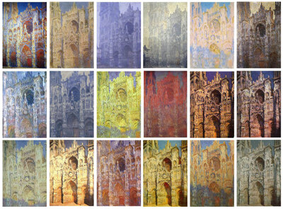
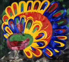
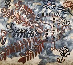
Our first artist of the day was Claude Monet and his cathedral, the other Natalia Goncharova and her peacock, or rather, two peacocks because Natalia Sergeevna created more than one and that was exactly what we needed. We looked at the two peacocks and answered a few questions: ‘What colours can you see?’, ‘Do you like this peacock? Why?’, ‘How does it make you feel?’, ‘Why did she choose such colours?’, ‘Which one do you like more?’. We compared the paintings with the photos of the cathedral and of the bird.
In general, the colourful peacock was a favourite although some of my students mentioned that there are too many colours and they are too loud. The black-and-brown peacock was noone’s favourite as very thin, very sad and a bit scary.
We needed these artists also because their colour decisions were rooted in two different sources – the sun itself and the artist’s conscious decision and it is the second approach that we were getting ready to use in our art.
The art
The task was very simple and it came as a natural follow-up of the activities in the first half of the lesson: choose a simple object and paint it twice, using a different set of colours to represent two different ideas or emotions.
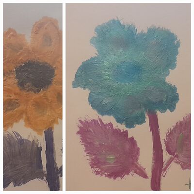
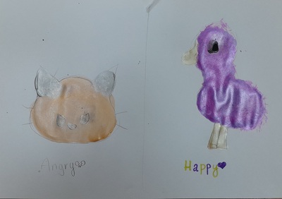
To demonstrate how it can be done, in an even more direct and straightforward way, I showed the students the pictures that I created – a flower that I decided to paint using my happy colours, such as pink, green and blue and to paint the same flower using the colours that make me angry (orange, purple and yellow). You can see it above. Below – everything that my students created last Wednesday.
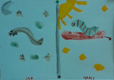
Before we started, we also brought back our earlier project, namely Andy Warhol and Chebourashka that I wrote about here. The previous activity had a character in it and it was, perhaps, easier to associated it with a set of emotions whereas this time round I wanted everyone to be a little bit more open-minded and, at the same time, to focus on the emotions and colours, rather than on looking at the world through the character. However, I did not limit them in any choice and, as a result, some of them decided to choose two different items to paint or to even give up on the shapes and focus entirely on the colours.
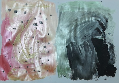
It is exciting to see that they paired up their beloved shapes and characters with the colours they love and, in the same vein, they made a decision to combine their less preferred colours with the characters they just don’t like. It seems your beloved goose could just not be painted in the colours you have a strong dislike for.
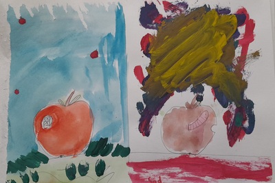
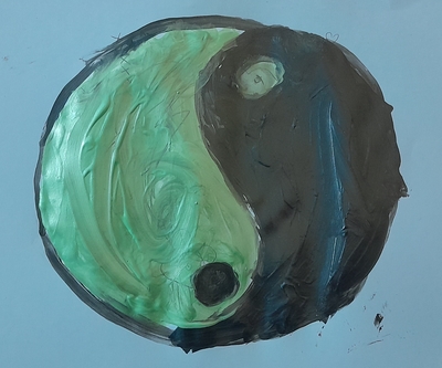
The kids made conscious decisions regarding the colours and while they were painting, we were discussing their choices and, in the end, the final outcome, too. And it was a real discussion, to a large extent in L2, in some cases also in L1.
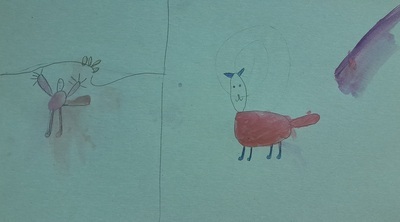
This last piece here is special in many ways because we had a new student join our group and try his hand at creativity for the first time. He got the idea and the was happy to experiment with the colours and images and it turns out that his favourite combination is a cat in pink because this is his favourite colour and because ‘Boys like pink, too!’. He is one of the epitome of the cool kid and the would be alpha male in our class so I was surprised and in awe that he dived in and took to everything that we do in our classes. And, even more so, he enjoyed it.
Happy teaching!
