The language
On the spur of the moment, at one point before Christmas, I decided that our January theme will be the jungle. As in: January Jungle! (Or ‘Jungle January!’, we are using both terms interchangeably.
This means only three lessons but it took me about one blink to decide what we are going to be doing and I am not saying it to brag but to share the surprise because, without knowing, I had these three lessons already in my head. They were just waiting for their cue, apparently.
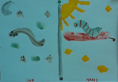
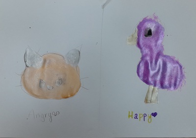
I decied that we are going to practise a lot of ‘I can’ with different verbs to describe sensory experiences and in the classroom that is actually very (very) far away from a real jungle, I hope we can at least manage ‘I can see’ (the easiest one of them), ‘I can hear’ (there are the sounds) and, perhaps, ‘I can smell’, with a fragrance or two, hopefully.
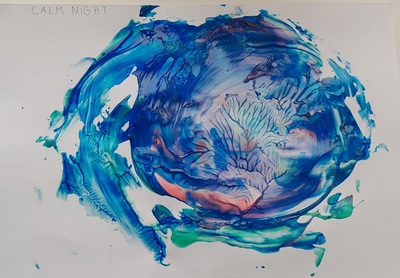
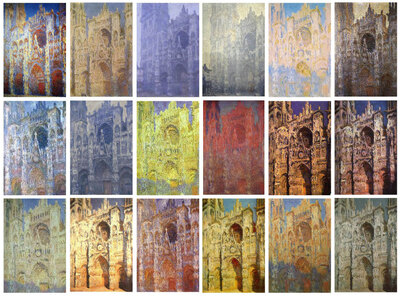
In the first lesson, we focused on the general vocabulary, related to the tropical forest. We learnt and revised the words and we practised guessing, using ‘I can see’. With the older kids, we also looked at some of the paintings by Henri Rousseau (a preface to the second lesson in the cycle) while describing the pictures and everything we could see in them (presentation from slide 11).
The artist
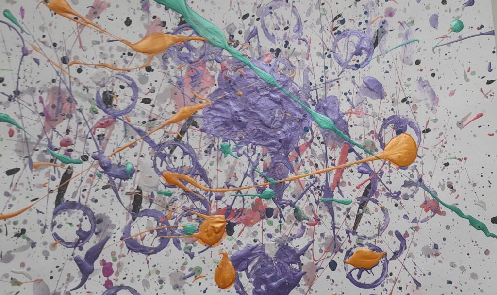
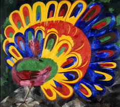
Our real artist of the day, however, was my beloved (no joke here), Erik Bulatov. I designed a lesson based on his works a few months ago, during the summer camp lessons. You can find it here, it is only of my proudest creations and I really do recommend it, especially that it lends itself to many different topics and age groups.
I knew that Erik Bulatov would be coming back and the jungle month seemed perfect for it.
We looked at only a few of his paintings (presentation, slides 5 and 6) and we talked about the main idea, that is using the words as visuals, or, as I have been putting it, ‘a word is a picture, a picture is a word’. Actually, it is for that reason that I chose those particular pieces by Bulatov, I needed some clear examples.
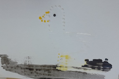
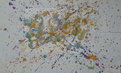
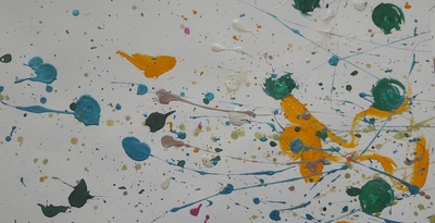
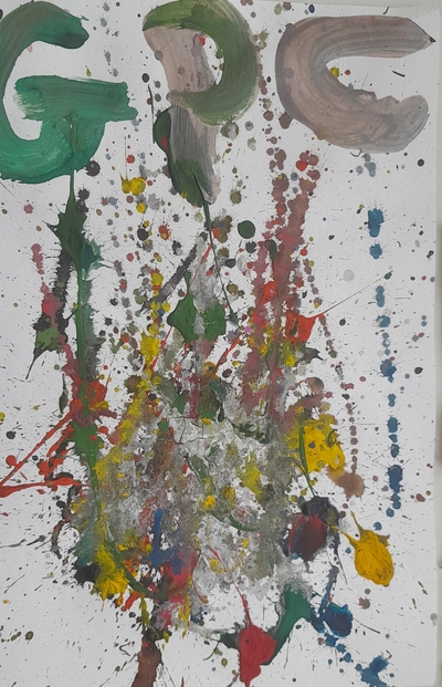
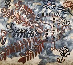
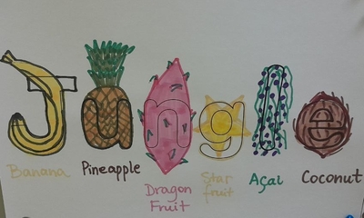
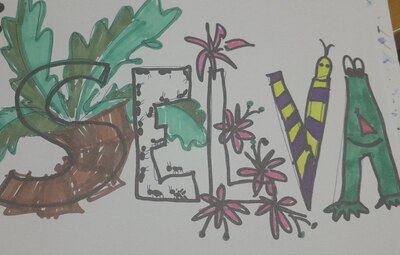
We also looked at two of my pictures that I created as models, ‘jungle’ in English and in Portuguese. I wanted the children to see that even though we don’t really know the word and ‘selva’ is unsimilar enough, we might be able to guess (or to decode) what it tells us. I also wanted them to see an example of how different letters can be shaped into the jungle animals and plants.
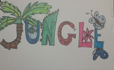
The art
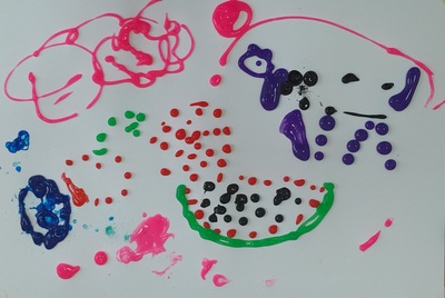
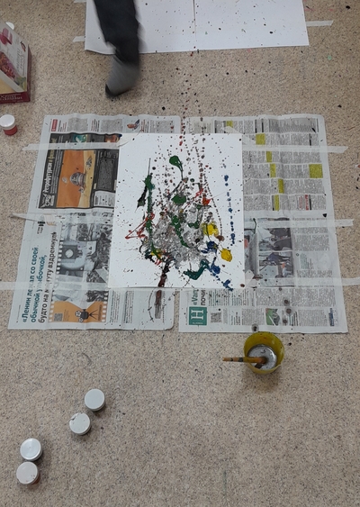
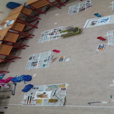
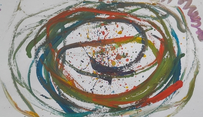
Afterwards, we just got to work. In terms of resources, that was an easy-peasy lesson because it required only pencils, markers and paper. I did prepare a template with the word ‘jungle’, to speed up the process a little bit. Since, however, I am dealing with a very creative and independent bunch, as it turned out, some specifically asked for the permission to opt out of the template. And, as was to be expected, some asked for the permission to opt out of the jungle altogether. Permissions were granted.
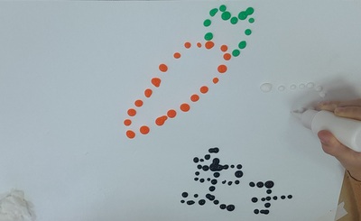
We also used a bit of brainstorming (‘What fruit do we have in the jungle?’) and the internet research. This is a serious word but research it was for sure. We googled the fruit and some specific animals and items because the kids wanted to see them first before deciding which letter they could be incorporated into. I really loved to see the thinking that went into making these decisions. It was a process and they were really involved.
‘Jungle’ has only six letters but, still, it was too many for some of the students and, since we only had 45 minutes, they did not manage to finish their pictures, which, I suppose, can be seen as some kind of a failure, bad time management on the part of the student or bad monitoring on the part of the teacher…I’d rather look at it as an opportunity to see how my students were engaged. Those who didn’t finish either promised to complete the picture the next day, during the break or they came up with a pleading ‘Miss Anka, can I please take the paper home and finish there?’ It was important, it mattered!
I have also learnt that a teacher should research the topic a bit further before the lesson, even if only to refresh and to remember that, for example, there are jungles out there which, apart from toucans and piranhas or other tropical fish, might be recognised due to their volcanoes…I was surprised when one of my students started his ‘J’ as a volcano but then he told me that, ‘You know, miss Anka, in Bali…’ I accepted and ate my humble pie. And took notes))
Happy teaching!