Teaching Out of the Box. Teaching English through Art

Natalia Goncharova-inspired peacock

This article was published in the Modern English Teacher in the March / April issue of 2023 and it is one of my favourite pieces ever committed which summarises my (almost) two years in the classroom as a teacher of English and Art. I have included there all the main considerations and as many as ten different ideas for the classroom. (Although it has taken me a whole year to add it to the blog (rolling the eyes).

I am very proud of it and if you are not a MET member and have no access to the article, I can only recommend all the other lesson ideas that I have shared here, on the blog. You can find them here.

Ilya Mashkov and our first still-life. Teaching English through Art

Still life ingredients

The language

February is our month of food and fruit and this is what we focus on in the language part of the lesson. With my younger group we listened to a great song from the Singing Walrus and we used cards to guess the fruit and vegetables from the stencils. We did some drilling, too and we talked about whether we like them or not.

The older students needed a more advanced activity and for that I used my magic bag which, indeed, on the day was full of fruit and veg that I brought for the still-life installation. Kids put their hands into the bag and tried to describe the object they were holding using basic adjectives (big / small, hard / soft, smooth / rough, light / heavy). Despite the fact that some of the kids were as old as ten, they all did enjoy it. We also talked about the fruit and vegetables we like and don’t like.

Ilya Mashkov, Pumpkin (1914)

The artist

Our artist of the day was my still-life here, Ilya Mashkov. I have used his painting in my Art classes before and it was only natural that this time I would want to take it up to another level. I did and I am quite happy how it went.

First of all, we introduced the artist himself and his famous (in my opinion) painting ‘Pumpkin’. We defined what a still life is (‘a painting of things’) and we looked at a few chosen paintings by Mashkov. I put together a set of questions, inspired and adapted from the material online Essential Questions to ask about each still life photographs. My final, go-to set for this topic includes: What colour is it? What objects can you see? What shapes can you see? What is the biggest shape? What is the smallest shape? Is it light? Is it dark? Is it smooth? Is it light?, although in the lessons this week we have gone through only a few of them.

In order to prepare for our creative activity I prepared a special slide for ‘Pumpkin’ made entirely of shapes, one to represent every fruit and every vegetable. I was revealing them one by one and the task for the kids was to call out the object that they represent. In the end, I showed them the real painting and we checked our answers. I was a fun activity and it helped them the kids the basics of the composition of the painting and to prepare them for drawing.

The art

We started with putting together our installations and while I was the one responsible for arranging the items for the younger kids, my older group just took over the bag, the table and all the elements. And, it has to be said, not all the fruit made it to the table. Avocado and aubergine were not deemed worthy of our set. I accepted.

We outline the main stages of the lesson: 1. sketching with a pencil, 2. tracing the lines with crayons (one colour or a set of colours) and 3. colouring in with watercolours. I also showed my students the homework that I did before the lesson: a small still-life I painted at home and a photo of it, for comparison.

Since it was our first lesson with a still-life I did not want to invade too much and to direct the kids for example by guiding them in which order to draw the fruit. I wanted to let them try to face the task on their own and, also, to see what they can do. I was preparing my own copy and moving around, handing in the resources for each step (which also help with staging) and admiring what I was looking at. The only thing that I said to encourage them was something along the lines of ‘Don’t be scared, trust your hand. This is our first still-life. Let’s see how it goes’.

And guess what? It was beyond amazing. Some of my students are already very confident as regards drawing and they have a good eye for detail so I expected some good work but still they managed to surprise me, especially the little ones. They approached the task with curiosity, without fear and they were just working diligently on their paintings.

The only question left to answer is: What are we painting next?

Apples and an average Art lesson that sent me directly cloud number 9.

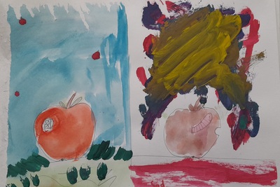
The apples? The apples!

‘What sometimes happens is that an artist, a real and creative person, gets what we call ‘a comission’: someone orders a special piece to be created and the artist agrees although, maybe, they did not really have that in mind. That is exactly what we are going to do today.’

This is how the lesson started. I delivered this little speech and my students were looking at me, puzzled. Apples (thanks to Isaac Newton) are some kind of a symbol of my school and I was asked to prepare some school decorations apple-related. To be perfectly honest, that had nothing to do with anything that I had in mind for February but since that was comissioned I decided to accept the challenge, to look for something and to change the idea for the month to food in art, moving ‘flowers’ to March. Which, actually, might not be such a bad idea altogether, for when we are a bit closer to the real spring. Fine.

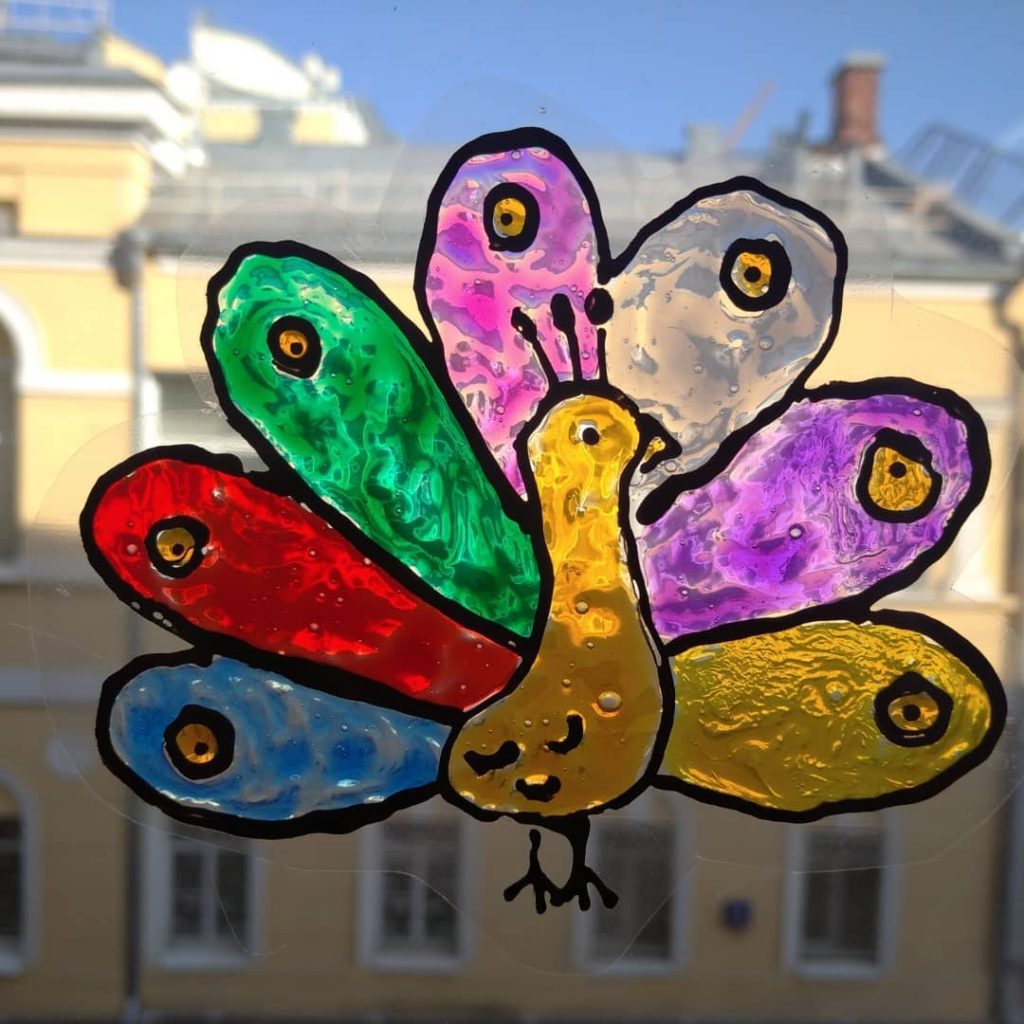
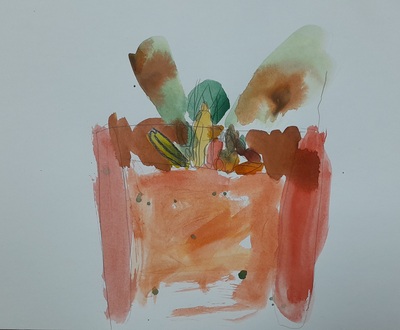
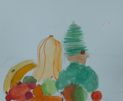
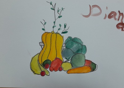
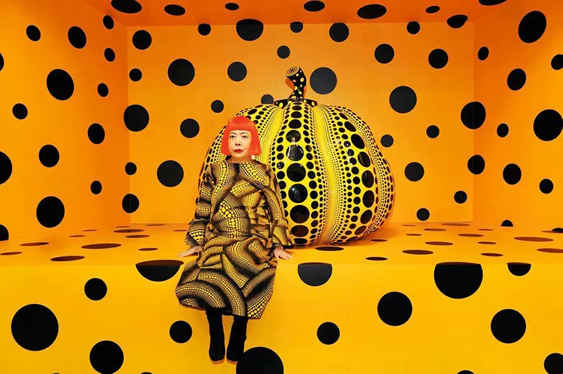
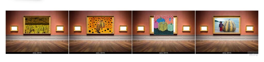
Much to my surprise, it turned out that apples are very much present in Art and it is possible to find enough pieces from different centuries, including such gems as Magritte, Cezanne or Raphael and more contemporary pieces from Kusama or the random literal apple carvings. Apple is a symbol and it is a brand, too and we had fun looking at them and talking about them, both with my younger and older group.

The craft

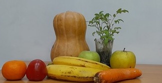
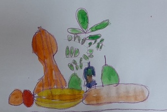
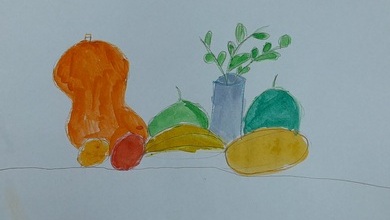
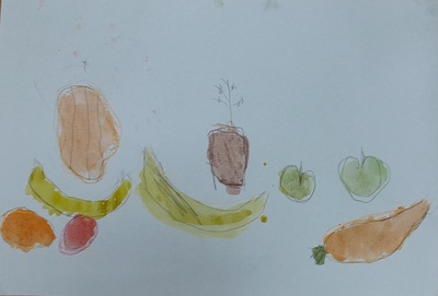
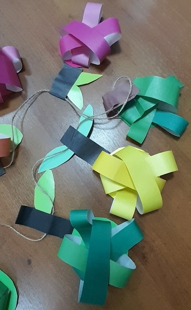
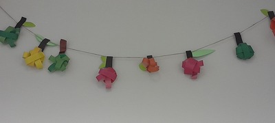
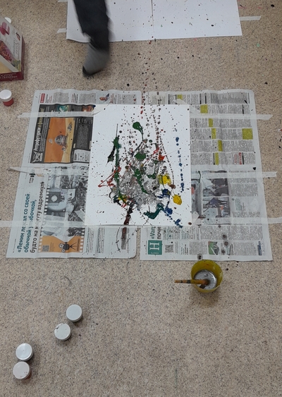
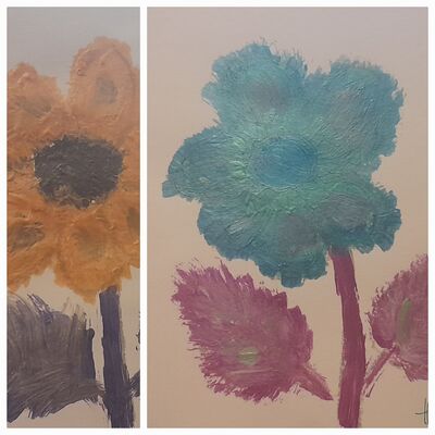
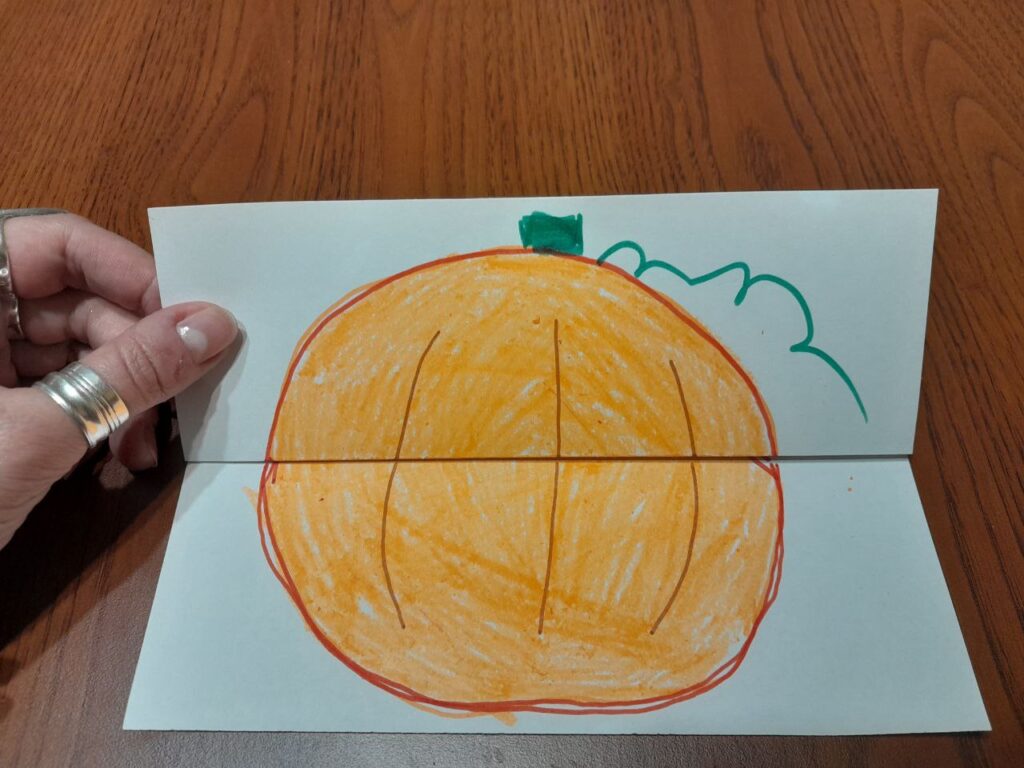
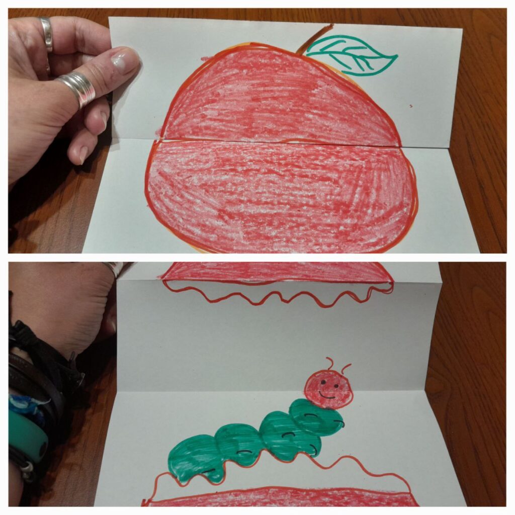
What was comissioned was some kind of a set of apples to put around the school, made of clay or paper mache or plasticine, but I have given myself a permission to interpret it my way, to create a 2D apple garland inspired by these two finds here and here. We used cardboard for the basis and coloured paper for the front and glue, scissors and crayons. The craft is easy and the base of the apple can be a square or a circle, even if it is not very expertly cut out by the students. The little strips can be glued in a few different ways and they are little hands-friendly, too. Kids can use the strips of one colour or they mix them and everyone can make as many as possible, maybe only one, maybe a few, giving us an even longer garland. And, unlike in the case of the Pollock’s lessons, there is a lot less preparation and cleaning. The teacher is relieved to be taking this kind of a time out.

The lesson went smoothly and now we have two garlands hanging over the arches in the main hall of the school, for everyone to admire. It is an easy task and if you need apples or oranges or any other fruit – here is an idea for you.

The lesson was ‘meh’ but I loved it

It was just an OK lesson. ‘Meh’, I’d say if you asked me if I liked it. I’d shrug my shoulders.

Yes, we prepared the garlands, more or less according to the creative brief, we now have something to put up on the wall and, really, it is a pretty garland, it looks good, especially with the multi-colour apples. My kids worked well, everyone made 4 or 5 apples, getting better as they went along and some students even chose to make one for themselves to take home (always a good sign!).

But we were not impressed. I was not and nor were my students. It really did feel like working on a commission that you just cannot say no to. Everyone was involved but the Muses did not enter the room last week. No one was inspired, no one got excited about their task, no one was calling ‘Miss Anka, miss Anka! Look! What do you think?’ from all corners of the classroom…’Meh’.

And yet I loved it. Even though my kids went ‘Meh’, both the younger ones and the older ones.

Why?

This lesson was a fantastic piece of evidence to prove how much we have developed and how much progress we have made since September. Whatever we were five months ago, we are not that anymore. We are artists now.

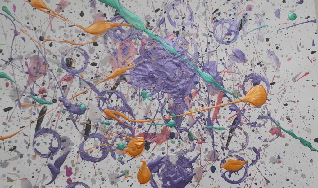
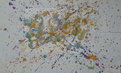
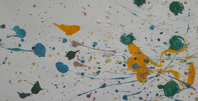
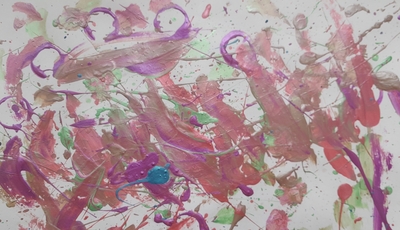
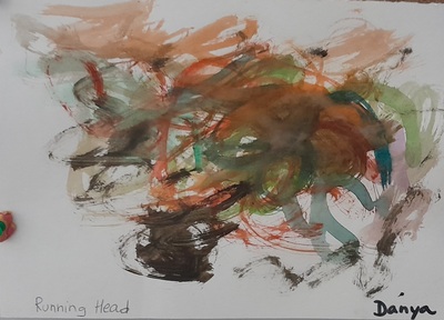
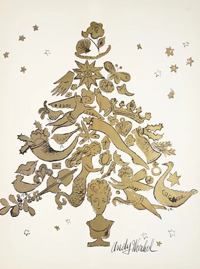
We have had a chance to work with a variety of techniques (spatter, print, ironed crayons, watercolours, stained glass paints, acrylic paints, guache, markers, crayons, collage, books and surprises) and we have imagined being in the Shoes of the Great (Warhol, Goncharova, Kandinsky, Picasso, Kusama, van Gogh, Malevich, Levitan and Pollock). Could a simple paper apple be of any challenge or interest to us? Debatable.

There was no challenge in the technique itself (because it was easy), there was no suprise of creation (because it is an apple) and there was no inspiration from the Artist of the Day (because there were too many and because we could not really interact with them).

My kids politely did what I asked them to do but there was no spark. They are already much older and more advanced. They need something else now. The teacher has had an OK lesson but the teacher is OVER THE MOON!

Jackson Pollock. How to survive a modern art lesson with kids. Teaching English through Art

The language

We continue to work on expressing our opinions and on justifying them. Since the Unusual Colours was a huge success with both groups, I decided to continue with a different set of visuals. We revised all the basic structures to express opinions, we looked at all the pictures in the set with the group and we said what we thought of them and why. As usual, it was great to see the growing confidence and the courage to express your preferences even if they are different from your friend’s or the group.

This time round I went more slowly, pausing after each picture, to share ideas. I was also trying to encourage the kids to produce a little bit more than just ‘I like it’ or ‘I don’t like it’, with questions such as ‘Why?’, ‘How does it make you feel about it?’, ‘What are you thinking about?’ etc.

The artist

Beginning October, my Art classes have been divided into two groups, the younger (pre-school and year 1) and the older (year 2 -4) and the decision to do so was a real game changer because I can adapt the level of the language and the Art input sessions to the age and the language level of the students. Each group has only one lesson a week but they are more meaningful, more focued and more child-friendly.

Because of the holidays and the calendar, the lesson with the older kids comes up first right now and it is also very important and handy. I can prepare for the more group with more advanced language skills, motor skills and with more life expience and do what I really want to do and then just adapt to what my younger kids are able to do. I really like it this way.

In our Jackson Pollock lesson, I introduced the artist of the day (name, country, favourite things) and the fact that he is, most likely, the most renowned modern artist today or, at least, the painter that most people associate with modern art.

Later on, we looked at five of his paintings, in different colours, with different titles, from ‘real’ names (‘Summer’) through ‘Number 5’, to the beautiful ‘Untitled’ and we talked about what we think about them and how they make us feel. In the end, we watched a clip from the video ‘How to paint like Jackson Pollock’ to show the students the real process. I also decided to include a short slot devoted to the main characteristics and I called it ‘What Jackson Pollock would tell us’.

The art

Well, this has to be the first thing to say out loud: Jackson Pollock is a serious logicstical challenge for an Art teacher. Especially if this Art teacher works with young kids and in a room that is a regular classroom which lends its square meters to all the creative activities and then goes back again to being ‘just a classroom’, used and shared with other students and teachers. To be prefectly honest, I am not sure I am entirely happy with how I dealt with it.

Things that need to be taken into consideration are as follows: the technique is a mess-generating one and it requires serious preparations. It is supposed to be done on the floor (which is refreshing and exciting) and the floor needs to be protected. So do the walls, the desks, the chairs and the kids’ clothes, because, surprise surprise, the paint spatter is a powerful force and you will find it in the most unexpected places.

The classroom was almost completely reorganised – the tables and the chairs were put aside, to make room on the floor. I perpared the working station for each of my students (an A3 piece of cardboard, on a much larger piece of newspaper, scotched to the floor) as well as the station with all the paints, brushes, water and tissues. Apart from that we had a semi-circle of chairs in front of the TV where we were to sit during the first, theoretical part of the lesson. We spent here around 20 minutes and later on, we moved to our work stations, to create.

The task was really simple – choose your favourite colours, think what idea you want to convey, take the water and the paints and start creating and experimenting with the technique. This part was great. The kids were trying out different hand movements, they were also observing each other and sharing ideas and opinions. The creativity was slow and a bit inhibited at the beginning but, as we moved on, the kids really got into it. Things were coming together. In the end, we talked about the possible titles for our paintings and how we felt during the entire process. This part was amazing. The paintings were left on shelves to dry overnight and some of my students came on the following day to pick up theirs and to take them home. They did enjoy and they did treasure their creations. Aims – met.

However, I have to admit – these preparations were not enough. The stations were too close to each other, the pieces protecting the floor were too small and, overall, the students’ clothes were not protected. We talked about being careful and respecting the other artists’ space, but I could have done better but mostly because I was lucky, with my older group of only seven students. I am to do the same lesson on Monday, with the younger group and I am working on adapting the ideas and the set-up or, also, entirely giving up on Jackson. I will also be adapting the number of resources used, giving up on the acrylic paints and the guache, because only the watercolours are relatively easy to wash and to clean.

The Pollock lesson – round two. Pre-K and year 1

There were a few things that I had to change for the lesson with the younger kids.

  • I took over a much bigger space on the floor, with the smaller pieces of cardboard (A4) on much bigger pieces of newspapers and with much bigger distance between them. I also marked the place on the floor where the kids were supposed to be sitting, to ensure that they are not facing each other but sitting back to back to minimise the paint spatter.
  • I also gave out the painting aprons that we apparently had at the school. However, I had my plan B – bin liners with holes for arms and head.
  • I was more selective as regards the types of paints, limiting them to watercolours only. Watercolours lend themselves to splashing and spattering, too if more water is added. Acrylic and guache paints are more thicker and more difficult to wash. What is more, a box of watercolours is a box of watercolours, with each child working on their own, at their station, without the need to get up, walk around and exchange jars with friends. Hence – fewer opportunities for stepping into splashes and dirty footprints around the room.
  • I am happy to say that it all worked very well!
  • Apart from that, I have to say that, somehow, my little students were somehow more open-minded and ready to dive into the modern art world. They were eager to discuss what they could see in the paintings I showed them and I really could not calm them down here. They wanted to talk and talk, although, because of their level of language, they could do it in English and in L1. They were also very eager to come up with titles for their own creations. These were really artistic discussions. I was really proud of them and some of these paintings are just precious!

Natalia Goncharova’s lesson about colours. Teaching English through Art

https://arthive.com/

The language

January is our month of colours, chosen this way to balance up the monochromatic landscape outside the window. At the moment, due to the combination of various factors, calendards and timetables, I get to teach every lesson first with my older group and then to repeat it and to re-do it with the younger kids. This, in itself, is a fascinating set-up for experiments and reflection. The activity with the objects in unusual colours was created for my little ones but it was such a success that I decided to do it again with my older group, too. It was a success and my older and more advanced children were even more involved and more capable of taking part in a discussion and expressing their views on pink teddy bears, brown unicorns and pink chocolate. This was the main language activity in this lesson. The older group were using a wider range of structures, including ‘I really like’, ‘I really don’t like’, ‘I love’ and ‘I hate’ and they could explain why they felt this way.

Because of that I am going to repeat it, once more, with a different set of images in this coming week.

The artist

This week, we invited not one but two artists to lead us through the world of colour and this decision was made specifically with the art project I planned for us for the day and that, in turn, was the result of these creators’ artistic decisions.

My main idea was to show the students how the same object can be painted with different colours and how the selection of the colours can affect our perception of the painting and our emotions. Or, in other words, why would an artist choose specific colours to paint.

Our first artist of the day was Claude Monet and his cathedral, the other Natalia Goncharova and her peacock, or rather, two peacocks because Natalia Sergeevna created more than one and that was exactly what we needed. We looked at the two peacocks and answered a few questions: ‘What colours can you see?’, ‘Do you like this peacock? Why?’, ‘How does it make you feel?’, ‘Why did she choose such colours?’, ‘Which one do you like more?’. We compared the paintings with the photos of the cathedral and of the bird.

In general, the colourful peacock was a favourite although some of my students mentioned that there are too many colours and they are too loud. The black-and-brown peacock was noone’s favourite as very thin, very sad and a bit scary.

We needed these artists also because their colour decisions were rooted in two different sources – the sun itself and the artist’s conscious decision and it is the second approach that we were getting ready to use in our art.

The art

The task was very simple and it came as a natural follow-up of the activities in the first half of the lesson: choose a simple object and paint it twice, using a different set of colours to represent two different ideas or emotions.

To demonstrate how it can be done, in an even more direct and straightforward way, I showed the students the pictures that I created – a flower that I decided to paint using my happy colours, such as pink, green and blue and to paint the same flower using the colours that make me angry (orange, purple and yellow). You can see it above. Below – everything that my students created last Wednesday.

Before we started, we also brought back our earlier project, namely Andy Warhol and Chebourashka that I wrote about here. The previous activity had a character in it and it was, perhaps, easier to associated it with a set of emotions whereas this time round I wanted everyone to be a little bit more open-minded and, at the same time, to focus on the emotions and colours, rather than on looking at the world through the character. However, I did not limit them in any choice and, as a result, some of them decided to choose two different items to paint or to even give up on the shapes and focus entirely on the colours.

It is exciting to see that they paired up their beloved shapes and characters with the colours they love and, in the same vein, they made a decision to combine their less preferred colours with the characters they just don’t like. It seems your beloved goose could just not be painted in the colours you have a strong dislike for.

The kids made conscious decisions regarding the colours and while they were painting, we were discussing their choices and, in the end, the final outcome, too. And it was a real discussion, to a large extent in L2, in some cases also in L1.

This last piece here is special in many ways because we had a new student join our group and try his hand at creativity for the first time. He got the idea and the was happy to experiment with the colours and images and it turns out that his favourite combination is a cat in pink because this is his favourite colour and because ‘Boys like pink, too!’. He is one of the epitome of the cool kid and the would be alpha male in our class so I was surprised and in awe that he dived in and took to everything that we do in our classes. And, even more so, he enjoyed it.

Vasilyi Kandinsky, colours and sounds. Teaching English through Art

This time, the whole lesson planning process started with my decision to spend the whole month of January doing fun things with the colour and it was an absolute necessity to start with Vasilyi Kandinsky. This particular lesson did not follow the traditional routine and the painting that is usually the centre piece of the lesson, this time made only a cameo appearance that illustrated what our artist liked to create.

The language

We started in a very relaxed way and in the first lesson we talked about our favourite colours. We also learned some more advanced colours names.

I wanted to get the kids to associate colours with emotions, feelings and music, just like Kandinsky did, and that is why our next stage involved watching a video with the unusual instruments and deciding how we would present each instrument and its sound with a colour. After each short clip, we paused the video and shared our views. Only then did I introduce the artist of the day.

With the youngest group we focused on the basic colours which we revised using two of my favourite songs: What’s your favourite colour? – with looking for colours around us and with My yellow car – with pausing and guessing what product is going to be bought.

Afterwards, to get the kids ready for the alternative approach to colours we looked at the set of cards which I prepared, the everyday objects in unusual colours. I asked the kids to look and to say what they think of the idea, using a simple ‘I like it / I don’t like it’. It was a lot of fun!

Kandinsky, Composition VIII

The artist

The reason for that was the fact that Vasilyi Kandinsky spent a large part of his creative life not only using colours but also trying to understand them (‘Effect of Colour’). After we shared our ideas about different pieces of music, we watched a clip of the video ‘What’s the Sound of Colour‘ to check whether we agree with his interpretation. Sometimes we did and sometimes we didn’t.

As a follow-up to that we looked at Kandinsky most famous creation, Composition VIII, but only to have something to represent him with. We did not analyse the painting apart from the title because the name went nicely with the idea of colours and music.

Our lesson with the little kids was so packed with activities that I had to skip the artist stage, in order to make sure that we had enough time for our creativity. Nonetheless, it all worked very well!

The art

I did not want to create anything in the style of Kandinsky not to steer away from the colour itself. For that reason I chose spread painting – it has the colour at its centre, it is not very challenging and it can be done with a variety of different paints.

Before the lesson, I prepared the paints (acrylic and gouache), the pieces of thick cardboard (photocopying paper box cut up into bits) and the paper. I used the thicker paper sheets used for watercolours to ensure that the paper holds up the amount of paint and water and I decided to go for the A3 size, to give the children more flexibility with the spreading movement and the feel of being real artists who work on bigger sheets.

In this kind of a lesson, it was absolutely necessary to demonstrate the technique and in order to do that, I put my paper on the floor, made a decision about the colours that I wanted to use, put a few blobs of different colours and then showed the students some basic movements to spread the paint on the paper (straight, wavy, circular, semi-circular). Apart from that, I also had a few pictures of my own, prepared before the lesson, with different movements, sets of colours and, in some cases, the additional drawings with a marker. These already had titles, too.

Afterwards, we just went on to create. The most important decision to make was the colour selection and we discussed that while I was walking around the room and monitoring. It was great to see how these decisions were made and how the kids were becoming more confident with the movement and the technique. In the gallery below you can what they produced and how their favourite things are reflected in their creations i.e. ‘the rabbit’ created by a fan of rabbits and Malevich or ‘the goose’ that features in many of our lessons because a goose is my student’s spirit animal. I am also extremely proud of the blue – mustard – silver creation which is the title photo because it was a first for one of my students who so far had been only sitting and participating in our debates. He finally felt curious and ready to get his hands dirty and with what result! I just love the combination of colours here.

Initially, I wanted everyone to name their paintings but then I gave up that. After all, this was our first approach at the abstract art and I just wanted them to enjoy the process without pushing them too much. Our paintings are now on display and we can always get back to them and give them their titles later on, when we are more comfortable with the non-figurative art.

It was a great lesson! Next week I am going to get to repeat it with my younger kids and then, there is the rest of January to celebrate colour!

Here are some of the pictures that my little students created! It was one joy of a lesson, with my students discovering the world of the modern art and the brand new technique, experimenting with it and being proud of their creations. Amazingly enough, they really took to looking for ideas in their paintings and trying to name them. This was just precious.

Crumbs #74 Christmas a la Andy Warhol

Ingredients

  • A3 paper, glue and scissors and a stack of newspapers and journals (gardening, furniture, fashion, kids, music, animals)
  • music, for atmoshpere
Andy Warhol’s Christmas Tree

Procedures

  • This lesson in this format was done with my older primary students whose language is on the level of A2 – B1.
  • We started with bringing up Andy Warhol whom we got to know in September (more about this lesson here). As always, it was a pleasure to find out that our Andy Warhol Chebourashka was a very memorable lesson. My students did rememember! We talked about Andy again and especially about his love for Christmas (I do recommend reading about it here).
  • We looked at the Christmas tree he designed and at the technique (collage).
  • Afterwards, I showed all the materials and I started to make my own collage to demonstrate the technique.
  • We looked at the journals and newspapers, leafing through to find the theme. I suggested a few (a colour, an object, a topic) and just allowed the kids to think about it.
  • All this time I was making my own: I drew a big triangle and started glueing the pieces to match my theme (Nature).
  • Kids were working, cutting out their pieces and composing their collages. They were also looking for pieces for their friends. All this time we were having an open class dicussion about different artistic decisions and the bits and pieces that match or do not match the individual collages.
  • In the end, we briefly demonstrated all the trees, together with the title.
  • In order to create a more festive atmosphere, I put on some non-invasive instrumental music, Christmas-themed.
Nature (by the teacher)

Why we like it

  • The collage was a success. The students got really involved perhaps because the activity gave them an opportunity to be creative without requiring any real artistic skills, drawing, sketching or painting which sometimes can be a challenge.
  • It took a while for the students to choose the theme but it is perfectly natural because they needed time to leaf through, to see what is available and to make up their mind and to select something. But I was really happy because it was clear and obvious that they really did make a decision and focused on the colour, one specific item or a general idea to represent. What’s more, I could see that the kids themselves were happy and proud of their choices especially when their pieces were completed.
  • The task became a collaborative one although only by accident. Once it became obvious what everyone was working on, we all started to suggest and to offer pieces that we found in the journals that we were looking for. ‘I’ve got a yellow sofa here. Do you want it?’, ‘There is a princess here. Does anyone need it?’ and so on. It started with the teacher but the kids picked up on it. It is definitely something that I will be introducing purposefully the next time we do a collage.
  • We used the A3 paper but the A4 sheets are also an option and the trees will be easier to fill in as the smaller the paper, the fewer the elements.
  • We started with drawing the triangle on the A3 paper and went on to fill it in with the items. Two of my students did not have enough time (and the chosen elements) to complete the tree in one lesson. We are going to finish next week, we have this opportunity. However, that made me think that it might be a good idea to choose a topic, cut out all the elements and them compile them into a tree, making a conscious decision regarding the size of the tree and opting for a smaller version if time or resources are limited.
  • I presented the idea of a combined technique: a collage and drawing, to fill up the space with own drawings, if needs be, but, in the end, not one of my students decided to use this option this time.
  • The decision to put the background music on was a good one, too. It helped to create the atmosphere and, after a while, kids asked for the permission to put on their favourite songs which was granted and we ended up working and singing together.
  • As regards the language production, a lot was going on because we were chatting throughout the lesson but I have to be honest about one thing – my older group are already a high level, some of them very close to fully communicative in English and even bilingual. That is why I didn’t need to do much to encourage production in the way an EFL teacher would. They wanted to talk and we did, in English. However, there are other options for the lower level and the EFL/ ESL students. I am still to try these in class but off the top of my head, I would go for:presenting the collage with the title, calling out the names of all the elements of the tree (or as many as possible), choosing the character who might like this kind of a tree. I am quite likely to teach the same lesson on Monday next week and, if I do, I will be updating the post soon.
  • We did it in our Art classes but it might be a fun activity for a regular VYL or YL class, perhaps even with teenagers.

Here are some of the Christmas trees my students created:

Teaching English Through Art: Malevich

The language

Malevich was the hero of the first October lesson but somehow, it landed in the wrong order on the blog. This whole month we are learning about shapes and you can read about some of the ideas for these here. Thanks to Super Simple Songs we have two cool songs about shapes, this one and this one, and they can easily be turned into a game as we go on singing and looking for shapes around the classroom, on the walls, in the alphabet and on our clothes. I don’t.

Some animals admiring the black square

The artist

There could be only one painter to be invited to this particular lesson, of course, Kasimir Malevich and the Black Square. We started with introducing him and we looked a few of his paintings. I rarely include a lot o detail from the artist’s biography but here it might be quite interesting to see how his creativity went from ‘just realistic paintings’, through many intermediary stages, casting off realism and colours, to the Square.

Because at the time, we also had the mixed age groups and levels group, we could discuss symbol in general and what symbols exist in our everyday life for example the symbols that are logos of different brands or the symbols that we have in the streets or in the public transportation. This is how we arrived at the square that could be a symbol, too. We also looked at some of the parodies of Malevich.

Black on black by one of my students

The art

  • The preparations for this lesson were quite limited: markers, glue and scissors and a lot of coloured paper. I had white and coloured paper for the background and some bigger and smaller black squares for the main protagonist.
  • I showed the students my example and the kids were asked to pick a square and the colour of the background. Then, they went on to glue, to cut and to create.
  • I was monitoring and discussing the choices. I also helped them translate the titles for their creations.
  • As can be seen, not everyone was very concerned about the perfection of their squares. It is my fault because I gave them relatively big squares and rectangles for them to make their own decisions regarding size. Some of the kids decided to glue them as they were. It is ok. i don’t think Malevich would have minded.
  • I loved the creative process and I was so proud of them for having created all these lovely pieces. The Camera by Nikita is just briliant and it was actually a 2D creation. The Labirynths by Kostia are out of this world and, although I don’t understand them, there is some link to some computer game. Apparently. One of my students, Sasha, kept walking around the room and trying out the square against different background and, surprise, surprise, she ended up choosing the black one, taking Malevich one step further. With the older students we also had a great discussion in which we shared why we like the square so much. ‘It is like the silence in a picture’, was one of the lines in that conversation.
  • I can’t wait to teach this lesson again)

Happy teaching!

Teaching English Through Art. Jeff Koons and his rabbit

The language

  • The activities mentioned here were a part of the final lesson of the month and in the unit on animals. We practised the names of animals and we tried to make very simple riddles about animals (‘It is big. It is green. It can swim’). In this particular lesson, for the first time ever, I invited the children to make their own riddles and, with the help of the teacher, they managed.
  • I also introduced the forest version of ‘Walking in the jungle’, which very conveniently, includes a rabbit.
  • We used the finished product for practising the target langauge (Rabbit, can you jump? Yes, I can). We created a few questions (and I say ‘we’ because I only needed to start and the kids took over), answered them and then followed that with singing the song that we learnt in this unit (Little bird, can you clap, from Super Simple Songs) which turned into our own conversation and / or a version of a song (‘Anka, Anka, can you dance?’) which is now one of our favourite parts of the lesson. Kids took a lot of pleasure in answering the questions about themselves.

The artist

  • Jeff Koons was chosen to be the artist of the day only because he was what came up as a result of the google search along the lines of ‘modern artists who drew animals’. His most famous animal is, of course, the balloon dog but I really could not think of a way of turning it into a fun craft activity in the online environment, without asking parents to purchase some unique resources. Plus, we made a puppy craft only a few weeks earlier and I wanted something else. Luckily, Jeff Koons created more than just one dog and a balloon rabbit was one of his creations.
  • We introduced the artist (name, country, favourite things) and we looked at his animals and tried to guess what they are.

The art

  • We started with checking all the materials: an A4 piece of paper (either the drawing album paper or just regular photocopying paper), scissors, glue and marker. I also sent the photo of the finished product to the parents so that they could help, if necessary.
  • As usual, I was modelling every step, then waiting for the kids to complete the action before moving on to the following stage.
  • First we drew two lines along the long side of the piece of paper and we cut along them.
  • Then I put the two strips together into a letter L (although in class I used the references from Russian and we made a capital letter G) and glued the ends together. Then came the time for the most challenging step, making the harmonica (or the spring (the reference that came from the student who had a slinky and called it a spring). I used the phrase ‘on the top, on the top’ while demonstrating how I was folding the paper. We glued the ends, too.
  • On the remaning piece of paper we drew a circle and drew the face of the rabbit on it. Afterwards we drew ‘two letters A’ for the ears and cut them out. We glued them together and then we glued them on the top of the spring.
  • Next, we drew ‘4 zeros’ for the paws and we also cut them out and glued them on the pieces of spring, two at the base and two somewhere in the middle. The glue here can be applied on the top or at the bottom of the piece and glued on, it does not really matter.
  • The rabbit was adapted from the original version from DIYArtPins to make it feasible in an online class but, still, it is the most complex and the most challenging craft that we have done in our online class. I had experiemented with it before the lesson, making my own copy, checking whether the quality of paper will or will not have an impact on the final product, visualising the stages and instructions. I was ready but I still got cold feel once we started to make it. However, my amazing kids who have been creative for two years and who have been creative online for one year managed. The youngest artist was supported by her mum and she managed, too. I would not recommend this activity for beginner online artists of beginner offline artists, either.
  • Without doubt, the rabbit is just cool. It is a real toy, made of paper and when you press it, it springs back or, we could and we did say, ‘the rabbit can jump’.

Happy teaching!

Yayoi Kusama and Pumpkins. Art and English in Primary

Yes, the Halloween was approaching and my English+Art lesson was on the day. Yes, I was just googling random things hoping that if I find something interesting, I will have a Halloween-ish lesson and if I don’t find anything, well, we will go in a different direction. At this point we have done colours, we have done leaves and, ideally, I was hoping to find some cool artist, some pumpkins and some technique that we have not tried before yet. Last year, around that time, we went to Ilya Mashkov as we tried to recreate his still-life with the magnificent cucurbita pepo but it was last year (aka we have done it already) and it was offline (aka it was more manageable)…I needed something different.

Surprisingly, googling ‘pumpkin in art’ can get you when you want to be)

The artist of the day.

Enter Yayoi Kusama. Until last Monday, I had never heard of her. Since last Monday, I have been a great fan. Her art is exploding with colour and with energy and she makes me feel like being a part of the Wonderland, Alice in the real world, easily available, at hand. And she loves dots and dots are circles aka the best shape ever that can be easily used in class (here is an earlier post about that).

We met Yayoi and found out about her favourite things and we looked at some of her paintings in our gallery as is now our habit. We also talked about the paintings we like and don’t like.

Yayoi Kusama and her favourite things
Our gallery in Miro

The language

In this particular lesson I wanted to focus on practising expressing opinion using ‘I like’ and ‘I don’t like’ and that is exactly what we did. We looked at Yayoi Kusama’s pumpkins and said what we think of them (P.S. We like them!), we looked at a range of creative pumpkin (google) said what we think of them and we enjoyed the variety in which pumpkins can appear (photos, art, real pumpkins (yes, these were present) and, finally, the Surprise Pumpkin that I have brought. See below)

The craft

The final product here was a compilation or an adaptation of two ideas from the amazing Art for Kids Hub and their pumpkin folding surprise and the most amazing mouse.

  • We looked at all the pumpkins, Kusama’s, the realia, the creative pumpkins
  • I presented the ready made product making sure that the Surprise Pumpkin is a proper surprise (‘Look, this is a pumpkin. But it is also a surprise. Are you ready? 3…2…1….’)
  • We went over the necessary materials with everyone (‘Have you got the paper? Have you got the pencils/markers/crayons?’)
  • I was making one more copy together with the kids. I am drawing on the regular paper, holding it in my hands, on a thick pad. Going step by step, slowly, pausing and waiting for the kids to complete every single step. This is absolutely crucial.
  • We folded the paper, stopping after every stage, showing the page to the camera. There are four essential stages: 1) show the A4 paper 2) fold the paper in half, widthwise 3) press at the crease / fold 4) fold the top flap outwards (show the kids how the edge of the paper touches the crease / fold in the middle 5) press at the crease / fold
  • Draw the pumpkin on the folded paper, that is at the 1/4 flap folded outwards and the 1/2 half at the bottom simultaneously, draw the stem and the leaf as well as three lines for the ribs. Don’t forget to pause at every stop, wait for the kids to complete every step and show you the result.
  • Open the paper and place it flat on the table. Draw the edge of the top half (‘Let’s draw a zigzac’)
  • Draw the edge of the bottom half (‘Let’s draw a zigzac here, too’)
  • Draw the mouse step by step: the oval for the body, two lines for the nose, the ears, the eyes, the whiskers, the tail and the hands.
  • Leave the colouring for after the lesson.
  • Play a bit with the surprise pumpkins that everyone prepared. My students simply recreated the ‘presentation’ that I gave at the beginning of the lesson, of their own accord, just like that.

Some final notes

  • Most of my students deal very well with the folding bit. Only one of us struggled a little bit and we needed mum’s help at the very beginning. It might be a good idea to let the parents know ahead of time and ask them to be at the ready, just in case.
  • As regards the materials, absolutely anything goes: coloured pencils are great, crayons are great, markers work, too. I am at my personal happiest drawing with markers and colouring with crayons or with crayons and markers, for the extra shine and glow.
  • Kids are amazing and they really can recreate the drawings or, rather, they can create their own versions of it. The only thing that is really necessary is the proper staging, going step by step, modelling and pausing, to give everyone time to complete the drawing.
  • It does not matter how big or how small the mouse is. It will all be hidden in the folds of the paper.
  • There are many variations of the craft. You can find some of them online. Below you can see what we have created ad hoc, just because we did everything that we needed and I could extend the lesson a bit. The pumpkin with a cat and the apple with a caterpillar were the result. These are only a few of the options!

Happy teaching!