The Erik Bulatov jungle-themed lesson is here. The Henri Rousseau – here.
The language
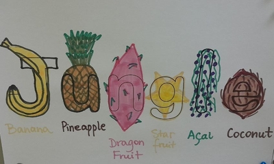
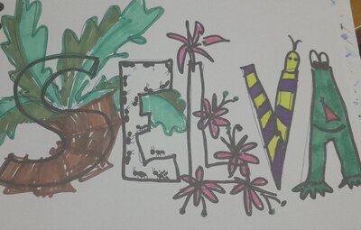
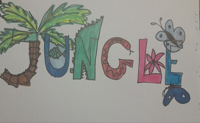
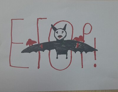
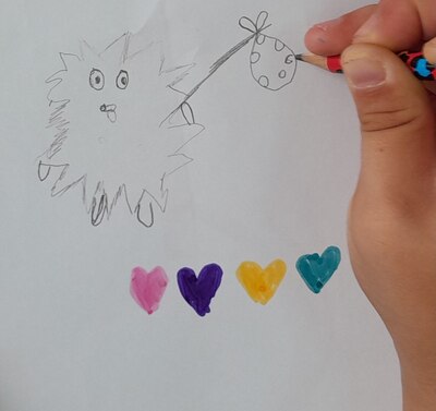
We continued with our January theme and the jungle, and we continued to focus on the animal vocabulary and the phrases with ‘I can’. We revised the animals and we played the animal riddles based on a video, guessing the animals by the sound (I can hear).
The artist
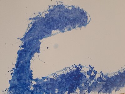
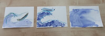
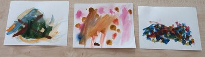
Our Artist of the Day this time came from Australia. We looked at his paintings and I told the kids a story of his travels to Europe and how him being far away from his own country made him realise that this is where the real beauty is. This was ‘the favourite thing’ for John Olsen – Australia. We looked at a few of his paintings to see the unique style; we compared the paintings and the same objects in photographs. This year, this was our first meeting with abstract paintings.
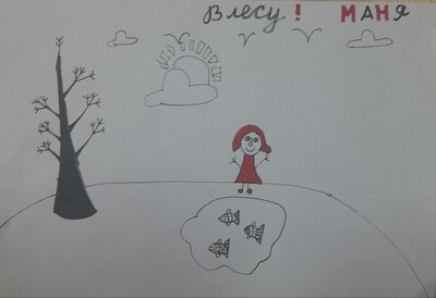
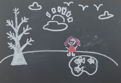
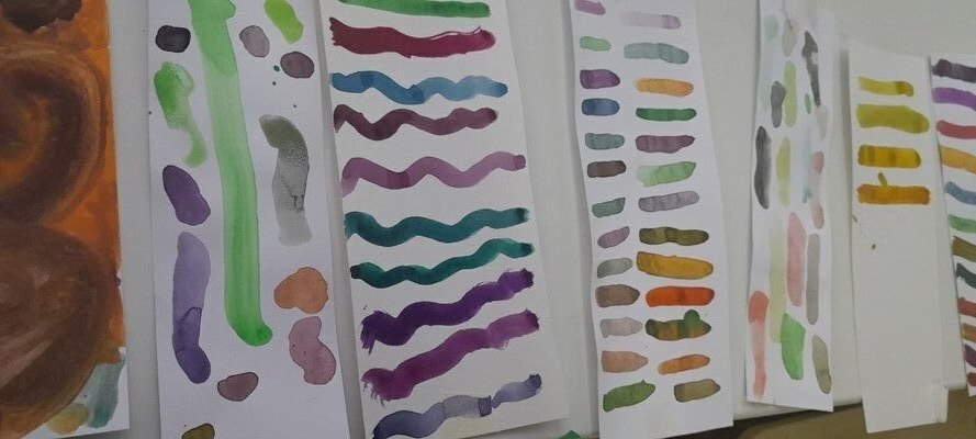
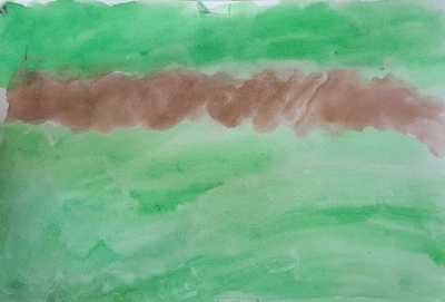
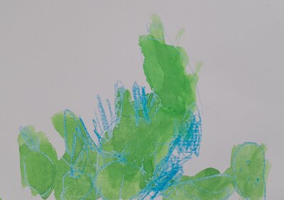
We also looked at different pictures of the jungle, to see what it looks like from the perspective of a bird (or as John Olsen would see it, if he painted jungle) and to see what colour palette we need (green!).
The art
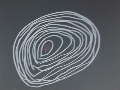
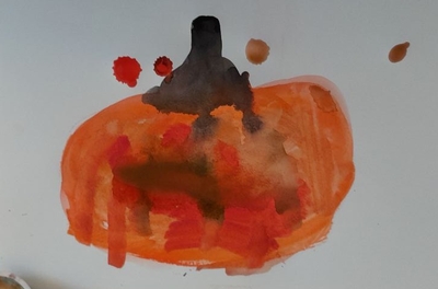
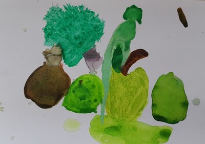
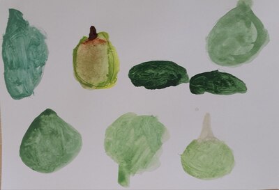
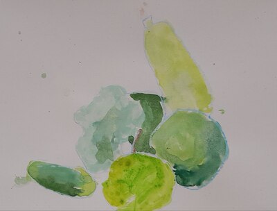
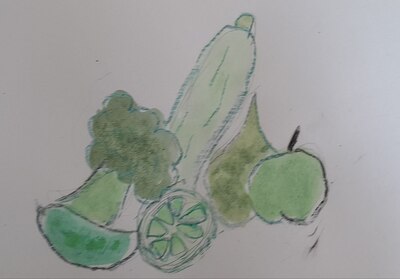
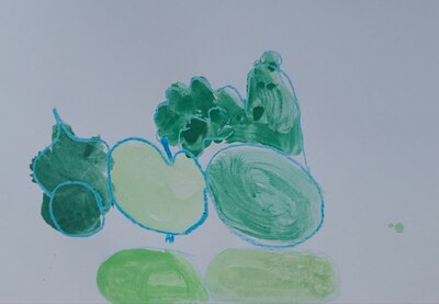
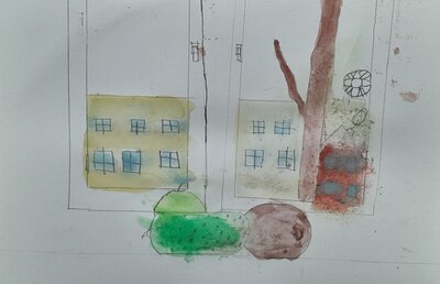
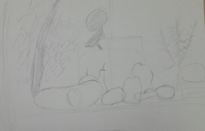
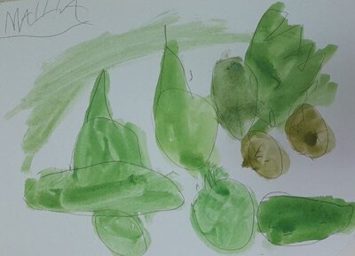
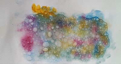
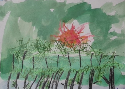
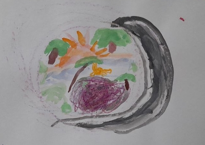
I have prepared my own version of the jungle picture, a la John Olsen, but I quickly realised that my kids were not quite interested in the abstract, non-figurative painting. For that reason, my painting was used only as a curiosity but everyone were allowed to paint the jungle in any way they wanted.
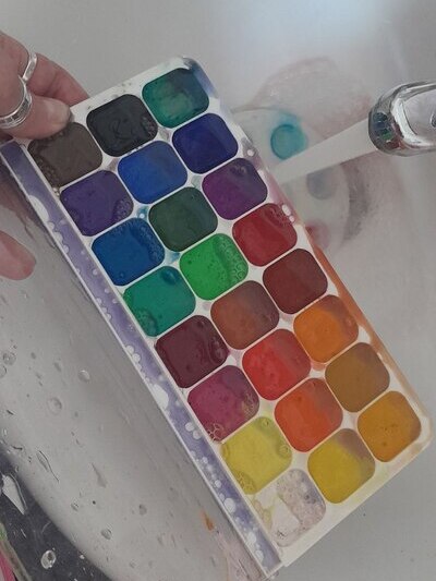
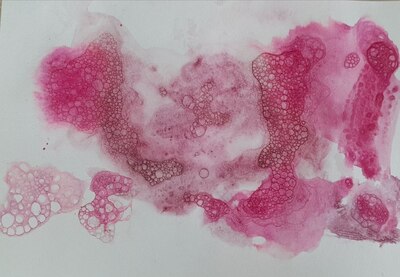
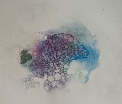
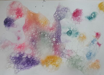
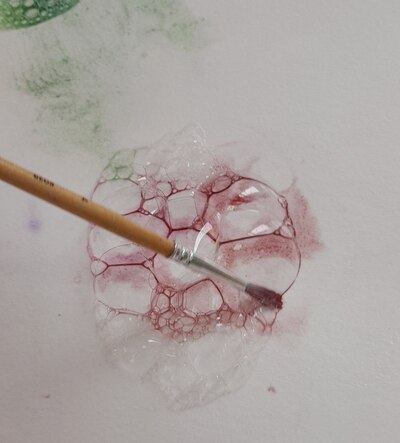
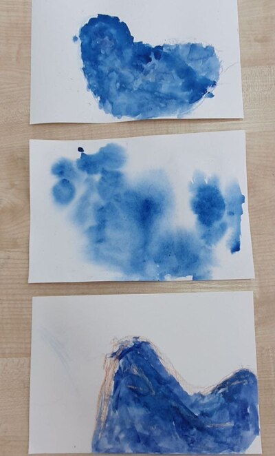
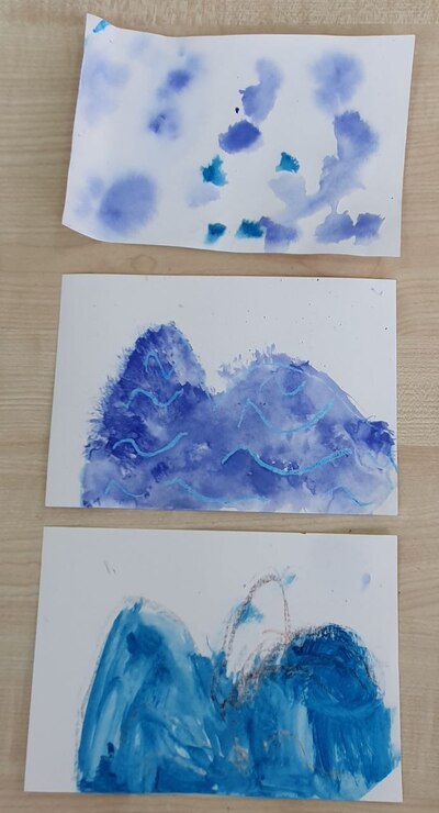
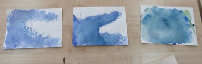
I demonstrated the technique that I have chosen for this lesson (crayons and watercolours, wet on wet or dry on wet) and we started to work. And, as usual, it was a joy to see them choose ideas, make decisions and work.
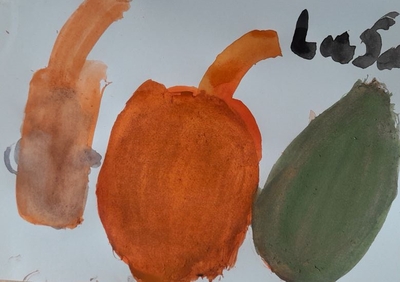
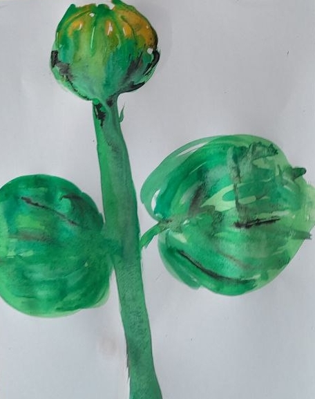
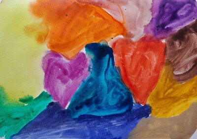
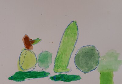
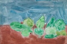
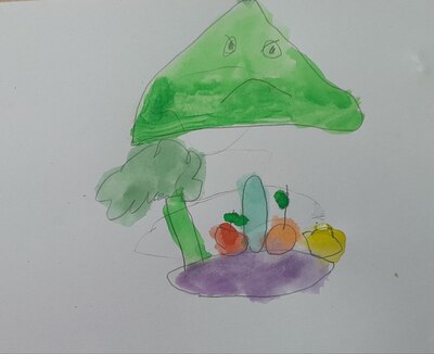
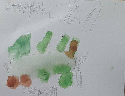
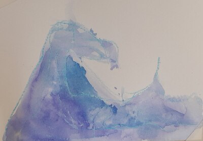
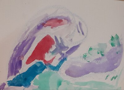
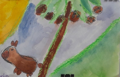
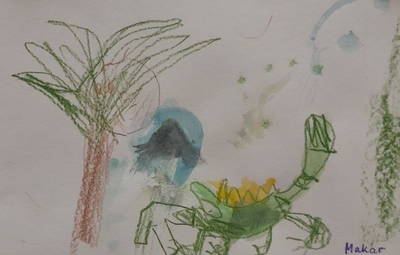
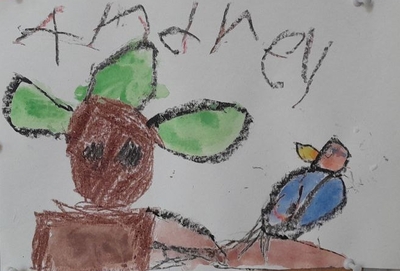
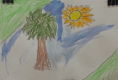
As could be predicted from their initial reactions, not one of my kids chose the abstract, not in the younger group, not in the older, either. Most kids worked with the technique I chose but I also had one student who asked for acrylic pens and one who only did crayons.
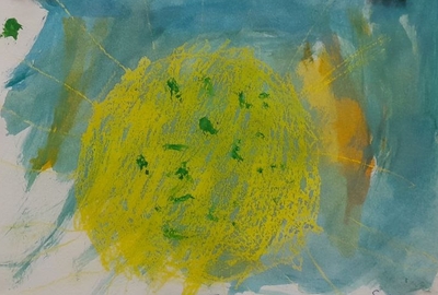
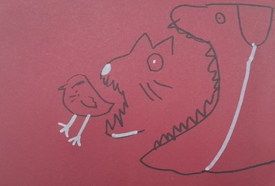
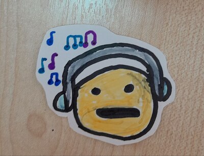
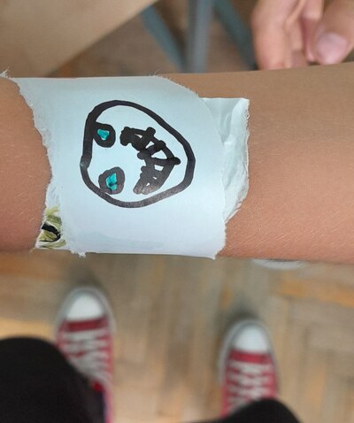
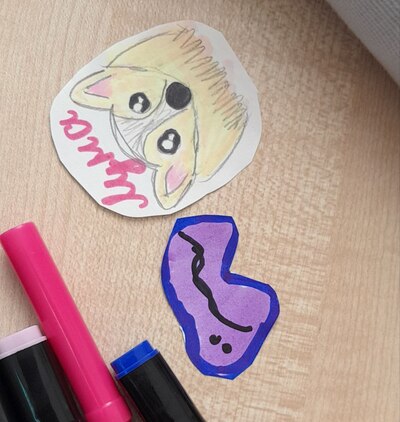
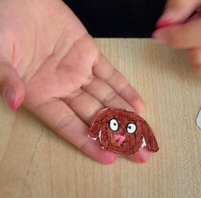
They were all invested in the process and I am really happy that we got so many beautiful and so many different paintings out of this lesson. I cannot even choose one picture that really ‘stole my heart’, although there usually is one. They are all special, each in their own way.
Every week, I have a few opportunities to interact with my students’ creations. First, when they are creating them – I am looking, then when I am editing the photos, then, when I am writing the post and then, usually after a few days, when I am uploading them here and posting. Every week, it is a chance to revisit and to notice something new. Initially, I thought that they did not really take John Olsen in, but now, on the 4th interaction, I can see that in those jungle of ours, the sun does play a very important part and, even when it is not always the centerpiece, it is very much present in their paintings. So, they did look and they did see!
Now, I am just wondering how to get them like the abstract art a tiny little bit more…
Happy teaching!