How we watched the paint dry. Bubble painting! Teaching English through Art

This was not a typical Art lesson for many reasons. First of all, it was a part of the camp programme, so I had a mixed ability group, with many children who have not created a lot with me. Then, it was an Art lesson that did not involve the Artist of the Day and, also, a lesson which was fully and thoroughly devoted to the process, perhaps more than any other lesson that I taught.

The language

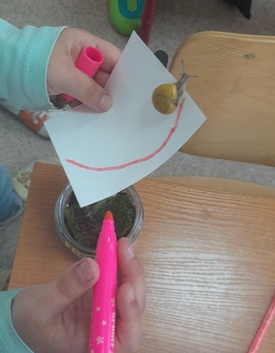
This particular lesson was taught as a part of the summer camp programme which meant a lot more time for all of us, we had one lesson for the language practice and one separate lesson for creation. And one whole lesson for Science and experiments! It was a part of the Black and White day so in our English lesson, we talked about the things that are black and white, we did some acting, we talked about our preferences (Do you prefer a black and white zebra or a colourful zebra? based on the illustrationsI found) and we wrote a poem about our favourite black and white things. We also had a fantastic Science lesson in which we were learning about what the colour black is made of and what the colour white (aka the light) is made of.

The art

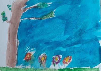
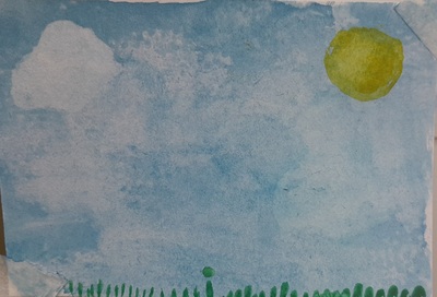
Initially, I had a different idea for this lesson and I wanted to create two drawings (black on white and white on black) but we did something like that very recently and I needed something a lot more inspiring.

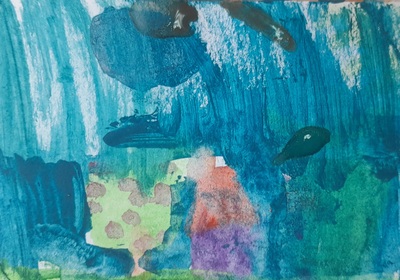
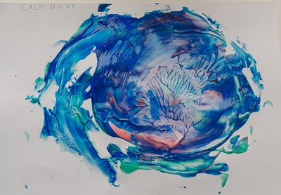
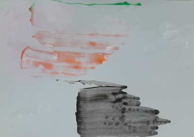
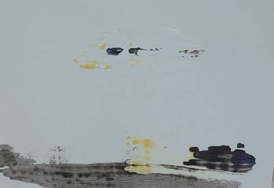
I did ‘waste’ some time thinking about the ways of making the connection between the colours and the art (something that is one of my favourite things, this kind of a brain-breaker) but, luckily, a few days earlier I was also researching new watercolour techniques and this is how I found a video on Lemon Creation ‘The most relaxing watercolour technique ever!‘. Then it was easy for the grey cells to make a connection: bubbles = white, bubbles = light, bubbles = colours.

I tried and tested the technique on myself, the day before. It helped me to understand the process better and to plan and stage it for the classroom full of kids. Not to mention that I had lots and lots of fun with it, as an adult. A delightful process that I really wanted to share with my kids.

In the classroom, the next day, it went like that:

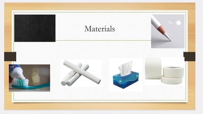
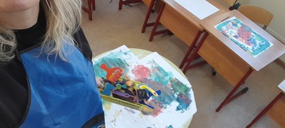
  • I showed the kids all of the materials (plates, spoons, straws, washing up liquid, watercolours, paper, paintbrushes) and I explained that we are going to make bubble paintings.
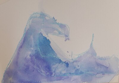
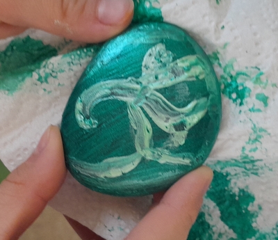
  • I showed the kids my creations, already dry and ready for all of us to see the final product.
  • The next step was the list on the board, all the stages with simple verbs, for each of them because, again, this is an activity whose success depends a lot on the careful following in the footsteps of the teacher, one at a time.
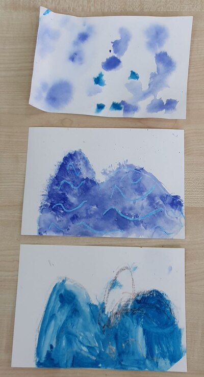
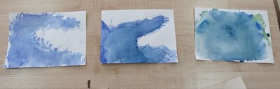
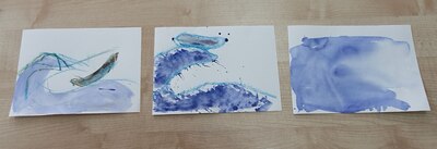
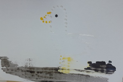
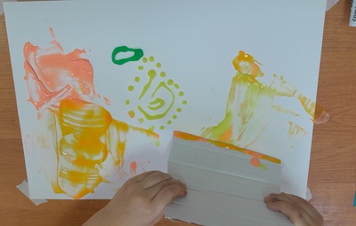
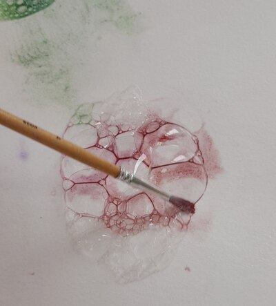
  • And, to further underline it, I produced one more picture in real time, with us following the instructions on the board and the kids watching the process, from the beginning until the end. Initially, I wanted to colour the bubbles only with the black paint, in order to keep in line with the theme of the day but I quickly gave up on the idea. Not because it is a bad idea but because adding more and more colour and looking at how they seep into each other and mix and dry was way too much fun to skip it.
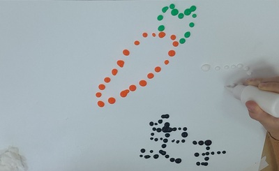
  • Giving out cups and straws to all the kids and making out own foam would be a lot of fun but I didn’t want to risk anyone taking a sip of the soapy water by accident (and, mind you, that is very easy, even for an adult, I did it myself while in class, oups) so I decided that there will be only two Foam Makers, myself and my TA.
  • After we have given out resources, put on aprons and prepared the paper, we started to walk around the room with my teacher assistant giving out the foam to kids. At home I used a piece of cardboard but a spoon is a much better solution (Miss Nigina’s idea:-).
  • Children went on to infuse their bubbles with colour and only now and again someone would should ‘Miss Anka, more foam, please!’
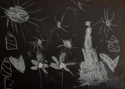
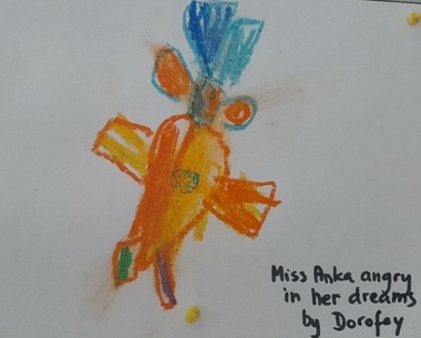
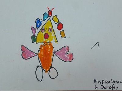
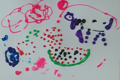
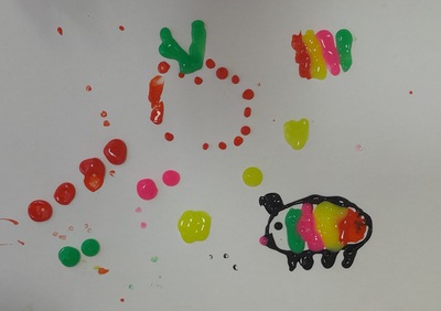
  • Some of the kids named their paintings in the same lesson, some decided to leave it for later (‘Miss Anka, I haven’t finished yet’ as my 5 y.o. artist told me).
  • When we came back after the lunch break, we unpeeled all of the pictures, signed them, named them and decided who is taking theirs home and who is keeping theirs on the noticeboard.

If you haven’t figured that out yet from the first 500 words of the post, I am here to tell you that we absolutely enjoyed this activity.

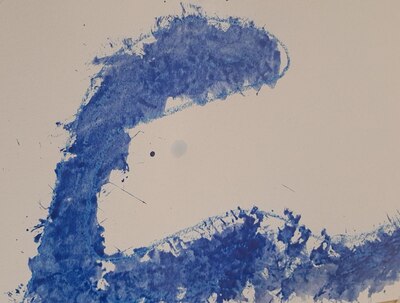
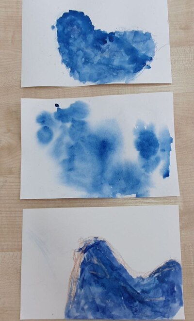
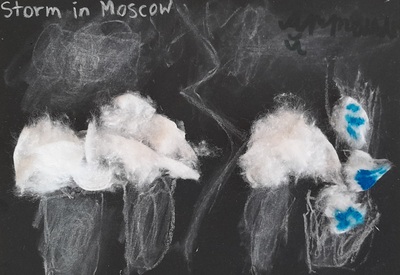
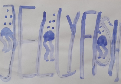
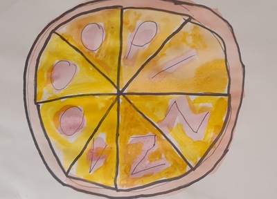
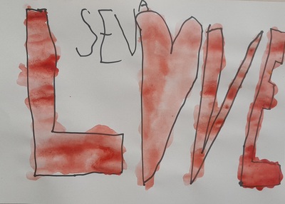
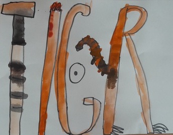
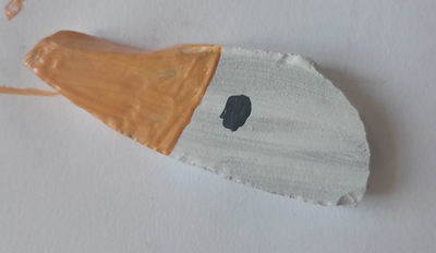
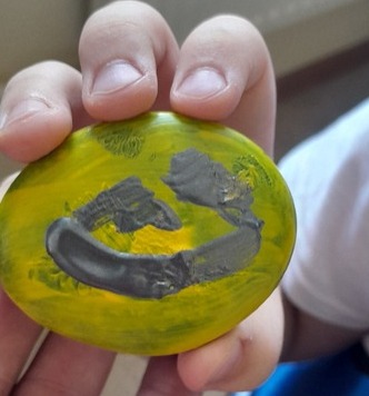
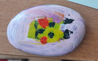
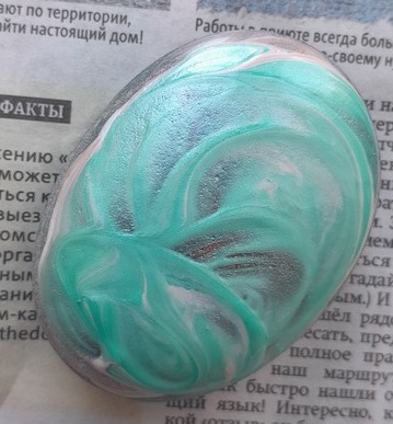
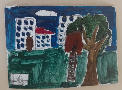
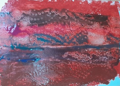
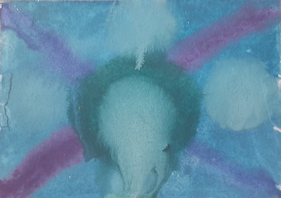
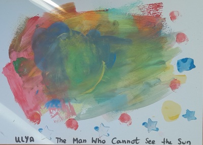
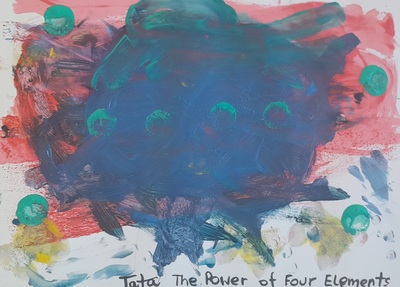
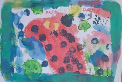
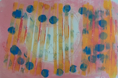
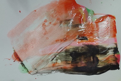
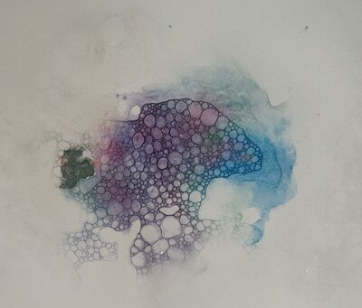
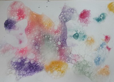
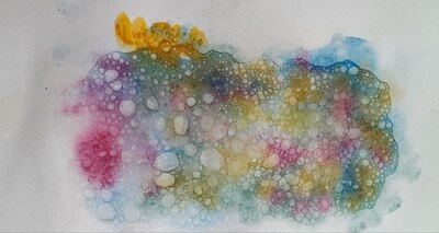
Yet again, we had an opportunity to learn to keep the pace and to follow detailed (but carefully-staged) instructions. We created these beautiful pieces that you can see in the photos and the kids were fully engaged. It is almost difficult to call it ‘painting’, it seems that ‘a show’ would be a more appropriate term as it was a whole performance that we created with the help of the bubbles and the watercolour. Observing how the paint seeps down, through the bubbles, colouring them and then drying and changing slowly…We literally watched the paint dry and it was an absolutely fascinating experience.

It was only after the lesson when I had a chance to look at the photos that we took during the lesson and the kids in all the photos are so focused, so engrossed, so into it…A beauty to behold!

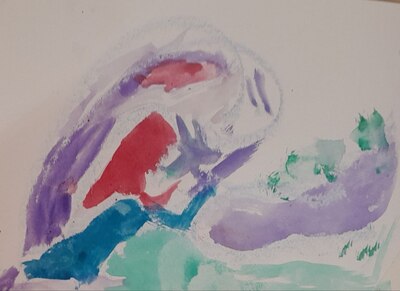
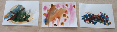
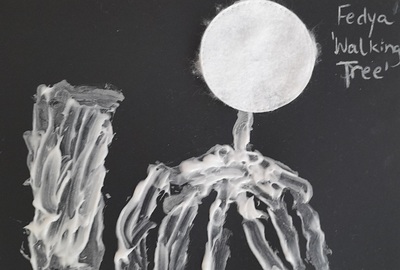
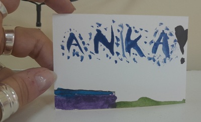
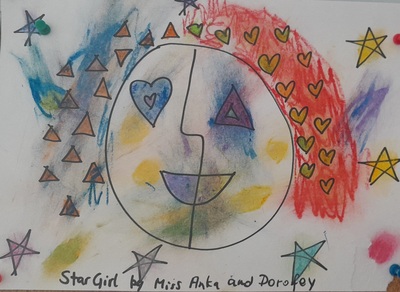
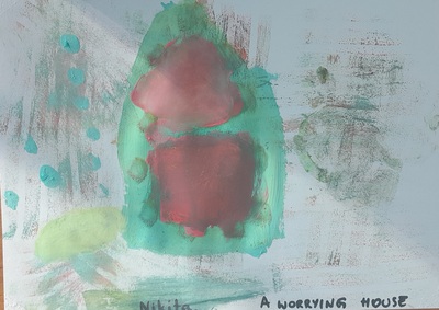
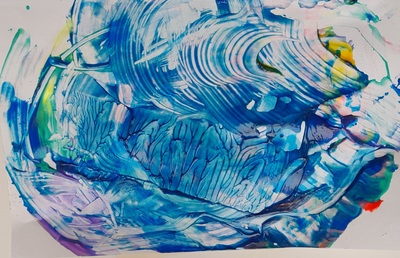
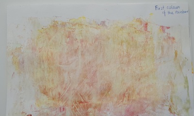
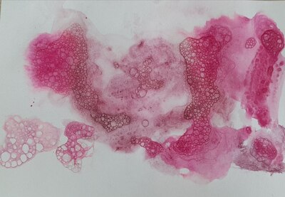
The study in pink that is the title photo of this post was created by my 5 y.o. firestarter who, when ‘forced’, stops plotting how to destroy the world and sits down to paint and ends up putting together the most amazing pieces. Like that one. I have already had a chance to witness it 6 times and every single time it is a wonder.

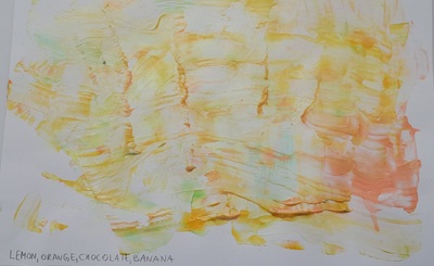
There many things that can be done with the finished paintings, with the use of markers or colours or even collage and we will definitely be coming back to it! Bubbles for everyone!

Hokusai, waves and watercolours!

8 y.o. artist

The language

This particular lesson was a part of our summer camp programme devoted to colours and that day was dedicated to ‘blue’ and all the blue associations, namely the sky, the water and the peace. For that reason, the language of the lesson was dictated and aligned with everything that we do in the other days of the session: talking about the things that are blue miming and guessing, writing a poem about the colour blue and singing songs of which my favourite one is this one here, from Kiboomers, with a catchy tune and the repetition.

6 y.o. artist

The artist

That particular lesson had a whole party of artists as I wanted the children to see a few different ways of depicting water in Art, with Turner, Hockney, Monet, Levitan and, of course, Hokusai. I live by the river and I have piles of photographs of the water and, as a joke, I decided to include one of my own photographs in the presentation. We looked through all of those, depicting a wild sea, a swimming pool, a pond with lillies, a wave and a river. Very briefly, we talked about the water being either calm or in movement and the children noticed themselves that there were no people in the paintings.

8 y.o. artist

The art

For the creative part of our lesson, I chose Hokusai. He has been on my mind for a while, just waiting for the most opportune moment and this moment came. I also wanted something that my mixed age group would be able to handle and recreate. Calling Hokusai ‘simple’ would be offensive but it is a print, with lots of intricate elements but the power of the water can is really shown by the line and that is something that even the little kids can relate to and to act upon. And they did!

The other thing that I wanted to do in this lesson is the use of a variety of watercolour techniques. It was very tempting to go overboard and experiment on a large scale, using everything we worked with before (a post here), but my students are the moment are still beginners in Art and very young, so I decided to be a clever teacher and I chose only three: crayons and watercolours, salty water and what we called ‘a broken brush’.

Before the lesson, I cut up the paper and all the students got three pieces of paper (A5) which I attached to the tables with the paints scotch. This really helped to set up the activity as it was clear, from the very beginning that we are going to paint three pieces. The size of the paper made it possible as they easily fit on the small table and it was perfect as it would not require too much colouring and painting. Three were a feasible number in one 45-min lesson. We reinforeced that by counting the pieces of paper and matching them to ‘technique 1’, ‘technique 2’ and ‘technique 3’ which I wrote on the board.

At the same time, the most important piece of instruction for this lesson was ‘step by step’ that I kept repeating throughout the lesson. I wanted to make sure that no one will draw on all three pieces at the same time or just destroy the paper. Or anything else that a creative pre-schooler can come up with.

I demonstrated each technique for the kids, step by step and we went on to create. I left the salty water for the very end.

There are the techniques that we use:

  • crayons and watercolours: give out crayons, one per child, a crayon of any colour as it really does not matter and any colour will look good and then colour the picture with watercolours which will not affect the drawing.
  • the broken brush: give out crayons, one per child, draw the wave, proceed with colouring the picture but instead of smooth strokes use the broken paintbrush: pick some paint and make small stamps with the paintbrush, mistreating it and leaving prints similar what a duck would leave. When there are many of them, the wave get a wonderful texture, especially when different colours and shades are used. Even if the prints are done inexpertly, the wave is covered in blotches of colour and it looks lovely, too!
  • salty water: I walked around the room, adding water to the pots that all the kids had (in some cases we had to pour some fresh water as it was very dirty) and I asked them to stir it properly and then we used the water to dampen the paper as it is a wet-on-wet technique and then drawing waves and applying little drops of colour and watching how it spreads beautifully. Here, the crayon can be used, too, to sketch the wave but last week we decided not to.

It was a great lesson and I am very happy with the outcomes. The task was easy enough even for the youngest kids, especially that they had three chances and even if some of them did not feel very confident at the first step and the first wave, they all got a chance to do it again and it was visible how their confidence grew. Technically, it was not complicated so the kids could focus on the creativity and on enjoying the process. Which they really did, both my youngest ones and my oldest ones (that’s 5 and 8 y.o.).

We got a set of amazing pictures for all of them. It was interesting to leave the pictures for the lunchbreak to dry and to come back later to check, together, what changed and what they looked like in the end.

It is the camp so, of course, we had some new children joining the group and it turned out that this kind of a task had a lot of potential for the mixed ability groups, who had done nothing of the kind before and the combination of three techniques helps to build the routine even within one lesson. What’s more, this type of a task works very well for staging and getting the kids to listen, simply because we go ‘step by step’ and doing that is the crucial part of the process. It is good to have this kind of an activity at hand.

Sitting here, thinking that Hokusai was a great choice, for the kids and for the teacher, too! Now, I can dreaming of making a real Hokusai-inspired print. And of writing a few more posts that he accidentally inspired.

Welcome to our gallery!

5 y.o. artist
7 y.o. artist
5 y.o. artist

Upside down art. White on black!

Walking tree. Artist aged 4.

The artist

We did have a set of paintings ready for this lesson as I taught it before, as part of our Monochrome March but we haven’t really used it. The reason for that was the fact that our lesson was brought about by the theme of the Camp Week 3 and that was: Wednesday Addams. Not my favourite topic and, definitely, not my choice but that was the brief, as it were, and I decided to go through with it, thinking of the ways in which the dots could be connected. And I found one as I am pretty sure that miss Addams would be a huge fan of the upside down, drawing with white on black.

Inspired by real events. Artist aged 8.

The language

This lesson was a series of four lessons on the day and that is why we could devote each of them to a specific topic and activities. Our ‘strictly English’ lesson focused on ‘I’ve got’ and pets and we really did lots and lots in terms of practice and speaking. We had a proper craft lesson, in which we created our own unusal pets and we talked about them, too and that is who we could easily devote our Art lesson to just creating and experimenting with all the new materials.

The art

I simply loved the look on my students’ faces when I showed them the materials that we would work with in class, on the slide and on my desk, a pile of tiessues, chalk, white pencils, cotton pads, cotton buds, toothpaste and black sheets of paper. It was an amazing and beautifully executed surprised ‘WHAT?! You want us to use THAT?’ When I joyfully announced ‘And tootpaste!’, someone even echoed ‘Toothpaste?’, without any conviction whatsoever in their voice.

We went to the carpet to experiment a little bit with the white pencils and the blending stump pencils. Everyone had a go. I also showed the children a few pictures that I made at home to show them how it is possible to mix a variety of materials in a collage painting.

Then we put on our aprons and sat down to work and I distributed all the materials, the paper, the pencils, the cardboard plates with some tootpaste on them, the tissue, the cotton pads and the cotton buds (to dip in the paste to draw). The kids were told that they could choose any topic for their painting.

Once the paintings were ready we came up with the titles, we cleaned up and we put up the paintings on the board, to dry.

As usual, I was surprised and amazed how my students, of different ages, took to the task. We went from disbelief through first dabs at the new resources and materials to creating all the beautiful masterpieces that you can see in this post. Everyone made their own creative decisions and, as a group, we ended up creating such a variety of themes and approaches. The kids were absolutely thrilled with the process and happy with the result. What more would you want from an Art lesson?

Naturally, we are going to do it again, for sure, and now I am only wondering what else I could add to the list of the white resources to use on the black sheet of paper…

Here are some of our creations:

Artist aged 6.
Artist aged 5.

Erik Bulatov. A word that is also a picture

A whale!

Even today, after a few days have passed since the day of the lesson, and with other lessons that have happened in-between, I am still simply, well, euphoric, about the lesson I taught and about the art we created. Cloud number 9.

I saw Bulatov in an exhibition more than ten years ago and, my oh my, what an inspiration he was. Really, I cannot think of anyone who had an impact comparable to him. And he stayed with me. For days on end did I draw letters and tried to make them work together. I even turned one of the pictures into a pillow case, in black and white.

A few weeks ago, I got to see his exhibition again and, once more, it was a blast, in every possible way and, naturally, I made an instant decision that we would do it in class, sooner or later.

A pizza!

The artist and the concept

It was with a real pleasure that I got to tell my students that our Artist of the Day is a contemporary artist who is almost 91 years old and who still lives in our city. They got really excited about it.

However, before we looked at Bulatov’s works, I wanted a proper lead-in. It seemed crucial to me that my students start to use the words as images, to have them look beyond the letters and to see the bigger picture. In order to do that I decided to use two tools or two tricks and I am so happy that what I came up with worked wonders.

The first, really easy exercise was to look at the colour words and to read them as words and as colours. There are plenty of resources that talk about the Stroop effect and pleny of resources to use: the online game, the article, the quiz video. I used a super simple visual, like this one here. The kids loved the challenge and I was having fun with them, quietly celebrating the fact that reading (all of a sudden) is an easy-peasy task for my almost-year-2 students.

For the following stage, I used my own illustrations of some of the Portuguese words which you can see the photographs. My students don’t speak Portuguese and I wanted to have them try to guess what they might mean just looking at the visuals. And they did so well here! Preparing those visuals took some time but I loved this kind of a homework and it made for a lovely evening for me. I chose ‘o sapo’, ‘a casa’, ‘o amor’ and ‘os olhos’ (without articles) simply because I had an idea for the illustration and I knew that my students will know these words in English. Obviously, any other words can be used and any other language that is appropriate in the context. I have already decided that when I teach this lesson again, I will use a wider range of words and a wider range of langauges.

At this point it was already obvious for the kids that words are more than ‘just words’ and we were ready to look at what Erik Bulatov created. I chose only five of the paintings. We looked at them and we briefly analysed why these particular words were presented in such a way. The main idea for this lesson was the sentence that I repeated a few times during the lesson and the one that is also the topic of that post: a word is also a picture.

Amor!

The language

The language input was minimal in this lesson as we only talked about the different words that the kids could use. As an example, I suggested using their names, animals, food, emotions and professions (the theme of our summer camp). The kids had time to think about it (as we were getting ready for the creative part, bringing water, getting on the aprons, giving out paints and brushes) and when they were ready, I wrote all the words they suggested on the board.

I was considering showing them a few examples of the English words that were also turned into images such as a few variations of ‘love’, ‘a cat’ and ‘a dog’ but I decided not to put them up, just to see what the students can come up themselves.

It is worth mentioning, however, that, depending the language input can be extended and there is a lot of potential for combining this lesson with a lesson on animals, colours, seasons or fruit and vegetables. I will definitely be going back to it and I am already excited about it. I want to be perfectly honest here, though. I focused on the artistic part because we are at the summer camp at the moment and there are separate English and Art lessons and, hooray, we have more time for English and for Art. Our Art lesson, however, was done entirely in English.

Sapo, casa, olhos!

The art

We used very basic materials: pencils and watercolours. We didn’t even have any real watercolour paper, because we ran out and we had to use the regular photocopying sheets. Not the best choice, but it didn’t stop us from creating.

I gave out the paper and pencils and we started to design our words. It is a good idea to keep a few spare pages of scrap paper for the kids to practice because it might be a bit complicated to get to the ‘acceptable’ level of quality of the letters or the picture, even with a good general idea, this does not happen naturally. I experienced that myself with my ‘casa’ picture and I was just so happy that I kept the drafts because I could show the kids that only practice makes perfect. Next time we are going to create Bulatov, I am also going to include different versions of his paintings that I saw at the exhibitions, either sketches (if they are at all available) or the same painting with various approches to the composition, size of letters or colours that I know exist. They will be a wonderful lesson into the creative process. Actually, here is another great idea for a lesson for me and for us, from the sketch to the masterpiece…Soon, I promise, soon!

A rabbit!

After the sketches were ready and the kids were happy with them, we started to paint. That’s it. The only thing to follow will be only my admiration, love, excitement, awe and multiple rounds of applause and high-fives. My kids did great.

Here is what went well / very well / amazingly well:

  • We went smoothly from the main idea, to Bulatov’s paintings and to our own creations
  • The kids did great, many of them knew straight away what idea they want to depict and they just went for it. They worked very well, they were focused and motivated. Many finished their first original idea and went on creating.
  • Designing the ideal visual was not easy for all the kids and not all of them got there from the first time. Keeping the additional sheets of paper was a good idea, showing my failed attempts was a good idea, too, and it did help some of the kids. I was really proud of those who got upset at the begininng but decided to go on and created real masterpieces.
  • It was interesting to work with this particular group of kids because they were a new bunch, a mix of my students and some new children who joined us only for those two weeks. All of them, however, apart from one, were new to the artistic activity, unlike everyone who took part in our regular Art Explorers activities that I normally write about here. And it was such a joy to teach them and to take them into the world of creativity.
  • We used the simplest resources, the pencil and the watercolours, but I have already started to wonder what else we could use. Perhaps gouache, perhaps acrylic paints or maybe a mix of techniques, paints and a collage, with the newspaper cut-outs…So many things to think about!

The only thing left now is to invite you to admire what my amazing artists have created!

Love!

Materials May: stone painting!

The language

This was the last episode in our series of Materials in May. The language input was a revision and limited to colours, emotions and animals which was also consistent with the vocabulary that featured in the photos I found online to inspire my students. Which, of course, means that the vocabulary can be adapted, adjusted and selected to match the topic that you are planning to focus on or the topic that the stone painting is supposed to accompany.

The artist

Since our main character was stone, I decided to choose a group Artist of the Day and look at the artistic creations across the centuries made specifically of stone (or, rather, different variations of it) such as the Sphinx of Giza, the Easter Islands monuments, Nike, the Greek goddess and Moscow lions, among others. The great thing about it was that many of these, the kids were already familiar with and they could relate to them on a slightly different level, for example, because they had a lot to share, although most of the time this was done in Russian, rather than in the target langauge.

The art

The art part was very simple and straightforward. We started with looking at a great variety of stone paintings that can be found online, with different smileys, fish, dogs, cats, elephants and what not. The kids were told that they would be able to paint whatever their want.

We proceeded to choosing the stones and handing out pieces of paper and pencils as we were to design our drawings. We traced our stones on the paper and spent some time trying to figure out the best picture or pattern for our stones. I tried to encourage them to be inspired by the shape, especially that we had stones of two different sources.

A word here on the stones themselves. They came from two main sources. Some of them were the ‘pretty’ craft stones, round and polished and I bought them in a craft store. The others were more organic, collected by me in the neighbourhood. These are irregular, ragged, rough but also more inspiring. I washed all of them with soap and hot water. In the end, they were left in a bowl with hot water, in order to sanitise them as much as possible.

When our designs were ready, we put on the aprons and started painting. Our paints were on a big table in the middle of the classroom so that all the kids could share all the resources. We used two types of the acrylic paints, I had some basic colours (but in lovely, rich shades) and some pearl colours (in other shades, as it happened). A part of the fun on the day was mixing of both in order to get the best of both. I am not sure if it can be seen in the photographs but it really worked out very well.

As for the design, as I said before, the kids had a free hand and they chose whatever they wanted. We had some smileys, we had some ‘favourite things’ such as the horses, the geese and Picachu, we also had some ‘magic stones’, which were only coloured and decorated. Because the acrylic paint dries relatively quickly, some of my students managed to decorate both sides of the stones.

I had the black markers ready for the follow-up decorating as it is also an option, especially useful for all the tiny elements of the drawing or the tracing, but it turned out not be necessary in the end. As with all the materials lessons in May, I announced that we would be leaving our creations to dry overnight but, guess what, that also didn’t happen. Almost everyone insisted on taking their stones home asap. I barely had time to take any photos. I suppose that means that the lesson was a success.

Don’t eat the materials! Salty dough creations

The language and the artist

…were completely given up on in this particular lesson. I was considering looking for someone who created something that we would be creating but I quickly realised that the process will be the more important part of the lesson and, again, because of the materials and of the many stages, we will need time. I just wanted to make things out of the salty dough.

The art

While I was preparing for the lesson, I considered different scenarios, also the one in which we make our little things and leave them to dry for a week and decorating them during the following lesson. There are microwaves at the school but I did not want to use them. I wanted to keep everything as simple as possible and after experimenting at home at the weekend and testing the drying and colouring and I had a solution. I also tried to paint my dough while still wet and that went well, too.

I made the dough at the school, just before the lesson. I didn’t have any bowls there but I used one of the big plastic boxes and even though though it did get stuck to the box and dried up a bit, I washed it easily after the lesson. There are many recipes out there but I used this one here.

I prepared the working stations for my kids (a double spread of the newspaper scotched to the table) and got changed into our aprons.

I showed the children the dough, I explained the ingredients I used and I repeated my basic health and safety drill that is the title of this post. I showed them the tools that we had at our disposal (cookie cutters of random shapes and two small bottles to be used as rolling pins) and paintbrushes that were to be used in lieu of the little knives to shape up our creations.

I also showed the children the photos of different things that I made at home while trialling and testing: a letter A, a snail made out of one piece of rolled string of dough, a flower made out of blobs etc. I wanted the kids to get at least a vague idea of the opportunities that the dough presented.

On the board I wrote out the main stages of the lesson and they went as follows: 1. Look (at the model), 2. Make, 3. Paint, 4. Transfer to the window sill, 5. Dry. I wanted to make sure we are all on the same page and that we all finish in time.

I told the kids that since we are experimenting with a brand new material and technique, everyone can make whatever they want. ‘Anything?’, they asked, incredulously. ‘Anything! Go on, experiment and have a go!’ And they did!

The outcomes

It is possible to go through the whole process in 45 minutes, from instructions, through creation to painting and cleaning. Some of the students did finish early but we made sure everyone waited for everyone else to finish before moving on to the following stage.

The paint was dry within minutes but the cookies (that’s what the kids started to call them) were still to fragile to be transported so they were left on the window sill until the following day, when we packed them into plastic zip lock bags.

Once the creations were ready, we transfered them onto A5 pieces of cardboard, for painting, drying and safe travelling later on.

For colouring we used acrylic paints, with a pearl shine and that made them look even prettier. I was really proud of all my students because we took all the necessary precautions and there were no splatters or spatters. Our clothes, tables and chairs were safe.

The kids’ creations simply blow my mind. As usual, my amazing artists looked, thought and then went on creating in their own style. Most of them are simple cookies, cut out with a cookie cutter and painted. Some are decorative pieces, like the three hearts made for mum. One of my students thought of making a necklace and she even made a whole for the ribbon. Some students decided to create 3-D figures of their favourite things, some of them very elaborate. And of course they snatched them even before I could take a photo…

Guess, we are definitely doing this again! I am not sure when but we definitely are! Maybe they will be Christmas decorations, maybe little pumpkins for Halloween, maybe Easter egs! The salty dough will be back!

Even more things that can be done with salt dough (updated 18 August 2024)

I happen to have a 1-1 lesson with one of my students and, knowing that he loves making and creating, I decided to spend this time with craft and salty dough. Somehow, this was a very creative lesson as we could make, try and experiment and the ideas were bouncing off, back and forth. We have tried:

  • using shells and beads as decoration
  • applying beads onto an already painted surface (good idea!)
  • applying beads and shells, then painting with acrylic paint and wiping the surface gently with a wet tissue (good idea!)
  • constructing a piggy bank on a frame of a glass jar. Not sure what I can say about it, the shaping went well, but the piggy bank is still drying. The success of this one will be determined later)
Drying in the sun…

Tiny pictures. Alternative April #4

‘Anka with fireworks’, my name card by one of my artists

Let’s go alternative in April!

We did! In every possible way.

The size

This was the final lesson in our beautiful and exciting series of the Alternative April series. I really wanted to experiment with the size of the paper. Initially, I wanted us to paint something really big and then something really small in order to really experience the difference first hand. However, based on how the lesson with the older kids was going (in one word: too slow), I changed that for the lesson with the younger kids and opted for the A7 only. We were working well but the creative process, the decisions and the composition, takes time and I didn’t want to rush us and in the second lesson I decided to keep things simple: just the little picture.

The materials

Initially, I had the wild idea of letting the kids choose the medium that they want to work with. It is not a bad idea but, I will be honest, the preparations for its implementation need to be more detailed and organised in a slightly different way to what I did. Next time I will and next time will be better.

In the end, my older students went for the simplest and the most basic, pencils and black markers, and with my younger group I chose for all of us and we worked with watercolours.

The Zebra Heart. Print.

The artist of the day

didn’t come. The first reason for that was that I did not want to choose one and I felt conflicted about it. On the one hand, I really wanted to stick to the framework that I created for our course and we had always had at least one Master to inspire us. On the other hand, the topic that I chose for the lesson, namely ‘Spring’, is such an open-ended and all-embracing topic, that looking for the one was a task doomed to a failure. Plus, I knew that the format would be enough of a challenge and I wanted to give the children the comfort of working with it. I was worried that I would be limiting them too much, with the artist, the format, the topic and the resource. I decided against it. We sang the song, said hello, brainstormed all the associations with the word ‘spring’ and looked very briefly at a selection of paintings showing spring, without singling anyone out.

And then sat down to work.

How it all went

I know that I sound like a broken record when I say it but I will do it again: This was one of my favourite lessons ever and the reason for that is that, again, we set off on an amazing, 45-minute creative journey.

  • We all had to be very careful with choosing the topic for our work. The A7 format is a very small one and you have to take into account how small certain elements are and how much effort it would take to execute them.
  • All kids had three pieces of the A7 paper, attached to the table with the painter’s scotch (necessary!) so they could experiment with different approaches and they really did. The first pictures were usually the most cautious ones, the easiest ones and the least experimentative. However, since there were more pieces available, I could see how much braver and more confident they became in their following steps. Even today, while looking at the pictures, I can tell the order in which they were painted by particular kids. And it is amazing. For example, the triptych in red by Egorka, who started with a scene from Mars, all in red, then moved on to a superhero’s portrait and finished with what he called ‘a zebra heart’, in black and red that ended up being a print. Why? Because he noticed that the paper towels we had on the tables had an interesting pattern and he decided to experiment. Precious.
  • Three of my students painted only one picture but it is because they decided to make it more detailed and, naturally, these required more time, effort and attention. The other children went for a triptych and, one way or another, these three were connected by a common theme.
  • One of those three is the first in the world case of the Snail Art in which the artist traces the slime trail left on paper by her pet snail. Which, of course, was her own idea. No snails were harm in the production of this piece.
  • It turned out that this kind of art is a perfect exercise for improving focus and concentration. It worked like magic. For that reason it might be an interesting activity to improve in the general English classes, for example. I can easily picture it in our ESL / EFL courses, especially that the topic can be easily adapted to match the curriculum and it does not eat up a large part of your lesson. And if you don’t want to get into the whole watercolour mess, the same can be done with markers or coloured pencils.
  • For the time ever, I had not painted my picture before the lesson to show the kids. I wanted to experience the change of focus myself and I told them about it. This was also something that we did for the first time ever.
  • Having three pieces of paper came in handy with one more thing. As soon as I announced the topic of our lesson, the same question was asked, almost immediately. ‘Can we paint something we want?’ I mean, I always say yes in the end and inside of me there is one happy teacher celebrating the independence and the artistic freedom that my little kids want to exercise. But we did negotiate a tiny little bit, too and, in the end, they agreed that since we have three bits of paper, a lot can be done. Something that the teacher suggests, something that we really, really want to do…

It is beyond fascinating how much impact the A7 format had on our art, composition and work. Five stars, highly recommended. I hope you enjoy visiting our little gallery in this post.

The Snail Art

When Picasso came to school. Alternative April #3

The language

This was to be our final lesson in the topic of body parts and, once more, after singing the hello and going over ‘How do you feel today?’, we went for our spinner game. I was really worried that we would not have enough time for anything else as I wanted not only introduce a new artist but also a new tool.

The artist

This was the second time we invited Pablo Picasso to our lesson. And the kids remembered! They were a little bit surprised because they met him as a one-line artist with the amazing animals (post here) and, at least some of them, a little bit taken aback by the sheer contrast between the two. I showed them a few portraits and we highlighted the main pointers of cubism (which we also talked about before). We also tried to find all the figures (shapes) in the portraits.

The art

This was a day when we would be experimenting with a new took – oil pastels and that is why I decided to demonstrated some of the basic blending techniques. You can find the ideas in the videos here and here.

Afterwards I demonstrated the double portrait that I made while getting ready for the lesson and we talked about its main features (shapes and colours). I also showed them the simplest way for achieving the Picasso effect by drawing one more face: a shape for the face, divided into halves, smile (ideally misshapen, mismatching halves) and shapes for eyes, nose and hair.The next step went according to the plan one of my students wrote on the board once: ‘3. Miss Anka Paint, 4. We paint’. We started to work.

  • The kids chose different ways of working with the oil pastels. Some combined them with pencil, some with markers and for some they were just a crayons replacement. But we also had a few properly experimenting with the new tool.
  • Some of my students refused to see the world through Picasso’s eyes. They really didn’t like his approach and asked if it is possible to draw their friends the way they want. It was more common in the older group, the younger kids just went for it.
  • Some of the students also asked if they can draw ‘something they choose’, not faces and I also said yes. Obviously, Kolya had his own idea for the interpretation of the topic and for cubism and I am happy I did not object. The house of spades, hearts, dimonds and cards is just beautiful. ‘One house in the city’, as he called it.
  • Some of them loved it, though, and the best piece of evidence is that they snatched the paintings as soon as possible, to take them home. I barely managed to take my photographs.
  • We also had one character sitting for a portrait, my new portrait and a few other precious creations.
  • The Star Girl that you can see below is a joint effort between me and one of my youngest student who decided to help me with the colour. I decided to save it here not only because I am happy with my design but mostly because it shows how the kid’s creativity develops as they go through the task. I drew the face and started to colour it, in the most boring of ways but soon I was joined by my student who took over and decisively so. It was fascinating to see how many different ways of colouring, blending, shading and working with oil pastels he came up with during that task. The final product – below.
  • Watching the kids work was a real pleasure. One of my students was working on something hard that, from afar, looked like her trying to create one big, colourful, many-layered blob of pastel that some, less patient, might label as ‘trying to destroy all my pastels in five minutes’ but the final product, the girl with a horse, proved me wrong. Experimentation was just experimentation, and one of the many steps towards beauty.

Yves Klein. Take two. Printing and roller work.

The man who can’t see the sun

Somehow, in this academic year, in our Art Explorers adventure, the days are filled with some ‘firsts’. Now and then, and more frequently that I would expect it to happen, we bump into something that we have never done before and something that we are trying for the first time and that we are experimenting with. I love it!

This time round, we experienced a mini-series of the same artist over two consecutive lessons. It is not that Monsieur Yves is such an inspiring artist that we simply had to give him a double Art slot. I mean, he is amazing and I am so happy that I have discovered him for myself and for my students but, surely, there have been many Great Artists that, theoretically, at least, should have been granted with that privilege, Malevich, Goncharova, Warhol or Picasso…A simple coincidence, that’s all it was. I got the amazing set of rollers and stamps but only in time for my older group, the younger kids on Mondays missed their chance. Since we had so much fun with the rollers, I simply decided to let everyone help! Then and only then, did it turn out later that Yves Klein himself loved using different tools…What a coincidence!

The Power of four elements

The language

The language stayed the same and we had a lot of time with the spinner and the verbs (you can read about them here) and, to be perfectly honest, the langauge input was kept short on purpose.

The artist

We just got back to the previous class and looked at some of his paintings again and I told the students that, apart from using the beautiful blue and painting with different body parts, Yves also used a variety of different rollers, stamps and other tools and that it is exactly what we would do.

Colourful frame

The art

The room was set up exactly the way we did last week, with the round table in the centre of the U-set of desks and it was basically our palette (have been covered in paper and painter scotched over before). I showed the students all of the tools and how they can be used. Because it was the last lesson in the series, I was also able to look back at the works created before. My special focus was this one, created by one of my older students because it combines pencil drawing, a variety of prints and a great roller work.

After that, we just got down to work and, in one line, it was just amazing.

Kids really enjoyed working with a new tool and experimenting with everything they had to offer. It was a good idea to cover the palette table with paper because it was the first place to try out rollers and stamps. This is also were they were mixing the colours to get new shades and colours. They were very careful and conscious while choosing the tools and combining them with the paints. We were talking about the process, a little bit in English and mostly in L1 and thanks to that I could see how their ideas were taking shape. That was precious. Or so I thought. Until the artists started to come up with the titles for their work. They did all of that in Russian and I helped them translate but hey, look at them, they are amazing…What is more, they were not created instantly. The kids really did put some work into creating them. Some students made a decision and then, upon more consideration, they changed their mind and came up with even a better, more suitable option. I was speechless and I continue to be. Why? Just look at the photos!

A worrying house

Figurative and non-figurative art. Teaching English through Art

‘Calm night’ that started as an apple, if I remember correctly…

I am happy. As a teacher of English and a teacher of Art – I am happy. I have my Art Explorers classes twice a week, there are two groups so every lesson is not only taught twice and every idea trialled and trialled again. I am happy because I am getting better at coming up with ideas and with combining all the elements and finding the links between the artist, the language and the technique. And I can see how my kids are reacting to it and becoming more familiar with the paintings and more confident as artists.

I have also realised that all of us, we are more involved in the process and we are enjoying it more. The final product is important, of course, but so is the journey. It is all very rewarding and I am just happy that it is a part of my weekly schedule.

The art

As usual, out of the three components, one had to be prioritised and, this time, it was the art itself. I wanted to give my students an opportunity to experience the process of creating a non-figurative art piece. We tried doing it a little bit in our Jackson Pollock lesson but there the lead was taken by the very specific technique. The outcomes, amazing as they are, were absolutely accidental, and only at the very end of the lesson, we gave our paintings their names.

This time, I wanted it to be fully conscious, purposeful and planned, from A to Z for the kids to understand how a figurative painting may become a non-figurative piece and the artist (aka US!) takes the responsibility for that.

In order to achieve it we did the following:

  • we decided what to paint. I suggested a fruit and veg still life since it was still our Fruit February but I allowed the kids to opt out of it if they really wanted to. Some did.
  • we made decisions about the composition and started to drip draw with the paints. I had a set of paints that I bought for the stained glass lessons but they turned out to be of a very bad quality, too watery, to liquidy and I could not use them for stained glass. They spent about five months in the drawer and last week I had already taken them out to bin them when the hoarder in me hesitated and decided to use them somehow. Since they were so good at dripping, dripping was what I chose to be their destiny. We used a technique we experimented with before, spread painting.
  • we drew the contours with drips of the paint (sharing the one set of paints, hooray to the social skills development!)
  • we photographed the ready picture
  • we used pieces of thick cardboard to spread the paint and a decision had to be made here to, regarding the movement (or movements) of the hand.
  • we gave the paintings a name. In most cases, it was a list of the items of the picture but some of the children came up with different names, not related to what the painting first was. Real artists, I am telling you!

As usual, the creation started with a quick modelling session during which I produced a painting of a watermelon and then turned it into a non-figurative item.

The artist

This was one of the lessons in which we did not have one superhero but a whole dinner party. I divided them into two groups to illustrate what figurative and non-figurative art is. Our definitions were very simply, in order to convey the message even to my youngest students. ‘Figurative’ was defined as ‘I can see real things’ and represented by a still-life by Cezanne, by Rene Magritte’s Son of Man, by an apply by Yayoi Kusama and a still-life by Ilya Mashkov. ‘Non-figurative’ was defined as ‘I can see shapes and colours’ and represented by a piece by Jackson Pollock, Kandinsky’s circles, Mark Rothko and Yves Klein that I have just discovered for myself.

I also brought two pictures that I created at home and I asked the students to guess what fruit I tried to paint by the colours that they could see or the shapes that were still visible, just to highlight the fact that the fruit might be only represented by a fruit, not necessarily by shape.

The language

The langauge in this lesson was, as in every lesson of this month – fruit and vegetables. Apart from that I wanted to play with the language and to reinforce the idea of looking at the world from a different perspective. In order to do that, we looked at a set of pictures of the everyday objects and fruit and vegetables, seen either under a microscope or in a close up. This was a lot of fun and I am definitely going to use this resource again!

Outcomes

It’s not going to be the first time I say it, here or in the real life, but this, indeed, was one of my favourite Art lessons ever. The rest you can see in the paintings my students created.

‘First colours of the rainbow’