Much Ado About Nothing: realistic flashcards vs illustrations and the EFL world.

Realistic vs non-realistic? Am I am really inside of a huge glass piano?

Preface

A while ago I got into a discussion on why the realistic flashcards aka photographs are much better for YL than the cartoon flashcards.

Oh wait, not quite this way. First (and foremost), as I am typing up this post, I am glancing left and right, for support. To the right, towards the shelf with my storybooks and all the ‘unrealistic’ illustrations and all the imaginary characters and to the left, where the materials for the next Lesson at the Museum are lying (this week: Natalia Goncharova, more of that – soon!). At this point, I still cannot formulate it very well but my guts (and a few years in the classroom and around kids) are telling me that realistic and photographic IS NOT the only way. I object.

Second of all, this discussion, it just was not a discussion at all. I must admit, I am a bit naive when it comes to the social media and I would like to believe that teacher meet there to exchange ideas, to learn from each other, not to preach, making it look like theirs is the only way to do things and recommending that I should do my homework and read first before I voice an opinion (as if the empirical evidence did not matter at all).

Enough of this bitterness, though. Here I am after all, doing my own reading and research, with mixed feelings, if I am to be perfectly honest. A little bit anxious (because what if the research proves that I was wrong, eh? What then? (I am laughing here) and a little bit excited (because what if the research proves that I was right? (still laughing).

This introduction was planned and written before the actual reading did happen but you, dear reader, looking at the title (courtesy of Mr W. Shakespeare of Stratford-upon-Avon), you can guess now where it is all going (based on the research that I have managed to do so far) so if you have very little time on your hands, I will make it easier for you, here is a summary of the whole post:

When it comes to choosing between the visuals with a high degree of iconicity (aka the resemblance between the picture and the object) such as photographs and the visuals with a low degree of iconicity such as cartoons, storybooks illustrations, there isn’t only one answer, one way out, one approach. It is not a case of black and white, good and bad, left or right. It is a beautiful case of ‘well, it all depends’. Done.

Now, if you have more time, follow me. There is more to come.

Realistic vs imaginary: My teacher is a cat.

Act I: Why choose the real photos

The first (and the most important question) to ask here is: How old is the child? A picture is a symbol, a representation of the real object and children will require a certain level of cognitive skills development (such as symbolic development, analogical reasoning, reasoning about fantasy and reality) in order to be able to process that image and to relate it to something that they know from real life.

For example, newborns, who have not become symbols users, when presented with a photographic image and a real object, would always choose the real object over the visuals but, at the same time, if the real object was not present, they would interact with its image in exactly the same way as they would with the real object. These examples come for a truly fascinating article by Gabrielle A. Strouse, Angela Nyhout and Patricia A. Ganea which you can find here.

As shown in other studies they mention, too, it seems that although these young children can transfer the concepts both from cartoons and photographs or realistic drawings to the real world, the more realistic the image the easier the transfer. And for that reason, we find plenty of recommendations for such books to be used with the younger pre-schoolers. This attitude seems to be especially popular according to the Montessori method (although to be honest, I am not very familiar with it, I know it only from reading, not from the classroom, so forgive me for any inaccuracies or faux-pas that I might commit here).

Another interesting argument, and this time applying to not only the youngest children, is how the information presented in the picturebooks might have an impact on children learning about the world. As Strouse (et al) claim, it seems that ‘Fantastical context used in stories may cue children that information presented in books is not transferable to real-world contexts’, especially when the children do not really have any opportunities to connect the book world with the real world because, for example they live in the city and have never been on a farm, or are not supported by adults in their journey through books. The authors claim that it might impact the learning of physics and biology or moral learning. All these arguments would support the use of photographs and realistic cartoons.

Apart from that, there is the obvious argument, applicable both to children, teenagers and adults, alike – we like photographs. According to the professionals such as graphic designers (because this is where this reasearch has taken me, too), photography is used when we strive for accuracy, professionalism and when promoting the object is the real aim. The latter two might not really be relevant to the world of EFL and ESL but the first of them, accuracy is going to be our key word. When presenting vocabulary to children we want them to understand clearly what we mean and a photograph of an elephant will illustrate it better than a drawing of an elephant. We might not only see the tiny little details such as the shade and the texture of the skin but, quite likely, the elephant will be photographed in a natural environment so we will be also able to notice how big it is and what kind of a habitat it lives in. The elephant will most likely be doing something, walking, running, eating or sleeping and this will help us understand a bit more about it. Not to mention that it will also help us produce more language (the secret aim for anything that the English teachers do).

It seems to be especially important in the English lessons while teaching the concepts that students are not familiar with and which they do not encounter in their real life such as the jungle animals (while teaching in Russia), snow (while teaching in Brazil) or Polish pierogi (while teaching outside of Poland). The photographs will help the children understand these concepts better than drawing, although, it has be said that no photographs of snowy landscapes will help you get the real idea of what winter is like unless you have rolled in snow yourself and unless you have actually tried to catch the snowflakes on your tongue. As regards preschoolers, there arises one more question, too – Should we even introduce the concepts, ideas and vocabulary that they are not familiar with in their L1 and in their lives? My personal (and very subjective) answer would be: ‘no’, not in the EFL context, with a limited language exposure and the limited lesson time available. With a very few exceptions, of some cool animals. Perhaps.

Realistic vs illustrations: Two Cookie Monsters

Act II: Why choose illustrations

First and foremost, as children are growing, they develop their cognitive skills and they become better at recognising symbols, using symbols and, last but definitely not least, at creating symbols (here you will find my earlier post devoted to symbolic representation and the EFL with your starter kit). Using illustrations, cartoons and drawing is necessary!

Children are progressively better able not only to distinguish between these and label them as more realistic and a less realistic representations of an animal…

…they might also appreciate the cat on the far right as it is most likely to resemble the cats that they draw in their pictures. And as they are learning to hold a pencil and to produce marks, scribbles, lines and circles, it will be quite a long time before their drawings look like the cat in the middle or anywhere near the cat on the far left. As Bernadette Duffy (see bibliography) says ‘If we intervene with a view that the purpose of art (or, in this case anything that children create (own comments) is to produce an image that is as realistic as possible and therefore think of children as failed artists we may do great harm by imposing inappropriate expectations that do not match children’s developmental stage‘.

Then there are the visual arts and these are full of ‘hurdles’ for a rational mind. Picasso’s faces are far (far far) from realistic. Chagal makes his characters float in the air, as if they were kites (sometimes accompanied by goats). Warhol stubbornly chooses the ‘wrong’ colours and Malevich replaces the whole world with one (amazing) square. And then there is Miro, Bosch, Rothko and many, many, many more. It is, of course, possible to give up on teaching art to such young children, but, before you do, please read why it is a good idea and how it benefits them. For that very reason, all the major galleries and museums include programmes for kids.

As for the graphic designers, among the advantages of the illustrations is the fact that they can be used whenever it is necessary to show the unique features and to stand out, since all the photos of the cat might look the same and the drawings will differ as they will depend more on the artist style, abilities and techniques, when a simple design is needed (for example an icon) and to depict the imaginary.

The last argument seems especially fitting in the world of the early years. Or in the classroom. Children love stories and these feature real children, talking animals and a whole array of imaginary characters such as mermaids, fairies, dragons, dwarves, fish with fingers and children who are going on a bear hunt (something that you should not really be doing in real life, not when you are five and, actually, although this is yet a very personal opinion, never ever ever). This imaginary world is a part of being a child and children do grow out of it, eventually and naturally. Although, still, some of us, even at 40, we like to revisit this world, accompanying Harry Potter to Hogwarts, Frodo to Mordor and Zima Blue in his search of the meaning of life.

Another thing is that, as a material designer for preschoolers (and I am that, too, as all teachers are), I sometimes tend to choose illustrations over photographs specifically because they are simple and easier to colour for my 3- and 4-year-olds and because I want to convey the general meaning of the word ‘bird’, rather than anything specific, for instance ‘a sparrow’

Another reason for choosing the illustrations over more realistic drawings or photographs is that some animals look too realistic and scary. I am one who does not really like touching the spider flashcard (cartoon, but too real and disgustic) and some of my students feel the same way. So, in case of a crocodile, for instance, I might opt for the one on the far right.

Realistic vs imaginary: a class portrait and a teacher of seven fingers (but with amazing eyelashes:-)

Act III: Why do we have to choose? Variety is the answer!

That’s it. A ridiculously short Act III. Nothing more to add. We can and we should use both. Also because the realistic is not always true, either. Have a look at the photo that introduces this post once more: Am I or am I NOT sitting inside of a huge glass piano?

I hope you have enjoyed reading this article as much as I have enjoyed researching for it and that this is definitely not the end.

And a request to you, dear read. All of the sources that I have used directly have been referenced throughout the post. Below you will see some other treasures that you might find interesting. If you have anything else to add to this list – please, let me know in the comments sections.

Two requests, actually – if you have any stories related to children’s reactions to the photographs and visuals used in class, more or less realistic, please share these, too!

Happy teaching!

Bonus: One of my favourite film adaptations
Много шума из ничего (1993) – IMDb

Bibliography and further reading

All the sources that I have quoted have been referenced throughout the post.

Here are some more things that you might want to read

Why children need real images – how we montessori

Drawings – stages, meaning, Definition, Description, Common problems (healthofchildren.com)

An introduction to the visual arts in early childhood education – THE EDUCATION HUB

Teaching Preschool Art Lessons — KinderArt

Around the world: Art allows all children the freedom to explore (pearsoninternationalschools.com)

Why Real Photos? What about Cartoons? (stageslearning.com)

Picture This! Why Books with Real Photos Help Kids Discover the Big, Wide World (kindercare.com)
Pictures and Images in Flashcards – Are They Even Useful? (universeofmemory.com)

The Truth about Flashcards for Toddlers Who Don’t Yet Talk – teachmetotalk.com

The Pictorial World of the Child (nih.gov) (a review of a wonderful book that I am getting as soon as I can come up with a reason to treat myself)

How to Introduce Toddlers and Babies to Books • ZERO TO THREE

Which Works Better: Illustrations or Photographs? – Ecommerce Platforms (ecommerce-platforms.com)

5 Reasons To Choose An Illustration | Holywell Press

Bernadette Duffy, Supporting Creativity and Imagination in the Early Years, Open University Press, Maidenhead

P.S. A request!

It is very simple.

I would like to know a tiny little bit more about my readers. There are so many of you, popping in here, again and again, and the numbers of visitors and visits are going up and make my heart sweel with joy. But I realised I don’t know anything about my readers and I would love to know, a tiny little bit more.

Hence the survey.

Children as symbols users and the EFL world.

‘Symbolic representation – making something stand for something else’*

Symbolic representation, its importance and development in children are a truly fascinating topic and one of the crucial ones to anyone who works with the little children.

Tina Bruce’s definition of symbolic representation has become the title for this paragraph and that means that absolutely anything can become a symbol of something else and being able to read these symbols is an important step in child development.

Symbols are everyone around us. Some of them are universally recognised such as mathematical symbols, musical notation or the letters of the alphabet, some are personal. While growing up, children are learning to differentiate between the symbol and the real object, they learn to recognise, learn and, eventually, to create symbols.

Examples? Imagine a cat, a black beautiful and soft murmuring creature. Now, imagine a flashcard of a cat. Obviously, as adults we have no problems differentiating between these two and understanding that the flashcard, no matter how realistic, is not a cat and that it only represents it. We can even take one step further and look at ‘CAT’ written on the board also understand that it is not the cat itself, only its symbol. Or that when we move one of our hands in the air (with the fingers spread apart and crooked a bit), while saying ‘meow’, we also want it to represent a cat. Although we are not the cat ourselves. One more step would be going in the direction of what the cat or the black cat itself might represent…

It is basically the development of abstract thinking. Why does it matter to us, the teachers of English? Well, there are a few reasons and a few immediate uses in the classroom.

Flashcards…

This is probably the easiest to highlight and, at the same time, the most obvious way in which the symbolic representation and its development influences our daily life in the classroom.

Flashcards are the staple resource of a VYL and YL teacher. We can bring toys into the classroom or plastic fruit to introduce and practice vocabulary with them but it is not possible with all the topics. Sadly, we can never have a real elephant or a real princess in the classroom, sadly, and for that reason we have flashcards. They help us work with the language as they are not only easy (or relatively easy) to obtain but they also help use the language and the variety of channels: visual (as they are colourful and pretty), kinesthetic (because we can manipulate them) and auditory (with the language produced by the teacher and the students).

However, there is the question of what exactly we want from the flashcards. They should be colourful and durable and visually appealing but they should also clearly convey the concept, not to confuse the children. The situation is much better nowadays, the materials that we work with are of a much better quality but you can still find a few ‘gems’ that should have never seen the daylight. I am collecting those and perhaps I am going to share with you my most precious finds (or rather ‘finds’).

It is a fascinating thing to be producing the flashcards to represent a less obvious concepts for example adjectives.

These first two are very straightforward, a frown is easily associated with ‘I’m sad’ or ‘sad’ and thinking of food with ‘I’m hungry’ or ‘hungry’.

The other two were a bit more challenging but I did assume that an owl is considered to be a very wise animal and it is often used in such a way. That is why we have also adopted it in our class. The other was even more challenging but I assumed that kids (or not only kids) often cover their eyes when they are scared and don’t want to look at what frightens them (although they sometimes peek through the fingers nonetheless:-). This is how we have ended up with these two symbols for ‘I’m clever’ and ‘I’m scared’ (or ‘clever’ and ‘scared’).

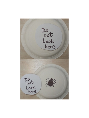
But things got really interesting and challenging recently. I needed a flashcard for ‘It’s scary’ (or ‘scary’) because we are in the unit of pets and animals and we learn to describe them, including what they like to eat, what they can do and what we think of them.

I already had a flashcards for ‘I’m scared’. For a moment I was considering using an image of a monster but those nice ones were sweet and funny and those that were really scary and illustrating the concept well, they were just too scary, even for me. In the end, I decided to go for a spider (as most kids don’t like them and I hate them so my reaction to them is always very real) but I covered it with a flap. My reasoning was that if something is scary, we don’t really want to look at it. So far it works well. And my kids love to pull off the flap while telling me that it is NOT scary.
Gestures

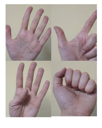
The gesture is king! By adding gestures while teaching kids vocabulary or structures, we multiply the number of channels through which the kids are operating (visual – with flashcards, auditory – the words spoken and kinesthetic – through gestures) and we help them remember and recall the language with more ease.

It does not really matter if we use gestures (or symbols) that are universally recognised. It is an advantage if we can, of course, but I doubt that any culture has a gesture ready for the vocabulary that you are studying at the moment, for example ‘It is snowing’, ‘it is windy’ or ‘a clown’, ‘a doctor’, ‘a princess’. It does not really matter, though. The English classroom is a sort of a bubble, a mini-universe where its own rules apply. It is almost natural that this world will have its own set of symbols or gestures.

I have already committed a separate post on different ways of using it with preschoolers learning English as a foreign language. You can find it here.

Vocabulary and structure or How to teach grammar to preschoolers

Symbols and their application can be especially useful while teaching grammar to preschoolers. First of all, taking the students out of the one word production world and into the phrase- and the sentence- or perhaps even the discourse-level is a challenge all by itself. Our EFL students have a limited class time (unlike the bilingual or the ESL children) and a limited exposure outside of the classroom. Second of all, pre-schoolers are indeed very young and their cognitive skills and the ability to deal with abstract concepts (such as grammar) are limited. Last but definitely not least, they are pre-literate in English and the structure cannot be just presented to them using the written word. Primary children, who learn grammar but depend heavily on the context (which is an advantage and a source of support), still receive the basic form of the target langauge on the board or in the coursebook for example ‘I like…’ which helps them remember the key structure and which supports production.

For that reason some other solutions have to be found and, at least, for me and my students relying on symbolic representation has been a life saver.

It started with a heart, you could say. I needed a symbol to stand for ‘I like’ and ‘I don’t like’ and at first I went for something resembling a face of a child that might be saying ‘Yummy’ but when I brought them to school, my students looked and said ‘happy’. Not good at all. The distance between the symbol and the real thing was too long and our new symbol resembled another symbol too closely. This is how we ended up with a heart – a coloured-in heart and a crossed heart to stand for ‘I like’ and ‘I don’t like’ respectively.
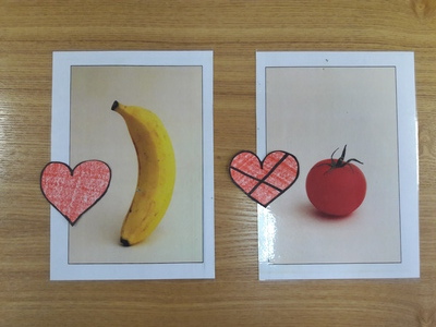
We use them together with the food, pets or colours flashcards and they simply work wonders. Both main components of the sentence are represented here visually, it is easier to remember them, to produce and reproduce them and they can be manipulated physically, too, as each of the students can have their own heart, double-sided. The heart can be put on the flashcard face up or face down depending on how the kids feel about it. It can be also held up, show the other students ‘the right side’.

It is amazing to see how quickly students accept this particular symbol and how effectively they use it. It is even more amazing to witness how they try to adapt it to the situation to make sure that they express their opinion and that this opinion is also reflected in how the symbol is used. In one of my groups we were using it with more complex food items and one of students said that she didn’t know whether she liked steak or not because shed had never tried. After a brief moment of hesitation, she decided to hold the little cardboard heart side-ways (or edge-ways) so that it expresses neither ‘I like’ or ‘I don’t like’.

Another way of applying symbolic representation are the mini-emotion flashcards which we use to describe the feelings of others. These are quite small, small enough to fit on the character or family flashcards and to make it for almost ‘real’ experience when ‘mum’ looks really happy or sleepy or hungry.

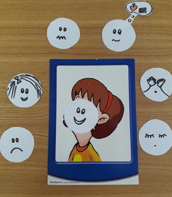
These mini-cards can be used in phrases ‘a happy princess’ or in sentences ‘The princess is happy’ and the position of the card will reflect the change in the phrase ie if the card is on the left of the flashcards it reflects the position of both words in the phrase in which the adjective comes first. If the mini-card is on the flashcard (for the purpose of realism and fun) or on the right we produce a full sentence in which the noun comes first, followed by the verb ‘is’ (the only part that needs to be remembered and which can be represented by a gesture) and by the emotion.

Unfortunately, it is not always easy to find a suitable visual symbol for each structure we teach but it does not necessarily have to be a picture, gestures will work equally well. For example for ‘I’m wearing’ I motion my hand from my neck down to point at the clothes and for ‘I can see’ I tap my finger twice on my chest (for ‘I’ and ‘can’) and then point at my eyes ‘(‘see’).

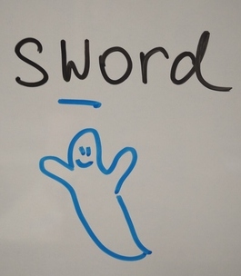
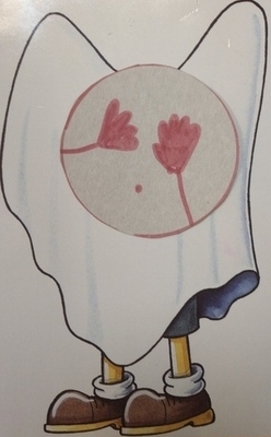
I think it can be safely said that I am (slowly?) adding symbols to my collection. Plus, it is fun to make the ghost scared, for once and this lesson always puts me in a better mood.
And then there are letters, too!

Letters and alphabets or any writing systems are a fascinating set of symbols and, eventually, children get to know them, in their L1 and in English, too. When they are ready. This is an adventure that deserves its own post (or, indeed, a series of posts), soon, especially that when we take the first steps in the world of the written word, it is with a background in another alphabet and another set of symbols, some of which are the same, some of which are different and some of which are false friends because they look the same but they represent different sounds.

Developing literacy skills is as much a challenge as it is fun. Especially that children as young as four and five comment on the fact the English ‘Pp’ looks exactly like the Russian ‘Rr’ and that ‘Ww’ turned upside down turns into ‘Mm’ (well, at least the capital one). Or that ‘Xx’ is a Russian ‘Hh’ or ‘A cross, Anka! It looks like a cross!

More on that later.

Kids grow up…

Of course the use of the symbol in the EFL classroom is not limited to pre-school, only later on the symbol is not an essential component (at least in my head) but a pleasant supplement that makes things fun, colourful and a bit easier. Examples? The ghost in the cover photo which we use with my primary kids to stand for the silent letters that started to appear everywhere in our A1 materials or the gestures that we used while learning and practising some basic adverbs of frequence: always (5 fingers – 5 days a week), usually, sometimes and never.

Happy teaching!

*****

If you are interested, make sure you have a look at these:

Symbolic Understanding in Infants and Young Children, a lecture by Dr Judy DeLoache (2013)

Symbolic Understanding in Infants and Young Children, a lecture by Dr Stephanie Carlson (2013)

Tina Bruce (2005) Early Childhood Education, pp 105 – 125

The stages of symbolic development, in a nutshell.