Just a little bit of Art (in your English classroom)…Erik Bulatov once more!

This time, I did not teach my regular Art lesson. Last Thursday, in the middle of a regular unit but at the end of the term, with all my kids already tired and looking forward to holidays and with the first properly spring days outside of our windows, I decided to let our hair down and engage into some creative activity as part of our regular English lesson. Yay to great ideas!

The language

This time round Erik Bulatov joined us in our regular English lessons. At the moment, we are in a fanstastic unit ‘Going places’ (Global English, CUP) and we have already revised the transport, learnt some less traditional transport, we did our Big Transport Tournament (choosing the best one, in qualifiers, quarter-, semi- and finals which was basically a lot of speaking) and now we are comparing the transport (‘Are they similar or different?’). We have also worked on the verb ‘to get’ and all its meanings (aka ‘The best verb in the world’).

And then I needed something lighter, more fun and more creative for the last lesson of the term.

The artist

I taught this lesson before, twice, in different ways (the previous posts can be found here and here). I reused the presentation I prepared before even though some of the students have taken part in my Art Explorers lessons already and it worked well.

We talked a little bit about the meaning of words and the meaning of pictures and I introduced the Artist of the Day. We looked at his paintings and the meaning and how Bulatov tried to show his ideas through words and through images.

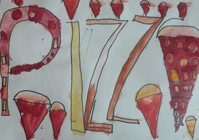
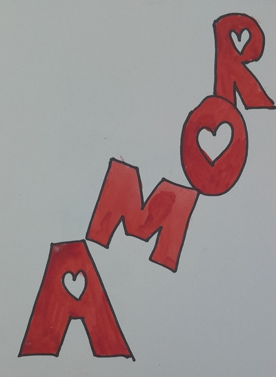
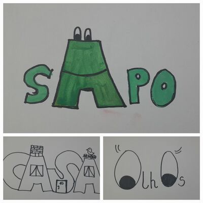
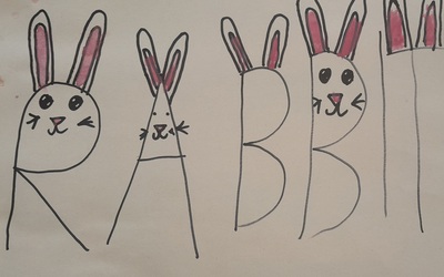
I have also showed the kids again the images in Portuguese I created for the previous lesson (in the posts mentioned before).

The art

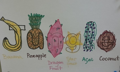
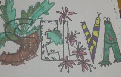
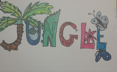
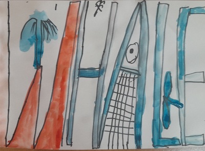
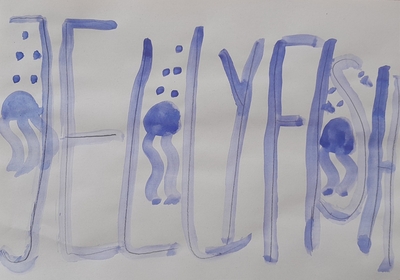
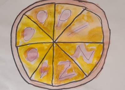
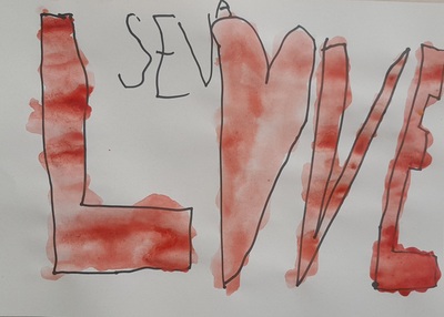
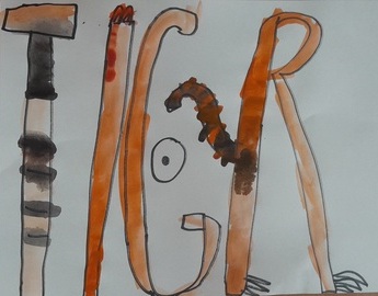
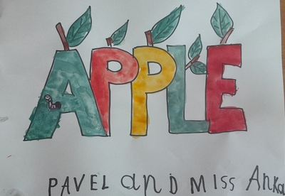
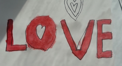
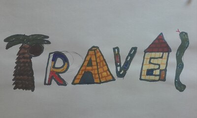
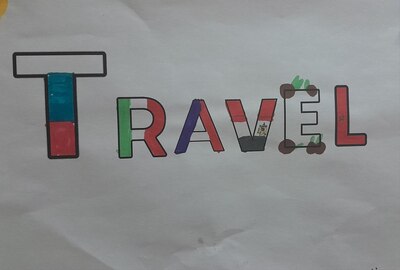
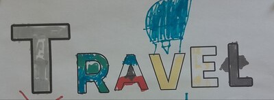
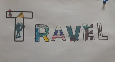
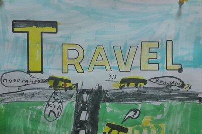
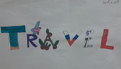
I showed the students the template I prepared, just a simple word TRAVEL in block capital letters and together we brainstormed their own associations with the word. Afterwards, I explained that their task will be to illustrate the word in such a way so as to show the word speak: as a word and as a visual. And that all ideas are good ideas. I gave out the pencils and the markers and they got to work. They were working and I was just supervising and helping with the content as we had to do some research to look for images or for information.

Afterwards we had a short presentation for everyone to see all the ideas (‘This is my poster. I’ve got…because…and…’) and when all of them were done, we also had a feedback session. I wanted to praise everyone together, as a group, apart from all of those individual praises I gave while monitoring and I also wanted to highlight that we had lots and lots of different ideas and that they were all precious. One of the students suggested choosing the best poster but I objected. I explained that all of the posters were great and so different that it is impossible to choose one, the best, they are all great.

Apart from that I also wanted to ask the students for their feedback and whether it was easy or difficult to use the words and images in such a way. This was also a precious part of the lesson.

It is also important to mention that this lesson, untraditionally, was longer as it took more than 1 academic hour that we normally spend on Art in our Art Explorers. I could do it because we had a double English on that day and it was absolutely necessary as only a few of my students are the regular creators and I did notice that these did have a different time management mode and ideas generation mode. The others needed more time to make decisions, to generate ideas and to execute them. Which is something to bear in mind. If it hadn’t been the last day before the term break, we would have created in one lesson and carried out the presentation + feedback on the following day.

The teacher watches and ponders…

Oh, this was one wonderful lesson!

I was really really curious how my regular class would react to the Art content as out of all the students only three or four attend the Art Explorers regularly, all the other ones do not have the chance to stay for the afterschool classes and only some of them attend our term break classes when these take place.

But it went well…I mean, it is a good lesson and, for me as a teacher, it has been tried and tested so I was confident and I knew that great things might come out of it. But the kids took well to it. They were curious about the artist and his paintings, especially that they were in Russian and they were interested and invested in answering the questions I asked.

The brainstorming session, something that we rarely do in the Art Explorers, also helped because it helped the (potentially) less creative students generate ideas or, at least, to see that there is a range of interpretations to choose from. To be honest, some of the kids really surprised me with their ideas and their interpretations as they were fresh and spot-on.

The presentation was a great idea, and again, something we rarely do, because only in our classes we have more time and a relatively even levels of English for everyone to produce and to understand but it was also worth it. I need to think of how to smuggle elements of it into our Art Explorers classes.

My favourite part, however, apart from the creation, was the feedback and all of the comments the kids made. The general consensus was that sometimes it was easy and sometimes it was not to come up with the ideas and to deal with their execution. I really loved the fact that there was such a variety of the interpretations and they the kids had a chance to see everyone else’s angle, too, further broadening their horizons. Some of my favourite ones were the following: travel represented by the sights from around the world, travel represented by things that we need to travel, travel represented by the flags of the countries that the artist likes, travel represented by the flags of the countries that start with the letters t, r, a, v, e and l, travel represented by the travel associations that look like the letters of the word or, even, travel represented by the potential problems which you might encounter while travelling…

The most beautiful line and the one that I will finish this post with was a question from one of my students, one of those cool one, the older ones, the ones who do not attend the regular art classes. It went like that:

‘Are we going to do it again?’

Erik Bulatov once again. January Jungle!

Once a teacher, always a teacher. I decided to use this one as an opportunity for all of us to learn some words)

The language

On the spur of the moment, at one point before Christmas, I decided that our January theme will be the jungle. As in: January Jungle! (Or ‘Jungle January!’, we are using both terms interchangeably.

This means only three lessons but it took me about one blink to decide what we are going to be doing and I am not saying it to brag but to share the surprise because, without knowing, I had these three lessons already in my head. They were just waiting for their cue, apparently.

I decied that we are going to practise a lot of ‘I can’ with different verbs to describe sensory experiences and in the classroom that is actually very (very) far away from a real jungle, I hope we can at least manage ‘I can see’ (the easiest one of them), ‘I can hear’ (there are the sounds) and, perhaps, ‘I can smell’, with a fragrance or two, hopefully.

In the first lesson, we focused on the general vocabulary, related to the tropical forest. We learnt and revised the words (those here) and we practised guessing, using ‘I can see’ (using these cards). With the older kids, we also looked at some of the paintings by Henri Rousseau (a preface to the second lesson in the cycle) while describing the pictures and everything we could see in them (presentation from slide 11).

The artist

Our real artist of the day, however, was my beloved (no joke here), Erik Bulatov. I designed a lesson based on his works a few months ago, during the summer camp lessons. You can find it here, it is only of my proudest creations and I really do recommend it, especially that it lends itself to many different topics and age groups.

I knew that Erik Bulatov would be coming back and the jungle month seemed perfect for it.

We looked at only a few of his paintings (presentation, slides 5 and 6) and we talked about the main idea, that is using the words as visuals, or, as I have been putting it, ‘a word is a picture, a picture is a word’. Actually, it is for that reason that I chose those particular pieces by Bulatov, I needed some clear examples.

We also looked at two of my pictures that I created as models, ‘jungle’ in English and in Portuguese. I wanted the children to see that even though we don’t really know the word and ‘selva’ is unsimilar enough, we might be able to guess (or to decode) what it tells us. I also wanted them to see an example of how different letters can be shaped into the jungle animals and plants.

The art

Afterwards, we just got to work. In terms of resources, that was an easy-peasy lesson because it required only pencils, markers and paper. I did prepare a template with the word ‘jungle’, to speed up the process a little bit. Since, however, I am dealing with a very creative and independent bunch, as it turned out, some specifically asked for the permission to opt out of the template. And, as was to be expected, some asked for the permission to opt out of the jungle altogether. Permissions were granted and the photographic evidence confirms that.

We also used a bit of brainstorming (‘What fruit do we have in the jungle?’) and the internet research. This is a serious word but research it was for sure. We googled the fruit and some specific animals and items because the kids wanted to see them first before deciding which letter they could be incorporated into. I really loved to see the thinking that went into making these decisions. It was a process and they were really involved.

Balinese jungle (yes, that has been confirmed)

‘Jungle’ has only six letters but, still, it was too many for some of the students and, since we only had 45 minutes, they did not manage to finish their pictures, which, I suppose, can be seen as some kind of a failure, bad time management on the part of the student or bad monitoring on the part of the teacher…I’d rather look at it as an opportunity to see how my students were engaged. Those who didn’t finish either promised to complete the picture the next day, during the break or they came up with a pleading ‘Miss Anka, can I please take the paper home and finish there?’ It was important, it mattered!

I have also learnt that a teacher should research the topic a bit further before the lesson, even if only to refresh and to remember that, for example, there are jungles out there which, apart from toucans and piranhas or other tropical fish, might be recognised due to their volcanoes…I was surprised when one of my students started his ‘J’ as a volcano but then he told me that, ‘You know, miss Anka, in Bali…’ I accepted and ate my humble pie. And took notes))

Not the best quality but that is the only thing I managed to snap before the picture went home…

Erik Bulatov. A word that is also a picture

A whale!

Even today, after a few days have passed since the day of the lesson, and with other lessons that have happened in-between, I am still simply, well, euphoric, about the lesson I taught and about the art we created. Cloud number 9.

I saw Bulatov in an exhibition more than ten years ago and, my oh my, what an inspiration he was. Really, I cannot think of anyone who had an impact comparable to him. And he stayed with me. For days on end did I draw letters and tried to make them work together. I even turned one of the pictures into a pillow case, in black and white.

A few weeks ago, I got to see his exhibition again and, once more, it was a blast, in every possible way and, naturally, I made an instant decision that we would do it in class, sooner or later.

A pizza!

The artist and the concept

It was with a real pleasure that I got to tell my students that our Artist of the Day is a contemporary artist who is almost 91 years old and who still lives in our city. They got really excited about it.

However, before we looked at Bulatov’s works, I wanted a proper lead-in. It seemed crucial to me that my students start to use the words as images, to have them look beyond the letters and to see the bigger picture. In order to do that I decided to use two tools or two tricks and I am so happy that what I came up with worked wonders.

The first, really easy exercise was to look at the colour words and to read them as words and as colours. There are plenty of resources that talk about the Stroop effect and pleny of resources to use: the online game, the article, the quiz video. I used a super simple visual, like this one here. The kids loved the challenge and I was having fun with them, quietly celebrating the fact that reading (all of a sudden) is an easy-peasy task for my almost-year-2 students.

For the following stage, I used my own illustrations of some of the Portuguese words which you can see the photographs. My students don’t speak Portuguese and I wanted to have them try to guess what they might mean just looking at the visuals. And they did so well here! Preparing those visuals took some time but I loved this kind of a homework and it made for a lovely evening for me. I chose ‘o sapo’, ‘a casa’, ‘o amor’ and ‘os olhos’ (without articles) simply because I had an idea for the illustration and I knew that my students will know these words in English. Obviously, any other words can be used and any other language that is appropriate in the context. I have already decided that when I teach this lesson again, I will use a wider range of words and a wider range of langauges.

At this point it was already obvious for the kids that words are more than ‘just words’ and we were ready to look at what Erik Bulatov created. I chose only five of the paintings. We looked at them and we briefly analysed why these particular words were presented in such a way. The main idea for this lesson was the sentence that I repeated a few times during the lesson and the one that is also the topic of that post: a word is also a picture.

Amor!

The language

The language input was minimal in this lesson as we only talked about the different words that the kids could use. As an example, I suggested using their names, animals, food, emotions and professions (the theme of our summer camp). The kids had time to think about it (as we were getting ready for the creative part, bringing water, getting on the aprons, giving out paints and brushes) and when they were ready, I wrote all the words they suggested on the board.

I was considering showing them a few examples of the English words that were also turned into images such as a few variations of ‘love’, ‘a cat’ and ‘a dog’ but I decided not to put them up, just to see what the students can come up themselves.

It is worth mentioning, however, that, depending the language input can be extended and there is a lot of potential for combining this lesson with a lesson on animals, colours, seasons or fruit and vegetables. I will definitely be going back to it and I am already excited about it. I want to be perfectly honest here, though. I focused on the artistic part because we are at the summer camp at the moment and there are separate English and Art lessons and, hooray, we have more time for English and for Art. Our Art lesson, however, was done entirely in English.

Sapo, casa, olhos!

The art

We used very basic materials: pencils and watercolours. We didn’t even have any real watercolour paper, because we ran out and we had to use the regular photocopying sheets. Not the best choice, but it didn’t stop us from creating.

I gave out the paper and pencils and we started to design our words. It is a good idea to keep a few spare pages of scrap paper for the kids to practice because it might be a bit complicated to get to the ‘acceptable’ level of quality of the letters or the picture, even with a good general idea, this does not happen naturally. I experienced that myself with my ‘casa’ picture and I was just so happy that I kept the drafts because I could show the kids that only practice makes perfect. Next time we are going to create Bulatov, I am also going to include different versions of his paintings that I saw at the exhibitions, either sketches (if they are at all available) or the same painting with various approches to the composition, size of letters or colours that I know exist. They will be a wonderful lesson into the creative process. Actually, here is another great idea for a lesson for me and for us, from the sketch to the masterpiece…Soon, I promise, soon!

A rabbit!

After the sketches were ready and the kids were happy with them, we started to paint. That’s it. The only thing to follow will be only my admiration, love, excitement, awe and multiple rounds of applause and high-fives. My kids did great.

Here is what went well / very well / amazingly well:

  • We went smoothly from the main idea, to Bulatov’s paintings and to our own creations
  • The kids did great, many of them knew straight away what idea they want to depict and they just went for it. They worked very well, they were focused and motivated. Many finished their first original idea and went on creating.
  • Designing the ideal visual was not easy for all the kids and not all of them got there from the first time. Keeping the additional sheets of paper was a good idea, showing my failed attempts was a good idea, too, and it did help some of the kids. I was really proud of those who got upset at the begininng but decided to go on and created real masterpieces.
  • It was interesting to work with this particular group of kids because they were a new bunch, a mix of my students and some new children who joined us only for those two weeks. All of them, however, apart from one, were new to the artistic activity, unlike everyone who took part in our regular Art Explorers activities that I normally write about here. And it was such a joy to teach them and to take them into the world of creativity.
  • We used the simplest resources, the pencil and the watercolours, but I have already started to wonder what else we could use. Perhaps gouache, perhaps acrylic paints or maybe a mix of techniques, paints and a collage, with the newspaper cut-outs…So many things to think about!

The only thing left now is to invite you to admire what my amazing artists have created!

Love!