Even today, after a few days have passed since the day of the lesson, and with other lessons that have happened in-between, I am still simply, well, euphoric, about the lesson I taught and about the art we created. Cloud number 9.
I saw Bulatov in an exhibition more than ten years ago and, my oh my, what an inspiration he was. Really, I cannot think of anyone who had an impact comparable to him. And he stayed with me. For days on end did I draw letters and tried to make them work together. I even turned one of the pictures into a pillow case, in black and white.
A few weeks ago, I got to see his exhibition again and, once more, it was a blast, in every possible way and, naturally, I made an instant decision that we would do it in class, sooner or later.
The artist and the concept
It was with a real pleasure that I got to tell my students that our Artist of the Day is a contemporary artist who is almost 91 years old and who still lives in our city. They got really excited about it.
However, before we looked at Bulatov’s works, I wanted a proper lead-in. It seemed crucial to me that my students start to use the words as images, to have them look beyond the letters and to see the bigger picture. In order to do that I decided to use two tools or two tricks and I am so happy that what I came up with worked wonders.
The first, really easy exercise was to look at the colour words and to read them as words and as colours. There are plenty of resources that talk about the Stroop effect and pleny of resources to use: the online game, the article, the quiz video. I used a super simple visual, like this one here. The kids loved the challenge and I was having fun with them, quietly celebrating the fact that reading (all of a sudden) is an easy-peasy task for my almost-year-2 students.
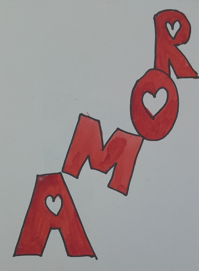
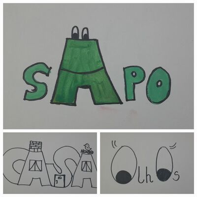
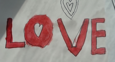
For the following stage, I used my own illustrations of some of the Portuguese words which you can see the photographs. My students don’t speak Portuguese and I wanted to have them try to guess what they might mean just looking at the visuals. And they did so well here! Preparing those visuals took some time but I loved this kind of a homework and it made for a lovely evening for me. I chose ‘o sapo’, ‘a casa’, ‘o amor’ and ‘os olhos’ (without articles) simply because I had an idea for the illustration and I knew that my students will know these words in English. Obviously, any other words can be used and any other language that is appropriate in the context. I have already decided that when I teach this lesson again, I will use a wider range of words and a wider range of langauges.
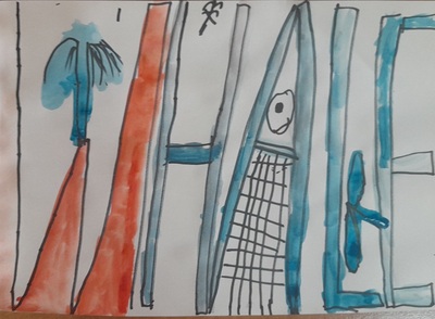
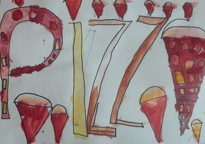
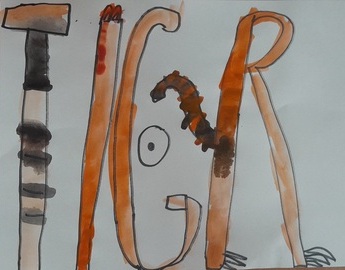
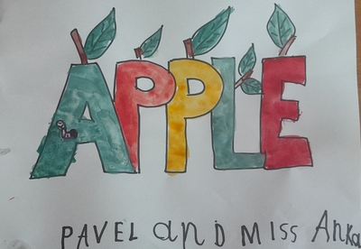
At this point it was already obvious for the kids that words are more than ‘just words’ and we were ready to look at what Erik Bulatov created. I chose only five of the paintings. We looked at them and we briefly analysed why these particular words were presented in such a way. The main idea for this lesson was the sentence that I repeated a few times during the lesson and the one that is also the topic of that post: a word is also a picture.
The language
The language input was minimal in this lesson as we only talked about the different words that the kids could use. As an example, I suggested using their names, animals, food, emotions and professions (the theme of our summer camp). The kids had time to think about it (as we were getting ready for the creative part, bringing water, getting on the aprons, giving out paints and brushes) and when they were ready, I wrote all the words they suggested on the board.
I was considering showing them a few examples of the English words that were also turned into images such as a few variations of ‘love’, ‘a cat’ and ‘a dog’ but I decided not to put them up, just to see what the students can come up themselves.
It is worth mentioning, however, that, depending the language input can be extended and there is a lot of potential for combining this lesson with a lesson on animals, colours, seasons or fruit and vegetables. I will definitely be going back to it and I am already excited about it. I want to be perfectly honest here, though. I focused on the artistic part because we are at the summer camp at the moment and there are separate English and Art lessons and, hooray, we have more time for English and for Art. Our Art lesson, however, was done entirely in English.
The art
We used very basic materials: pencils and watercolours. We didn’t even have any real watercolour paper, because we ran out and we had to use the regular photocopying sheets. Not the best choice, but it didn’t stop us from creating.
I gave out the paper and pencils and we started to design our words. It is a good idea to keep a few spare pages of scrap paper for the kids to practice because it might be a bit complicated to get to the ‘acceptable’ level of quality of the letters or the picture, even with a good general idea, this does not happen naturally. I experienced that myself with my ‘casa’ picture and I was just so happy that I kept the drafts because I could show the kids that only practice makes perfect. Next time we are going to create Bulatov, I am also going to include different versions of his paintings that I saw at the exhibitions, either sketches (if they are at all available) or the same painting with various approches to the composition, size of letters or colours that I know exist. They will be a wonderful lesson into the creative process. Actually, here is another great idea for a lesson for me and for us, from the sketch to the masterpiece…Soon, I promise, soon!
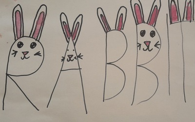
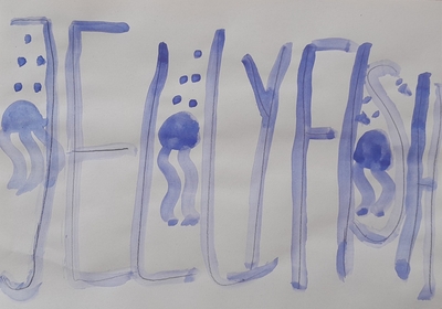
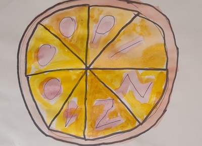
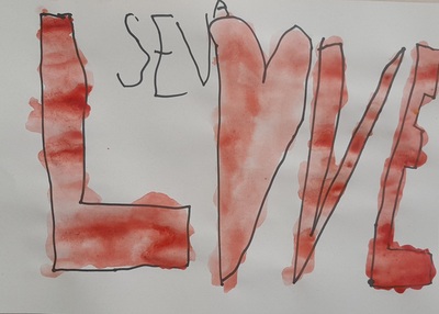
After the sketches were ready and the kids were happy with them, we started to paint. That’s it. The only thing to follow will be only my admiration, love, excitement, awe and multiple rounds of applause and high-fives. My kids did great.
Here is what went well / very well / amazingly well:
- We went smoothly from the main idea, to Bulatov’s paintings and to our own creations
- The kids did great, many of them knew straight away what idea they want to depict and they just went for it. They worked very well, they were focused and motivated. Many finished their first original idea and went on creating.
- Designing the ideal visual was not easy for all the kids and not all of them got there from the first time. Keeping the additional sheets of paper was a good idea, showing my failed attempts was a good idea, too, and it did help some of the kids. I was really proud of those who got upset at the begininng but decided to go on and created real masterpieces.
- It was interesting to work with this particular group of kids because they were a new bunch, a mix of my students and some new children who joined us only for those two weeks. All of them, however, apart from one, were new to the artistic activity, unlike everyone who took part in our regular Art Explorers activities that I normally write about here. And it was such a joy to teach them and to take them into the world of creativity.
- We used the simplest resources, the pencil and the watercolours, but I have already started to wonder what else we could use. Perhaps gouache, perhaps acrylic paints or maybe a mix of techniques, paints and a collage, with the newspaper cut-outs…So many things to think about!
The only thing left now is to invite you to admire what my amazing artists have created!

Happy teaching!